01
INTRODUCTION
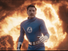
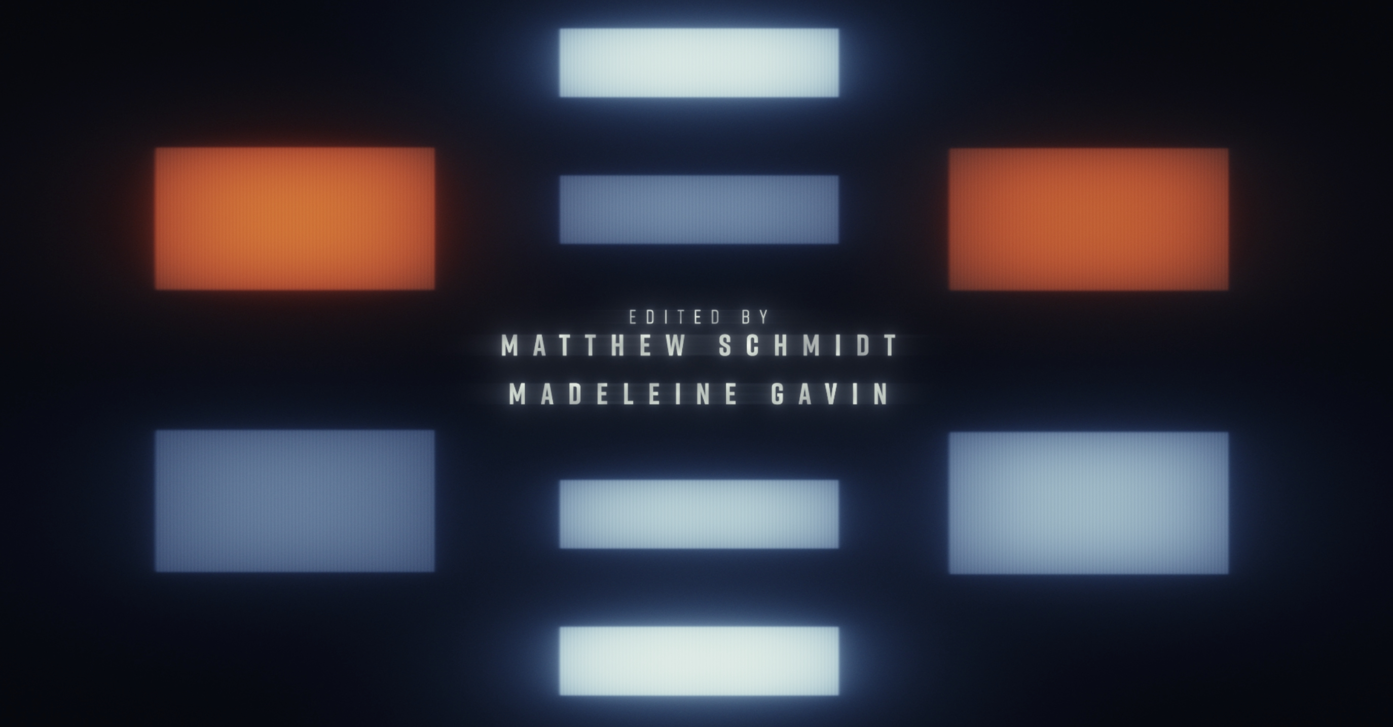
We were honored to return to the Captain America franchise and once again collaborate with Marvel Studios—this time to design the Main on End title sequence for Captain America: Brave New World, the fourth feature film in the franchise and the first film to feature Sam Wilson stepping into the iconic mantle of Captain America.
This project represented more than a continuation—it was a transformation. Our mission: to create a sequence that honors the rich legacy of Captain America, while channeling the fresh energy and dynamic spirit that Sam Wilson brings to the shield. The result is a visual journey that evolves from rigid order and constraint to movement and freedom, echoing both the film’s narrative arc and Sam’s path toward self-determination.
02
MAIN ON END TITLE SEQUENCE
Like all the title sequences we’ve designed, we wanted this to be a cinematic story in itself—beginning with moody tension and culminating in a celebration of energy, teamwork, and resolve. Drawing inspiration from the graphic language of '70s spy thrillers and political dramas, we built a world of grids and hypnotic light patterns that evoke the film’s core themes: mind control, resistance, and the rise of a new kind of hero.
Mind Control: A World Under Control
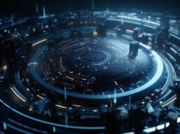
The sequence opens in darkness, guided by an ominous rhythm of flashing rectangles—a motif inspired directly by the film’s depiction of mind control technology. These glowing lights represent the calculated power of the villain, The Leader. The grid is rigid, the lights beat in unnatural synchronization, and the atmosphere is tense and oppressive.
We studied the behavior of light carefully, ensuring each rectangle felt like it was glowing from within—not just a shape on screen, but something alive and even subtly menacing. Cool whites fade into icy blues, every flicker and pulse meticulously animated to evoke the psychological unease of being under another’s control.
“A key design decision was to have the rectangles radiate with an inner glow,” says Doug Appleton, Chief Creative Director at Perception. “We focused a lot on the light’s behavior, ensuring that each flashing light felt organic and dynamic.”
Disruption: The Hero Emerges
As tension builds, a single red light pierces the order—symbolizing Sam Wilson’s Captain America disrupting the villain’s plans. The grid fractures, patterns unravel, and the rectangles become more erratic and energetic. Here, control begins to slip, and the hero’s presence is felt.
Teamwork: Motion, Energy, and Resistance
Blues and whites flood in, representing Sam’s allies. Motion accelerates, lines shoot upward, and the rigid grid dissolves into fluid animation. The title sequence now reflects Sam Wilson’s unique spirit: fast, resourceful, and dynamic. The visuals become more playful and alive, capturing the energy of teamwork and the determination to resist The Leader’s command.
Breaking Free: A Flight to Freedom
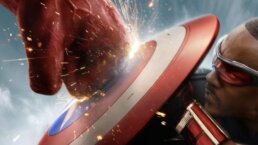
Finally, the closing section bursts into a sequence of flight—the rectangles scatter, motion trails streak across the screen, and the villain’s world of structure collapses in real time. Sam and Falcon soar through this disintegrating system, breaking it apart with speed and confidence. As the chaos settles, the iconic Captain America shield emerges—dramatic and unmistakable—symbolizing Sam’s full transformation and the triumph of heroism over control.
“The motif of the rectangle wasn’t just visual—it was narrative,” says Danny Gonzalez, Co-Founder of Perception. “We wanted to use the villain’s own mind control technology as a storytelling device—and then show Sam flipping that narrative on its head.”
03
DESIGN PROCESS
Unlike many of our past sequences, this project demanded that we dive straight into motion before design. Static rectangles lacked the character and tension we needed; it was only through animation—pulse, pattern, rhythm—that the sequence could be properly visualized.
We built the sequence in After Effects, leveraging custom lighting rigs and Deep Glow plugins to achieve that signature internal illumination. We focused on how light temperatures shifted over time: whites fell off into soft blues, and vibrant reds popped without overpowering the composition.
Our greatest challenge was balancing graphic simplicity with emotional impact. The best political thrillers of the '70s used visual restraint to create tension and drama, and we sought to echo that discipline—while still evolving into something expressive and fresh.
04
VISUAL SYMBOLISM
The sequence’s visual language was rooted in a reference clip from the film—an eerie blinking light display tied to the villain’s mind control technology. This became the conceptual foundation for our glowing rectangles, arranged in geometric patterns to feel cold, calculated, and daunting.
As the sequence unfolds, those rectangles shift, break, and scatter. The movement of light becomes less mechanical and more expressive, reflecting Sam Wilson’s growing influence and the disruption of control. The gradual breakdown of the grid—first with red flashes, then bursts of color and motion—symbolizes the collapse of the villain’s plan and the rise of a bold force.
05
OPENING TITLE AND MARVEL LOGO
In addition to the Main on End sequence, we crafted a unique Marvel Studios logo and opening title sequence, each designed to seamlessly blend the film’s retro influences with the new direction of Sam Wilson’s Captain America.
06
CONCLUSION
Our Main on End title sequence for Captain America: Brave New World is both a love letter to the graphic simplicity of '70s thrillers and a powerful symbol of transformation within the Captain America legacy. We’re honored to continue our collaboration with Marvel Studios and excited to contribute to the launch of this bold new chapter in the Captain America saga.
"We are honored to collaborate with Marvel Studios and step back into the world of Captain America celebrating Sam Wilson's unshakeable heroism. Our team drew inspiration from classic '70s political thrillers and bold graphic title design sequences to craft something that feels both uplifting and hopeful—perfectly reflecting the spirit of this iconic hero." – Jeremy Lasky, Co-Founder of Perception
“It's always an honor to collaborate with the Marvel team, but having the opportunity to work on a character I grew up with is truly special. Sometimes we fall into the world of wanting to use 3D to build these huge and wild sequences, but personally I find that the simple, elegant, and thoughtful sequences stand the test of time– just like Caps’ shield.” – Danny Gonzalez, Co-Founder of Perception