01
INTRODUCTION
We returned to Hell’s Kitchen with a clear mission: to reimagine Daredevil for a new chapter shaped by loss, exposure, and the fight to reclaim purpose amid ruin. In Daredevil: Born Again, Matt Murdock’s secret identity has been shattered, his life systematically dismantled by Wilson Fisk’s ruthless rise to power. This isn’t a story about who Matt fights— it’s about what breaks him, and what forces him to rise again.
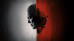
Collaborating with Marvel Studios once again, we set out to create a Main on End title sequence that didn’t just introduce the episode—it revealed the soul of the series. Less superhero, more man. A visual narrative of power lost and reclaimed, identity fractured yet resilient, and the slow, deliberate path toward rebirth.
We knew we were stepping into sacred ground: the original Daredevil on Netflix was a landmark in superhero storytelling, with a fanbase deeply connected to its tone and character. Our sequence needed to honor that legacy while pushing it forward—bridging the past and present with reverence and evolution.
02
MAIN ON END TITLE SEQUENCE
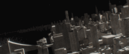
From the moment our sequence begins— after the initial red and blue intro fades— the world emerges in tones of cold stone, gray, and tan. The city is cloaked in fog, its edges blurred. We see through Daredevil’s perspective— not by sight, but by sense: a world of shadowed shapes, obscured forms, and fragile memory.
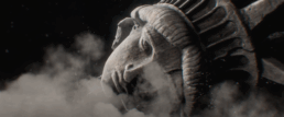
Monolithic statues stand damaged and eroded, emblematic of the crumbling institutions Matt once trusted— the law, the church, and the myth of the city itself. These structures are heavy with decay, yet they still hold weight and meaning, just as Matt himself is battered but not defeated.
Light doesn’t flood this world— it seeps through cracks and fissures, thin and uncertain. The atmosphere feels suspended, caught between ruin and the possibility of restoration. Silhouettes shift behind broken glass and shattered stone, a city frozen in time and tension.
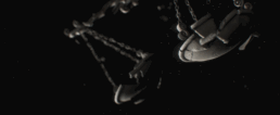
We embedded visual pressure points throughout the sequence— objects charged with emotional weight and story: the broken horn of Daredevil’s helmet, Kingpin’s clenched fist, the weathered Nelson, Murdock & Page sign. These aren’t just Easter eggs; they’re fragments of a corrupt world and justice system.
03
DESIGN PROCESS
This sequence was built to scale across two seasons, relying not on specific plot beats but on overarching themes.
Inspired by noir aesthetics, Gothic sculpture, and operatic lighting, we developed a visual language centered on fog, glass, and stone—obscured forms and fractured visions. We embraced Daredevil’s blindness as a storytelling device, favoring tension and ambiguity over clarity.
Using ZBrush and Substance Painter, we sculpted lifelike statues layered with grime, cracks, and the patina of time. Each object carries a human scale and weight, imbuing each frame with somber momentum.
The animatics evolved through numerous versions, always intending to feel like Matt Murdock being pieced back together— physically and emotionally. Working in Cinema4D, we staged them at cinematic scale, always framed from below, never above. The tone is heavy, weathered, and haunted. Not explosive— inevitable.
04
VISUAL SYMBOLISM
Built as a visual poem, this sequence speaks through metaphor. Unlike other title sequences that introduce characters, ours dissects what they’re becoming.
THE HORN
Opens the sequence broken and separate, slowly drifting back toward the body—drawn by gravity or fate.
THE FOG
More than atmosphere— it’s perspective. A city clouded by doubt, a mind uncertain.
THE STATUES
Fractured institutions—justice, religion, government— all caught mid-collapse.
MATERIAL DUALITY
Concrete versus marble, street versus tower, Daredevil versus Kingpin. The city is both a battleground and character.
05
STORYBOARDS AND STRUCTURE
The structure was born from a single question: What does it take to become Daredevil again?
Working closely with our storyboard artist, we mapped a list of thematic objects loaded with narrative tension— law firm signs, cracked pulpits, crumbling rooftops. These aren’t mere props; they mark the places where Matt’s world fell apart and where it might rise again.
The animatic was paced like a slow burn, avoiding conventional action beats and instead building toward a gravitational crescendo— the broken horn, the pull, the resurrection.
06
CONCLUSION
Daredevil: Born Again isn’t just the story of a hero. It’s about what breaks him— and what forces him to stand again. Our Main on End title sequence is a meditation on that transformation. Heavy with fog. Dense with symbolism. Slowly, powerfully, rising.
We’re proud to have helped bring Daredevil back— not with a bang, but with a deep, deliberate breath before the fight begins. In doing so, we embraced the challenge of meeting long-held fan expectations while crafting something bold and new— adding to the mythos without ever forgetting where it began.
“We’re thrilled to collaborate once again with the incredible team at Marvel Studios to help bring Daredevil: Born Again back to Disney+,” says Perception Co-Founder Jeremy Lasky, “This haunting, symbolic title sequence sets the tone for the series—echoing the crumbling foundations of justice and the rise of Daredevil. It’s a moody, powerful visual narrative that explores the duality between Matt Murdock and Wilson Fisk, and the shadows that bind them.”
