01
INTRODUCTION
Our team at Perception collaborated with Marvel Studios on their newest film, The Marvels. The Marvels details the cosmic adventure and team up between an unlikely trio, Captain Marvel (Brie Larson), Monica Rambeau (Teyonah Parris) and Ms. Marvel (Iman Vellani). Our team was brought in to conceptualize several elements for the film, from futuristic holograms to designing the retro-inspired Main on End title sequence.
The Marvels End Title Sequence
02
REFERENCING THE '70S
Upon watching The Marvels, our team immediately resonated with the idea of this film feeling like a rock-n-roll space opera. We were drawn to the retro influences throughout The Marvels and decided to base our title sequence in those vintage vibes.
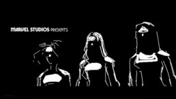
INITIAL STORYBOARDS
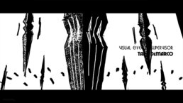
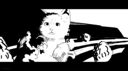
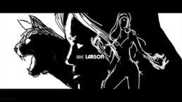
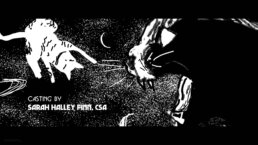
As we began mapping out our initial designs, we turned to 1970s sci-fi illustrations from artists like Mike Hinge, Kilian Eng and Mœbius, along with Heavy Metal magazine covers from the 1980’s for inspiration. These references ultimately played a key role in developing our design language, choice of colors and composition for the sequence.
OPENING FRAMES STORYBOARDS
03
ILLUSTRATIVE AESTHETIC
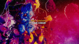
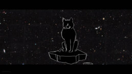
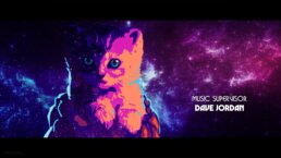
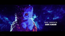
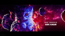
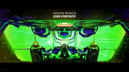
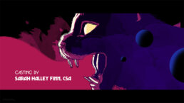
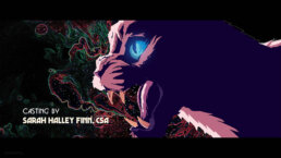
Since The Marvels is such a fun and colorful film, we wanted our title sequence to capture the spirit of the movie through illustrations. To celebrate the space opera vibe of the film, we created an illustrated style that is reminiscent of book covers and movie posters of the '70s. These illustrations depict key moments and characters seen throughout the film.
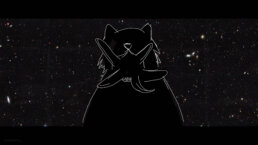
LOOK DEVELOPMENT FOR THE FLERKITTEN
04
A VIBRANT PALETTE
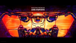
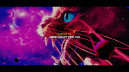
From the beginning of our early design phase, we had a clear color scheme in mind inspired by the vibrant colors of the film. We focused on blues, purples , pinks, and oranges, all falling in line with the '70s vintage idea. When we started the illustration process for the title sequence, we wanted to blend these colors with cosmic treatments, resembling space, galaxies and nebulas. We ran color tests to explore these possibilities within our initial edit and mimic the '70s aesthetic from our concept.
CAPTAIN MARVEL SHIP COLOR TESTS
05
THRILLING TRANSITIONS
Early on in the process we knew that dynamic transitions from shot to shot would be integral to keeping the excitement and momentum of the sequence rolling. As we were drawing our illustrations and mapping out our animations, we explored how each frame could move and transition into one another. This exploration process gave us the space and opportunity to come up with transitions that were both unique and felt naturally flowing.
TITLE SEQUENCE OPENER TEST ANIMATION
06
TYPOGRAPHY
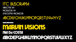
To further emphasize the retro aesthetic, our team began exploring various typefaces to utilize throughout the sequence. We landed on two typefaces which perfectly aligned with the '70s feel and complemented each other visually - Marvin Visions and ITC Busorama. We elected to color these typefaces with a vivid shade of yellow as a callback to classic '70s movie titles and poster text. Marvin Visions was also used to make the main title at the end of the sequence.
07
BUILDING THE SEQUENCE
To create this sequence, our illustrators began drawing each of the illustrations in Adobe Photoshop, referencing storyboards and our specific color palette. As the illustrations were coming together, we began conducting motion tests with animated textures that we felt added depth and character to these drawings. We used textures from Cinema 4D’s native noise maps while also creating our own custom grunge maps in Adobe After Effects using the Boris Fx Sapphire Plugin suite.
LOOK EVOLUTION FOR GOOSE
Later, when most of the illustrations were ready, we transferred everything into After Effects. We brought in all of the Photoshop files with their layers and spread them out in the z-space to place the elements throughout the scene with precision. We took all of our illustrations from the frame lockups and separated out the layers in Adobe Illustrator, bringing it all into After Effects in order to move individual layers around in z-space.
DEPTH ANIMATION TEST
For the overall animation style, we knew we had to create everything for a stereo workflow. In After Effects we separated every layer in z-space for our left eye and right eye cameras. We also wanted a constant camera movement happening so we could feel the 3D space in stereo at all times.
ENERGY HAND MOTION TEST
Once the animation was in a good place, we performed our final color correction pass. This was also done in After Effects, and was typically the final step in the process. This step allowed us to dial in the mood and tone of the piece and bring everything into a unified color space.
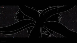
ENERGY HAND DESIGN BREAKDOWN
08
MAKING THE MAIN TITLE
The final main title for The Marvels was also based on the illustrative styles of our references with additional depth, dimension and unique textures.
We initially designed the title in Adobe Illustrator before bringing it into Cinema 4D. Using Cinema 4D, we created a 3D model of the type. A render of the type was then brought into Photoshop, painted over, then mapped back on to the 3D geometry to create the illustrated look. Each outline, edge highlight, and bit of grunge was hand placed to get the perfect look.
MAIN TITLE DESIGN BREAKDOWN
09
CAPTAIN MARVEL'S SHIP
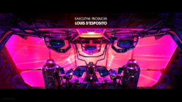
Similar to the main title, we used this same mapping technique for many of the elements throughout the sequence, notably, Captain Marvel’s ship. We created all of the illustrated textures in Photoshop and Illustrator. Then, we UV mapped them to the ship in Cinema 4D. We also created a second material to map over the ship that would give it more illustrative shading when it was rotating.
10
HOLOGRAM TECHNOLOGY
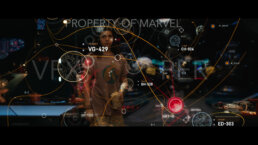
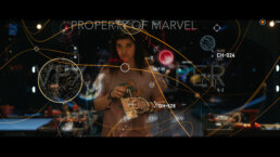
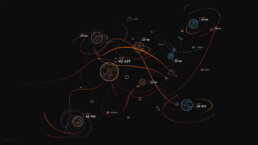
Our team also collaborated with Marvel Studios to animate and composite a large scale map hologram into a critical scene with Captain Marvel, Monica Rambeau and Ms. Marvel.
HOLOGRAM MAP LOOK DEVELOPMENT
This animated map is used as a narrative device, visualizing the information that is being discussed. Within our animation, we showcased important story beats, such as jump points, the destabilization of planetary systems and system threats.
MAP START UP TEST ANIMATION
MAP GLOW ANIMATION TEST
Simultaneously, we explored how this hologram can exist and move around the characters through different start up sequences and shifting animations.
MAP START UP MOTION TEST A
MAP START UP MOTION TEST B
MAP START UP MOTION TEST C
While the design was started in-house by Marvel Studios’ design team, we built upon that initial design to create a map that could work from the multiple angles seen throughout the sequence.
HOLOGRAM MAP FULL SCENE
11
TRIO TRANSITIONS
Our team designed several split screens during key moments throughout the film. The core of the film is three heroines working together and exploring how their powers are connected. Our split screen transitions were a visual way of showing moments of their powers becoming intertwined.
12
MARVEL STUDIOS LOGO
For every Marvel Studios film and series, our team updates and customizes the opening Marvel Studios fanfare. For The Marvels, we replaced several clips to add more footage of Captain Marvel, Monica Rambeau and Ms. Marvel. There were 16 clips replaced in total, evenly distributed throughout the animation. Towards the end, we do a full takeover of the floor clips so each piece of footage is of The Marvels. At the very end, we replaced the Black Panther explosion in the letters of “Marvel” to feature a Captain Marvel clip instead.
13
CONCLUSION
It was an honor to collaborate with Marvel Studios on so many brilliant aspects of The Marvels, including the illustrative end title sequence. Our title sequence takes the audience on a non-stop roller coaster ride through the infinite cosmos, revealing stunning imagery composed in unexpected ways!
