01
Introduction
It was an honor when Marvel Studios approached us to collaborate on WandaVision, especially because it was the first Marvel Studios original series streaming on Disney+. WandaVision centers around Wanda Maximoff’s childhood memories of seeing the perfect suburban lifestyle through decades of classic American TV. Our goal was to match the level of faithful detail in our design as the Marvel Studios team was bringing to the entire series.
WandaVision Final Design and Process
02
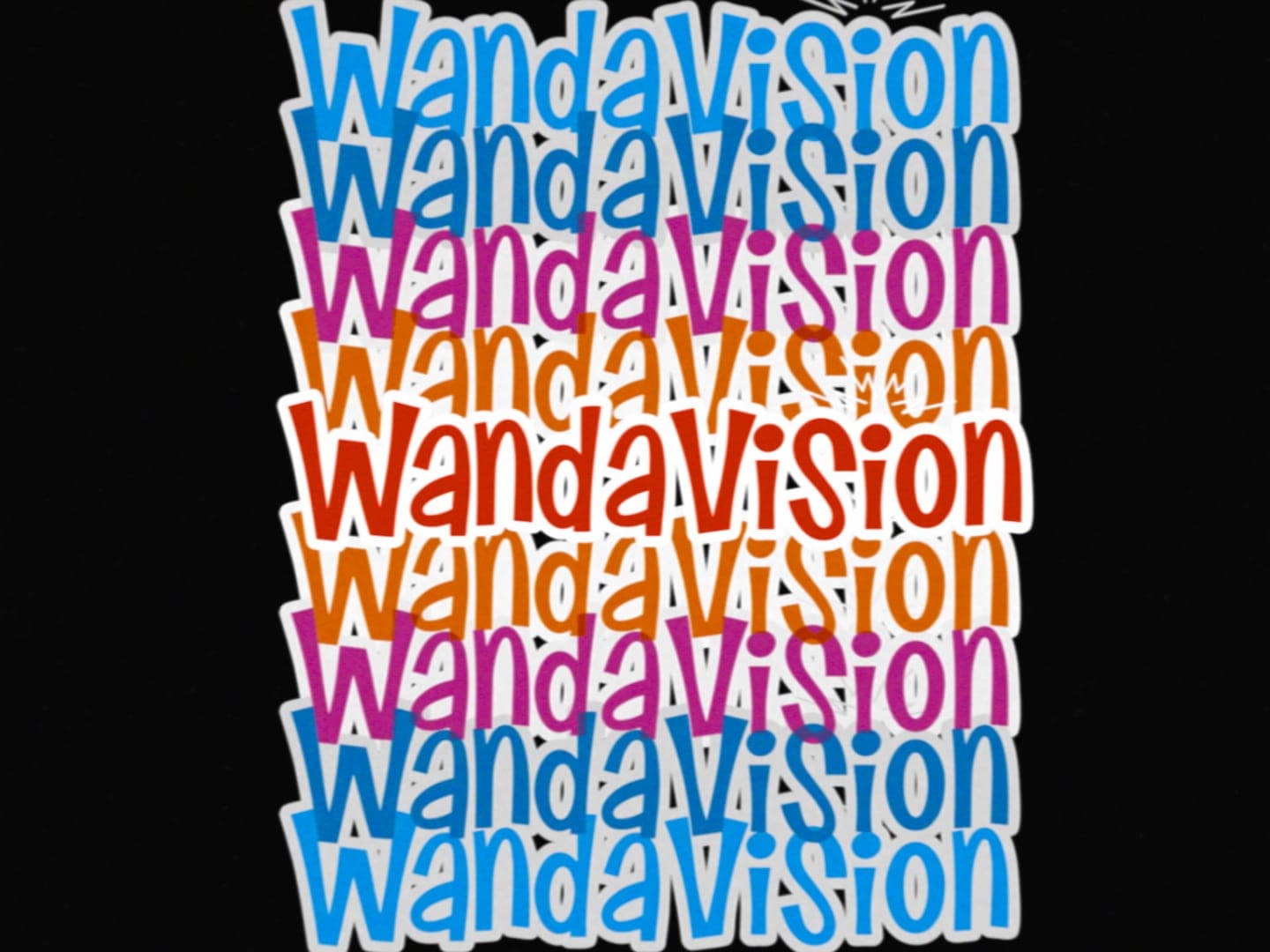
MAIN ON END TITLE SEQUENCE
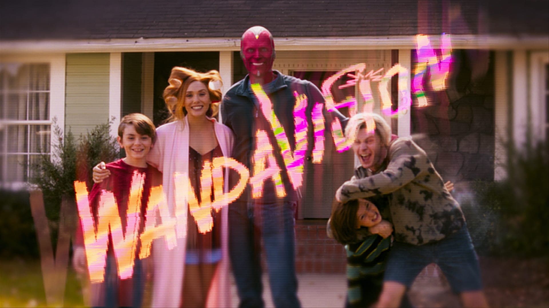
When creating the Main on End titles, we always want to tell a story. For this particular sequence, we wanted to focus on Wanda and Vision, and the world that is being created around them. From here, we developed several concepts that presented this storyline.
FINAL CONCEPT
After initial developments, the Main on End titles were conceptualized as a “Love Letter” to the medium of television. The TV changed the American household and has been a portal to other worlds, cultures, and stories. Our idea was to draw the viewer into the TV world that Wanda was creating.
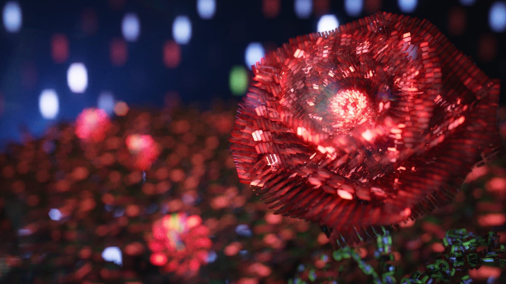
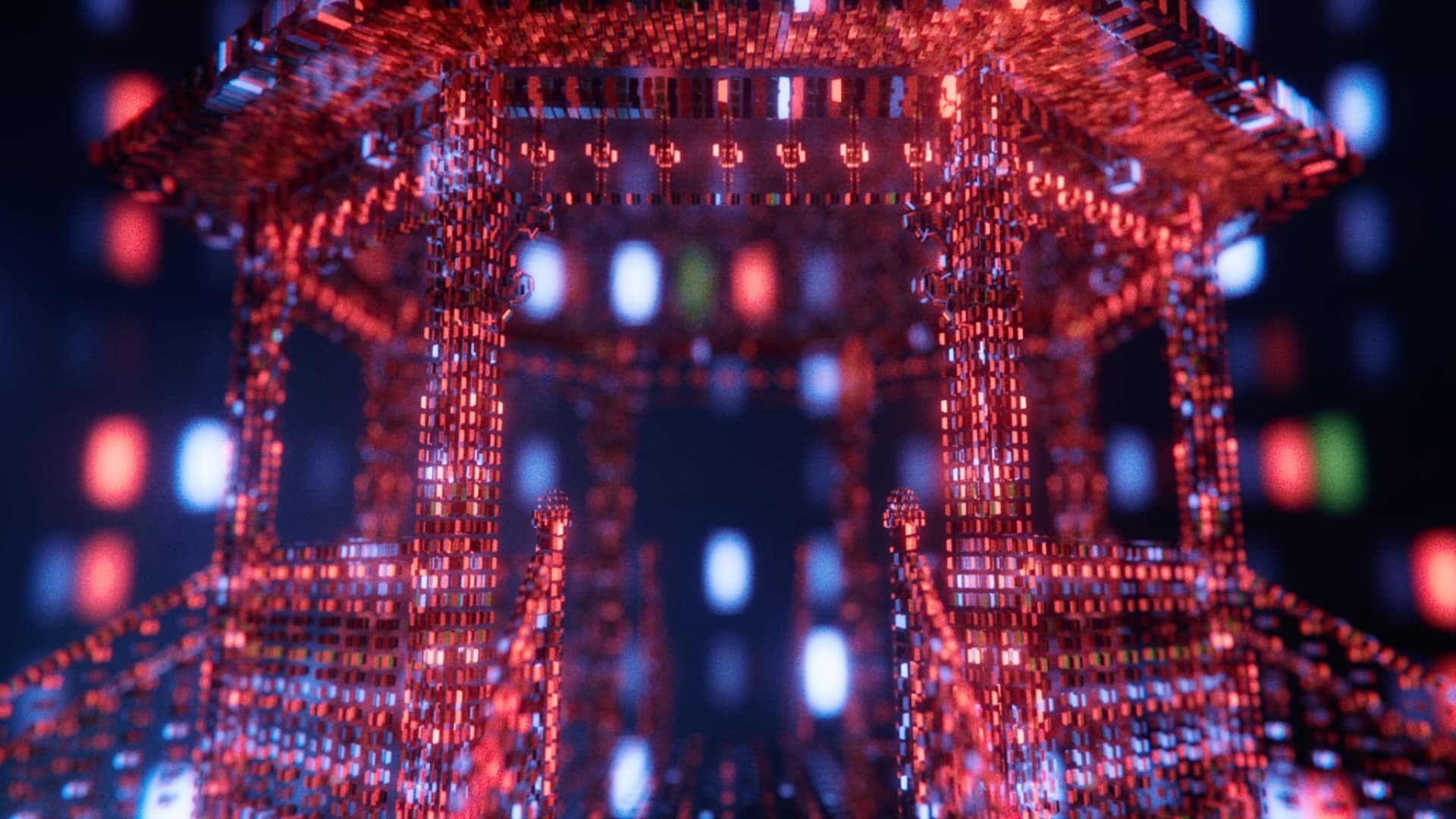
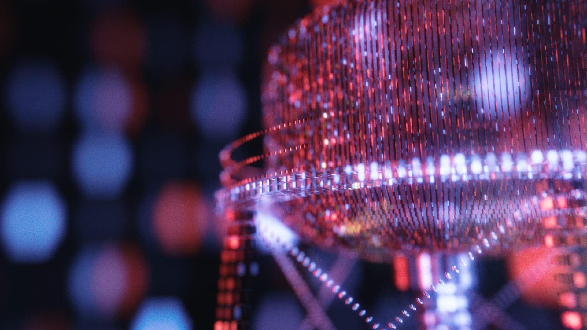
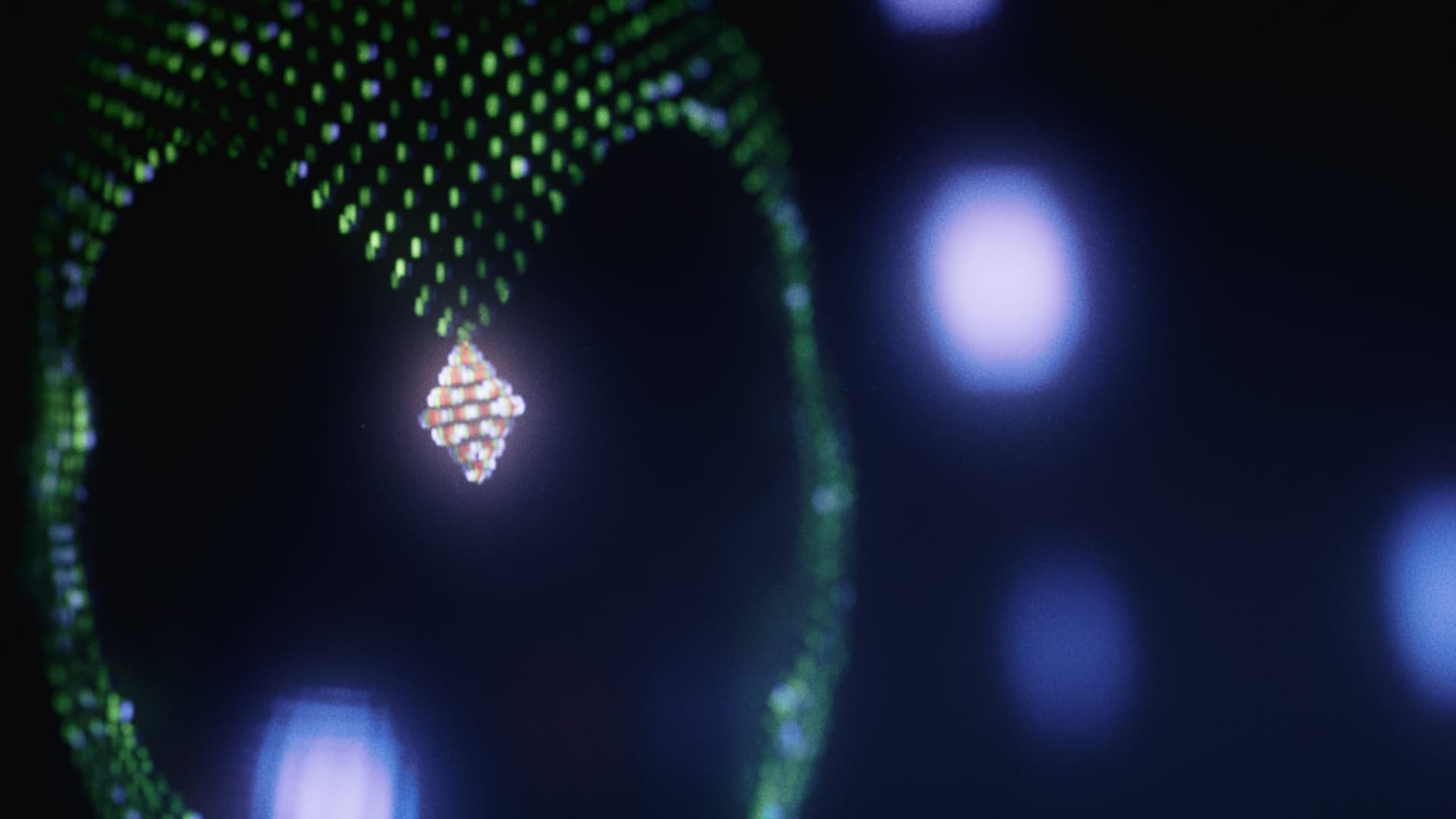
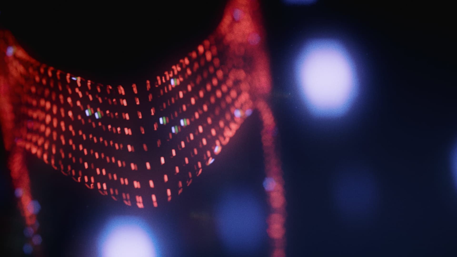
Pixels
We decided that RGB pixels, which make up the visuals within a television screen, would be the best way to tell Wanda and Vision’s story in the Main on End title sequence.
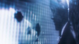
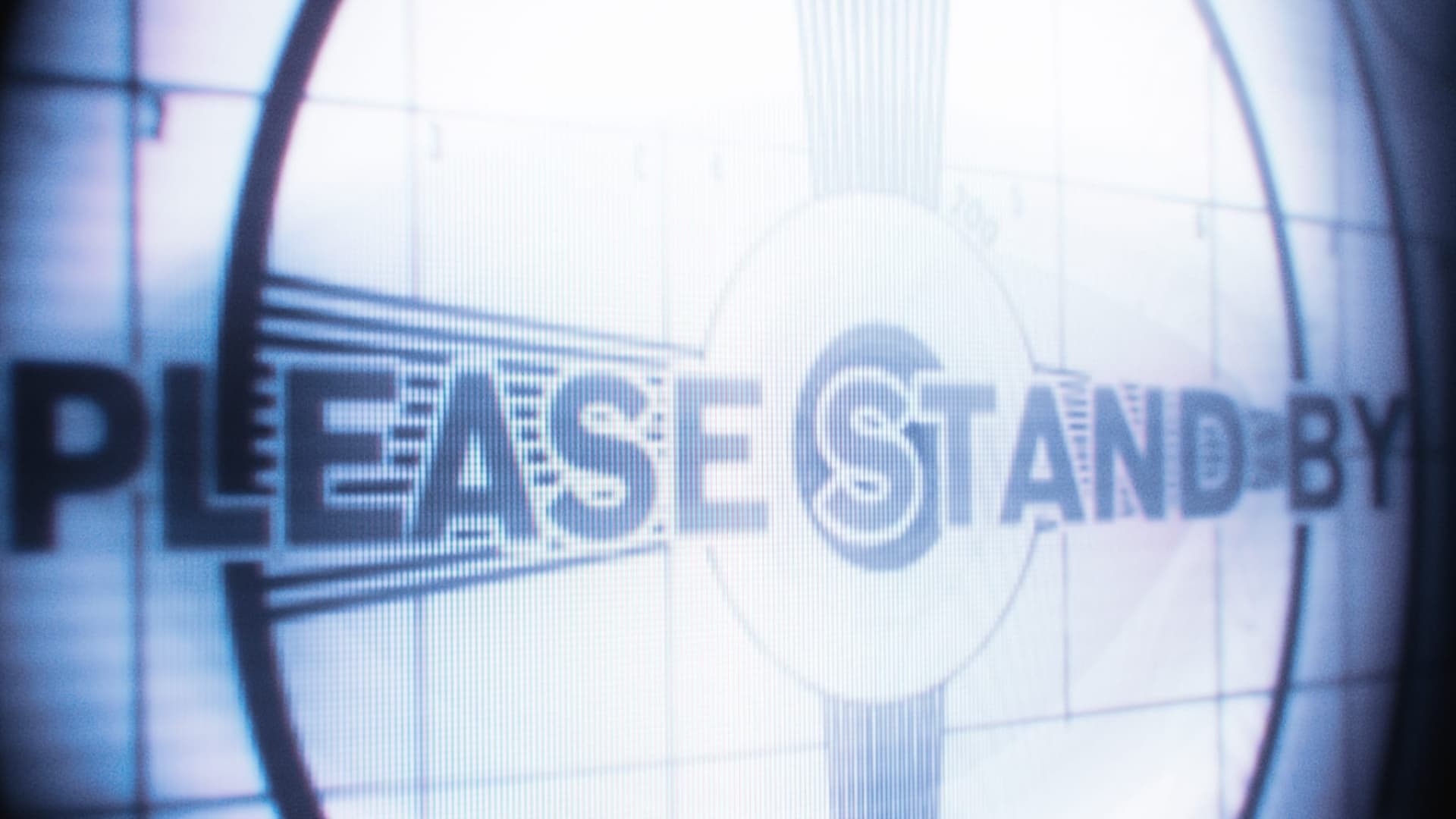
The sequence begins with a “please stand by” visual, which changes with every episode to match the traditional “please stand by” card of the era the show is from. We see extremely close up visuals from the episode on a television screen, and then the camera pushes forward into a beautiful visual realm created from hexagonal shaped RGB pixels.
The pixels are shaped like hexagons as a representation of Wanda’s “hex” powers, the hexagonal shape of Westview, Darcy’s nickname for Westview (“The Hex”), and the hexagons that consistently pop up throughout the show.
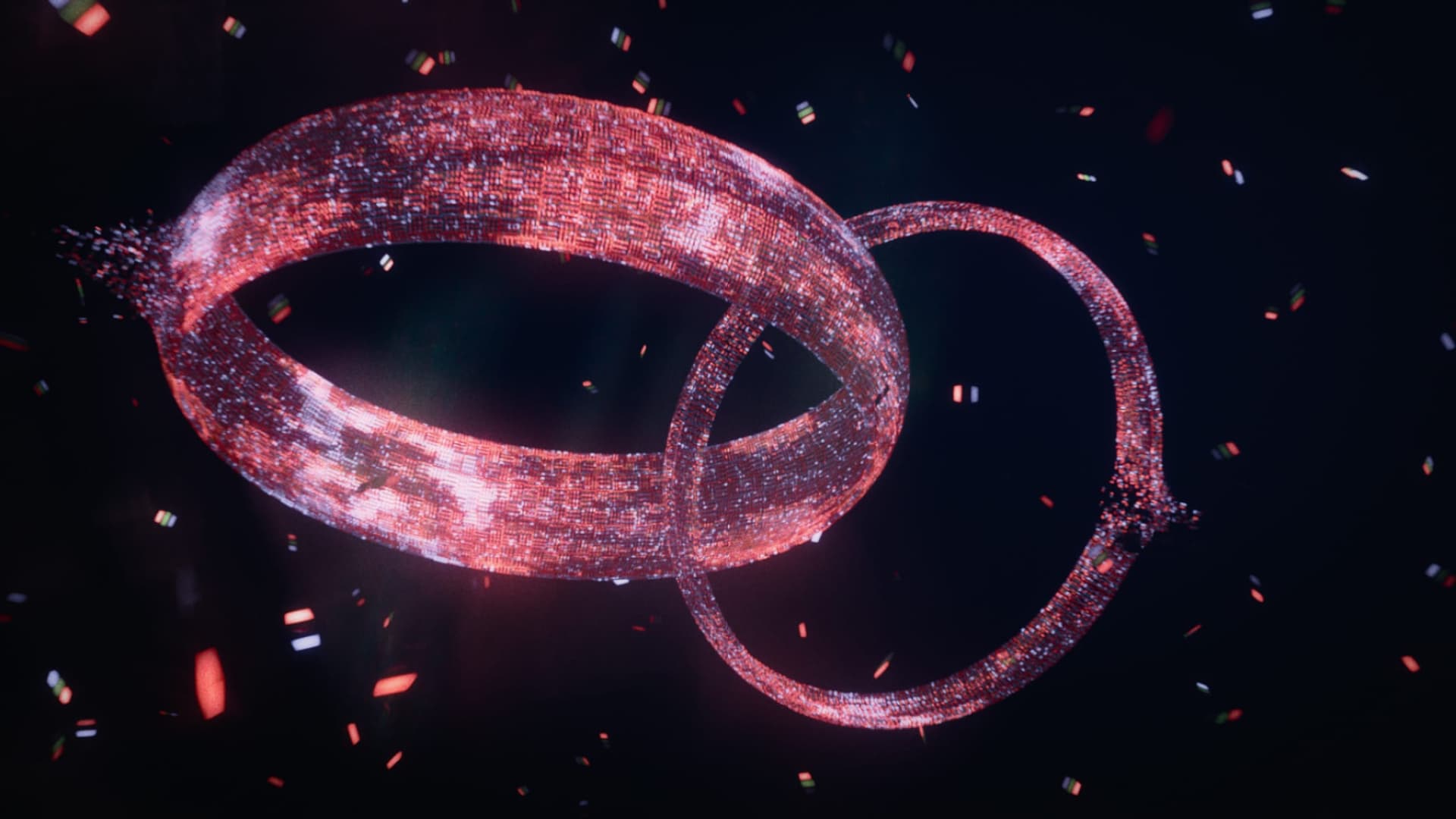
The Story
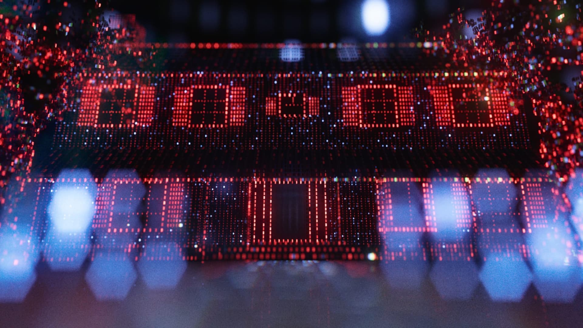
The story within the Main on End title sequence reflects the story of WandaVision itself. Wanda is creating her own reality within the town of Westview, and the pixels within the television screen are building a new reality as well. This sequence includes notable aspects of the show, such as Wanda and Vision’s house, the baby mobile, and the Westview water tower.
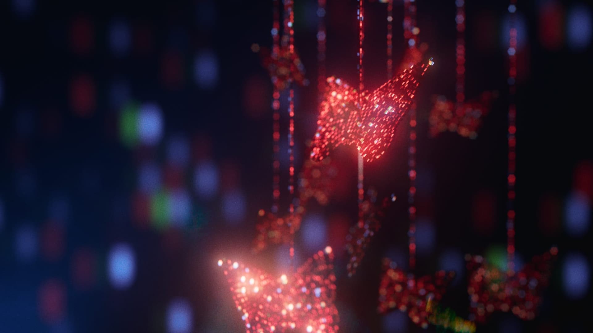

As the pixels are being built into different objects, a single red pixel falls down and crashes, causing a disturbance that begins to echo throughout the world we have just created. This was a direct representation of Wanda’s world falling apart around her.
The sequence ends with the camera pulling back and showing that even in the destruction, two wedding rings remain formed together. Since WandaVision is at its core a love story, this shows that even amongst the chaos and confusion, Wanda and Vision still love each other.
03
OPENING TITLES
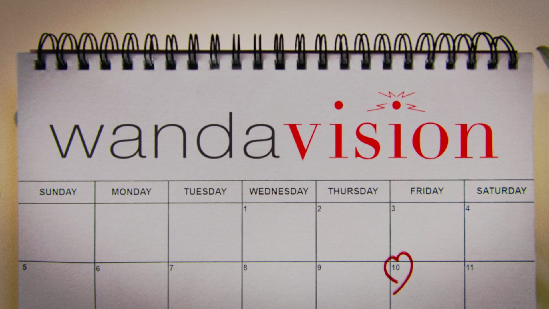
Since Wanda is creating her reality to appear as classic sitcoms, Marvel Studios wanted each episode to open with a title sequence designed to feel authentic to the style of that era. We researched the sitcoms that each episode drew inspiration from and studied their respective opening sequences. We not only wanted to match the style of the shows’ opening titles, but the energy and tone of them as well.
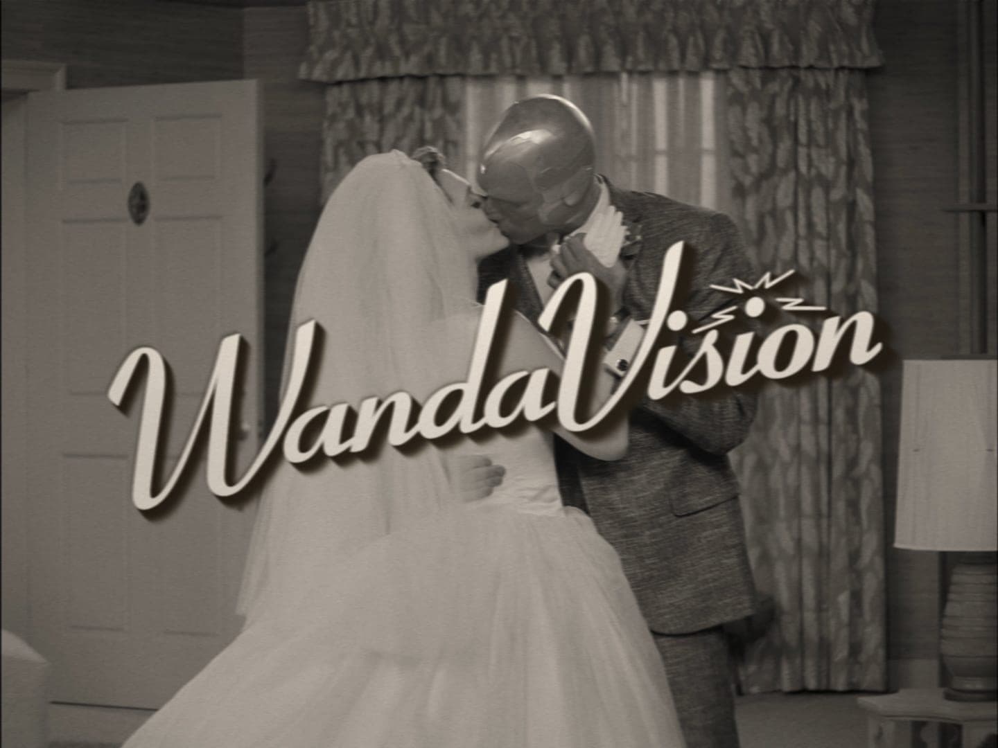
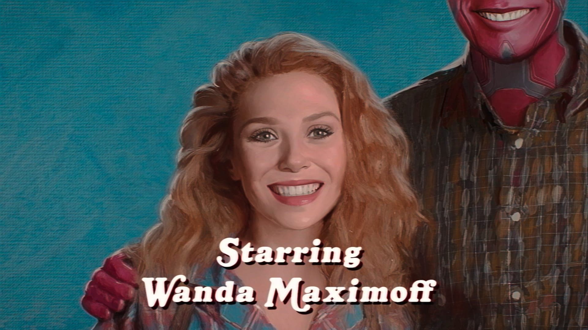
EPISODE 1
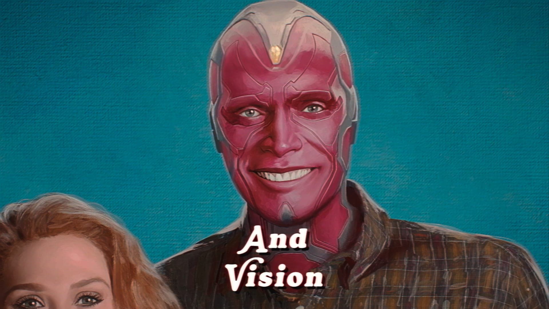
Since episode 1 of WandaVision takes place in the 50’s era, we designed the opening titles with inspiration from the text and graphics of The Dick Van Dyke Show. We also crafted the closing card of Wanda and Vision in the style of I Love Lucy.
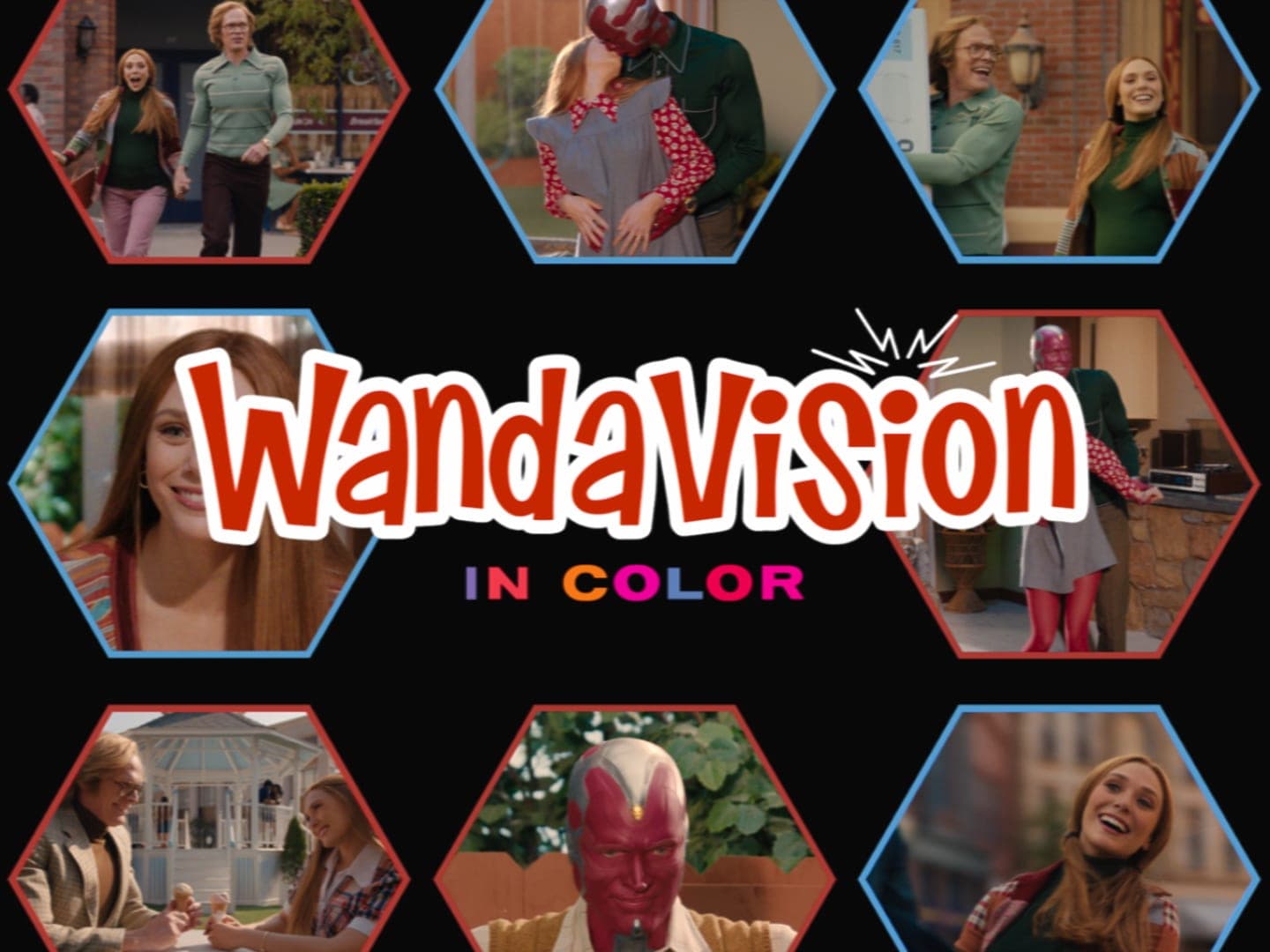
EPISODE 3
Following the style of The Brady Bunch, the opening titles for episode 3 of WandaVision show footage of Wanda and Vision in a repeating motif of multi-color geometric shapes and typography. The sequence ends with “WandaVision In Color”. This is a nod to both WandaVision and The Brady Bunch transforming from black and white to shows in color.
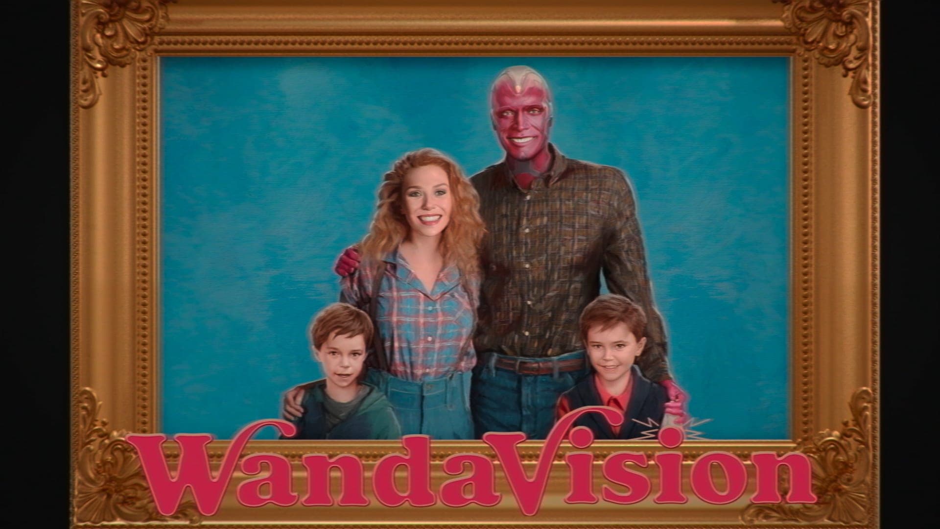
EPISODE 5
Modeled after Family Ties and Growing Pains, we created two portraits for this opening sequence: a pencil illustration and a painting of Wanda, Vision, Tommy, and Billy. The two portraits not only had to look like the characters, but feel like them as well. We edited the photos and postcards in the sequence to give them a weathered, old family photo album feeling as well.
EPISODE 6
This opening sequence was modeled after the frenetic energy of the Malcolm in the Middle show open. The idea is that this was a self-shot home movie made by the kids. We designed a video filter to mimic the DV cameras of the early 2000s and a fritzing type treatment for the names and show title.
EPISODE 7
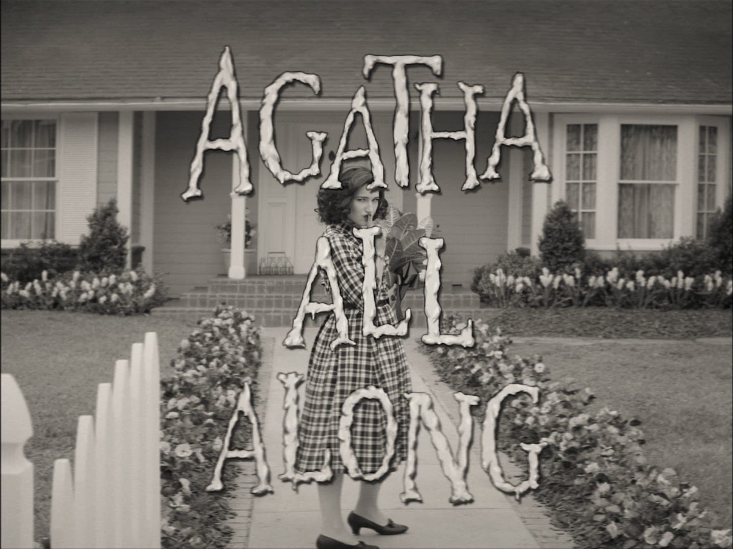
The opening titles for Episode 7 are in the style of Happy Endings, a show that WandaVision director Matt Shakman also took part in directing. Images with “Wanda” written on them appear on screen, immersing us in Wanda’s world.
This episode also features a sequence revealing that neighbor Agnes is secretly Agatha Harkness. We crafted the text in this sequence to mirror The Munsters. We also designed the purple smoke transitions between shots, representing Agatha’s magic.
04
MARVEL STUDIOS LOGO
There are two unique Marvel Studios logos we created for WandaVision. In episode 1, the logo transforms into a grayscale styled text and the screen shifts to a 4:3 aspect ratio to look like classic television screens. The music changes as well to sound as if it’s coming from old television speakers.
Another unique Marvel Studios logo appears in episode 8, which uses a magical-styled transition to bring the audience back to Salem, Massachusetts for Agatha’s back story.
05
COMMERCIALS
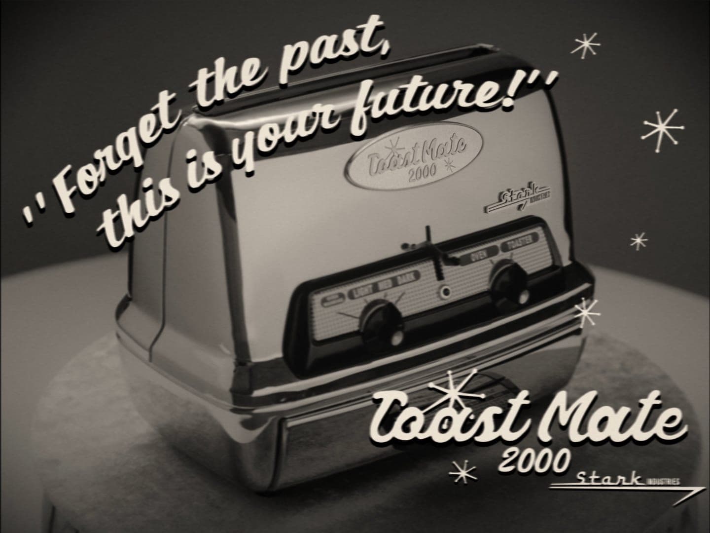
We designed the product cards and graphics for five different commercials included within the show: the Stark Toaster, the Strüker Watch, Hydra Soak, Lagos Paper Towels, and Nexus Medication. Each commercial was inspired by typical product commercials of the era they were reflecting. We studied commercials from each television era to craft accurate text and graphics for these products.
06
LOCATOR CARDS
We developed locator cards to feel tactical, as if they lived within the S.W.O.R.D. world. For our Salem locator card, we kept some of the same ideas as our S.W.O.R.D. cards, however we put a witchy spin on it. To push this feeling, we also created an Agatha inspired magical smoke reveal.
07
CONCLUSION
We are always honored to collaborate with Marvel Studios, and this project was truly amazing to work on. WandaVision is truly an innovative show that welcomes the audience into a unique way of storytelling for Marvel Studios. We are excited to see how the new era of Marvel Studios shows and movies kicks off from this series!