01
INTRODUCTION
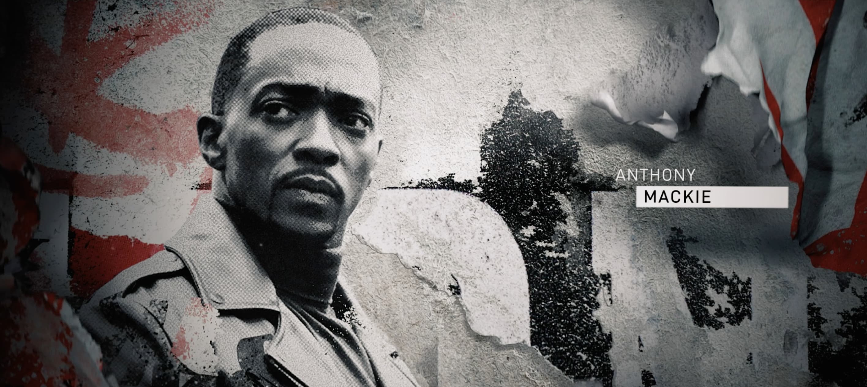
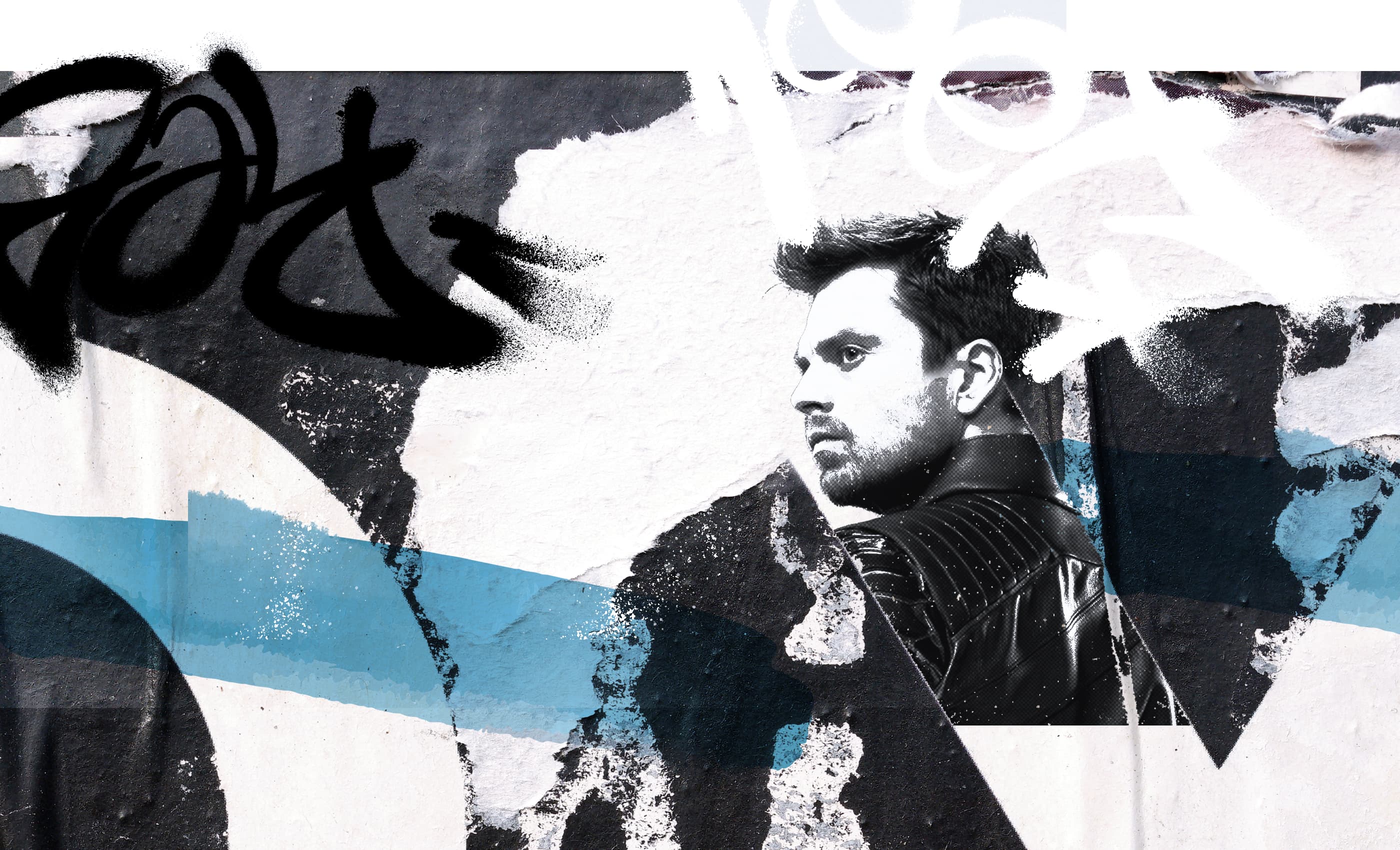
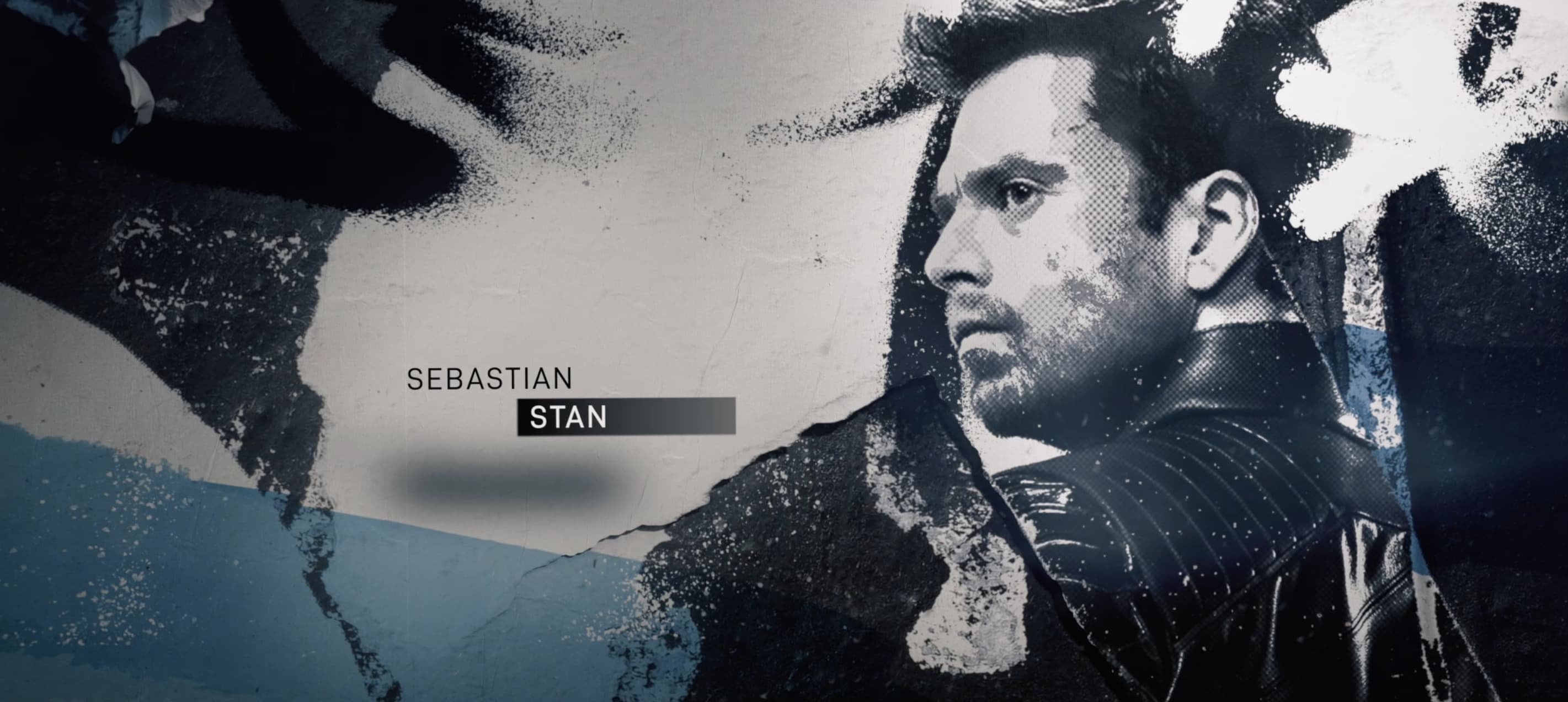
Marvel Studios approached us to collaborate on The Falcon and The Winter Soldier, a team-up show between Sam Wilson (Anthony Mackie) and Bucky Barnes (Sebastian Stan) taking place after half of the population has returned from “the blip”. This show plays on the great chemistry and unlikely companionship between Sam and Bucky that appeared previously in Captain America: Civil War.
Following a reluctant partnership between Sam and Bucky in a buddy-cop style show, The Falcon and The Winter Soldier explores the mantle of Captain America, the symbols of Cap’s shield, and the harsh reality that perhaps not everyone is satisfied with half of the world returning after being gone for five years. Our team focused on these themes within our designs, amplifying the struggle that Sam and Bucky, and the whole world are facing.
Falcon Winter Soldier - Main On End Title Sequence Final
02
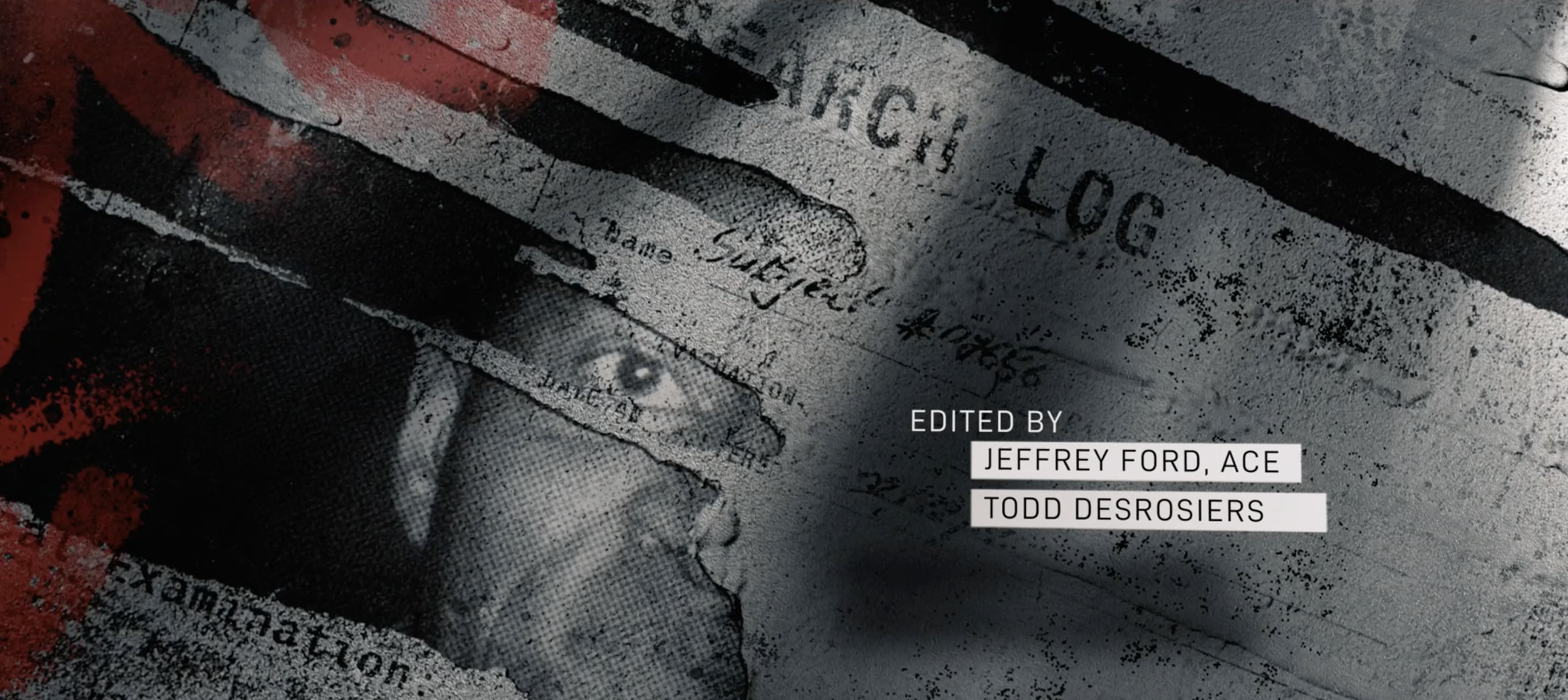
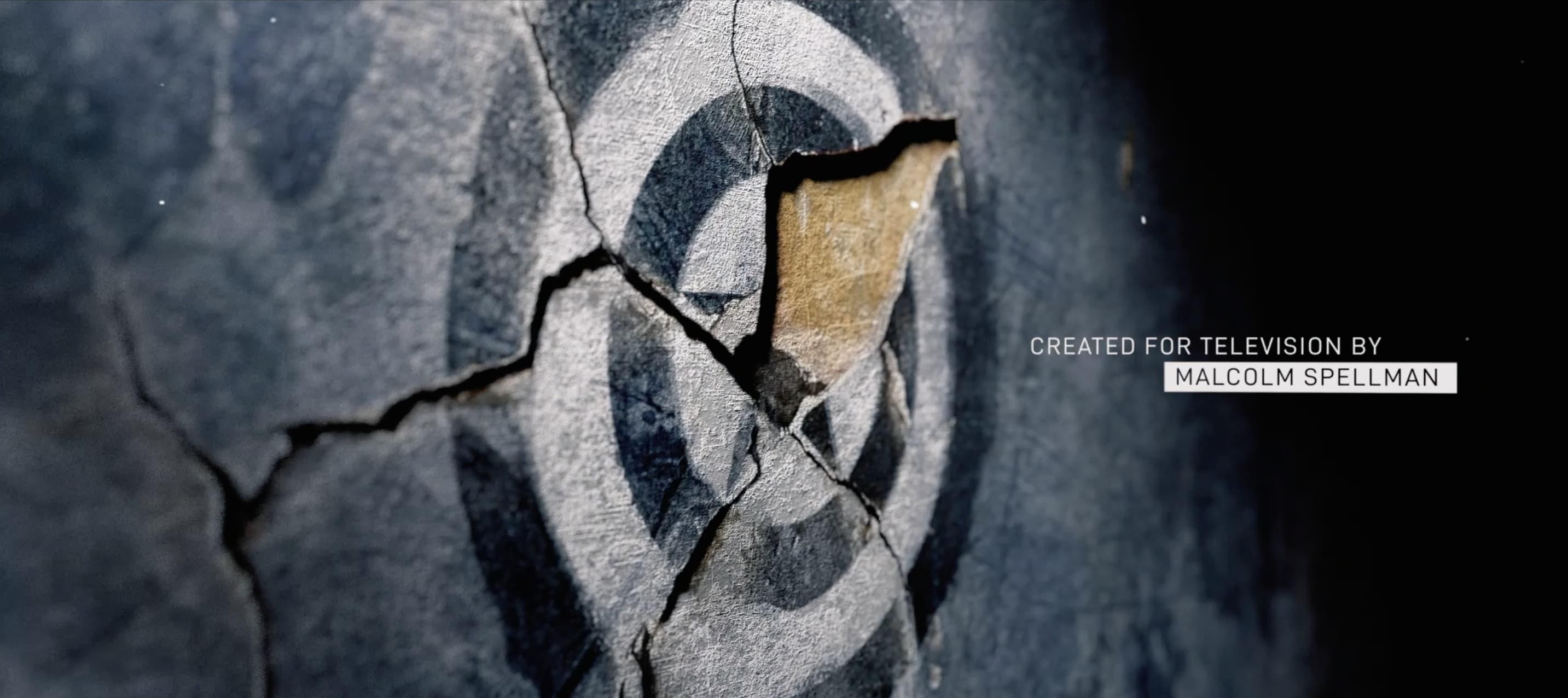
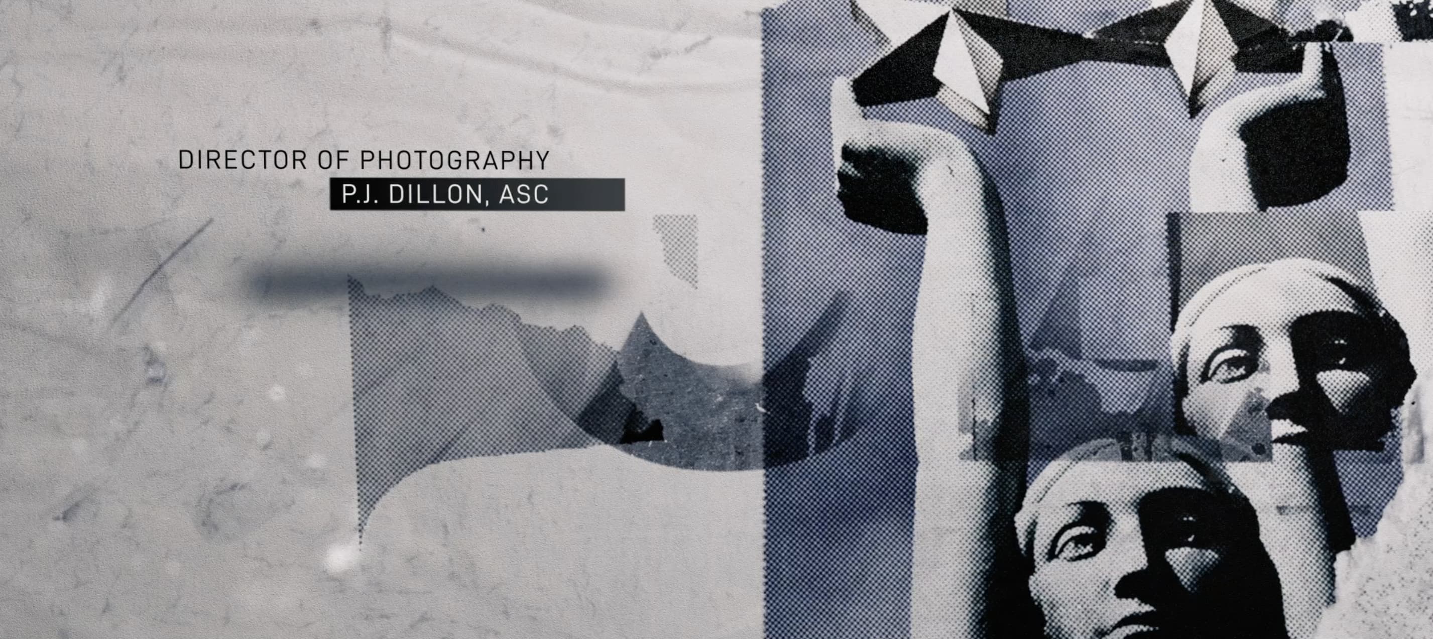
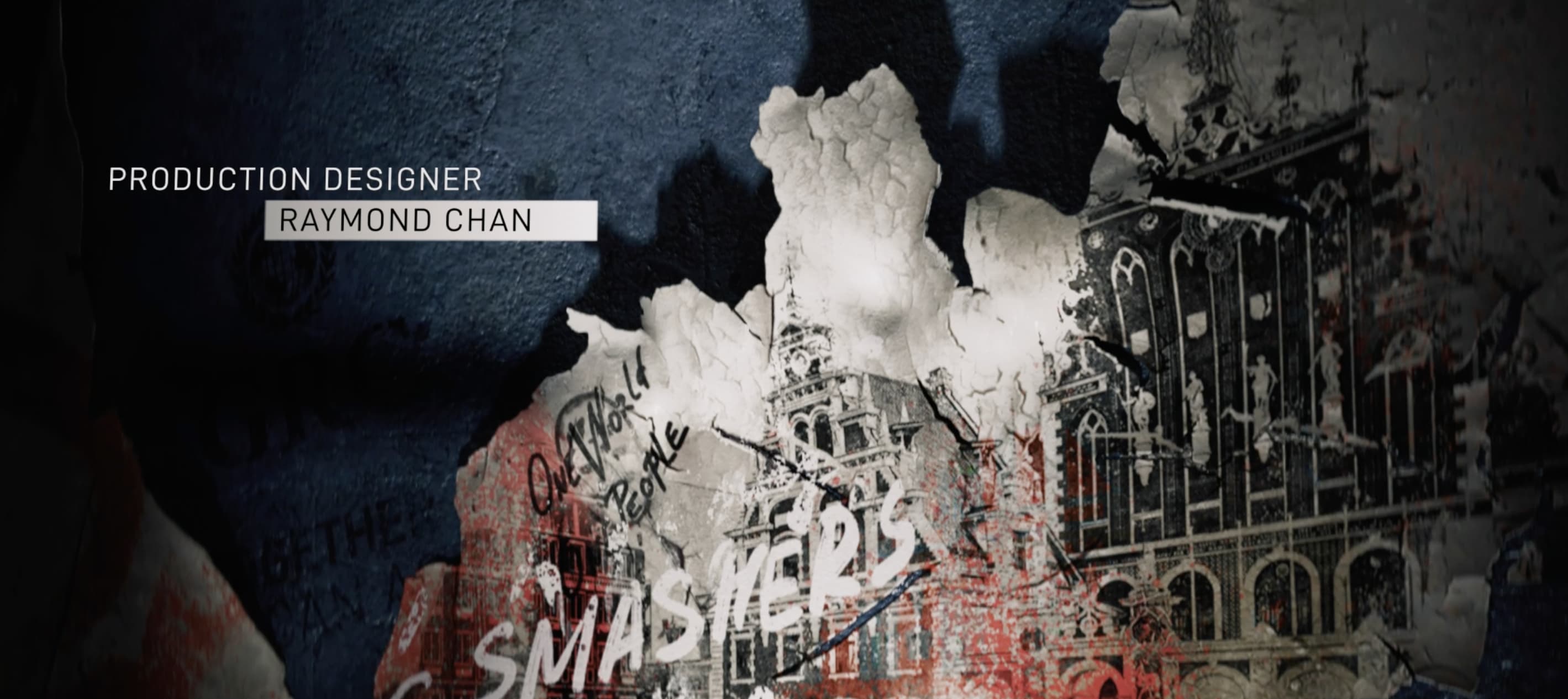
MAIN ON END
While in discussion with Marvel Studios, we took note of the variety of themes that would be included within the The Falcon and The Winter Soldier. Conspiracies, suspicions, and rebellion are growing amongst society, aiding in the development of themes such as the usage of propaganda and the effects of trauma. These themes would play a big role in the growth of the characters and the plot, so we wanted to expand on them within this sequence.
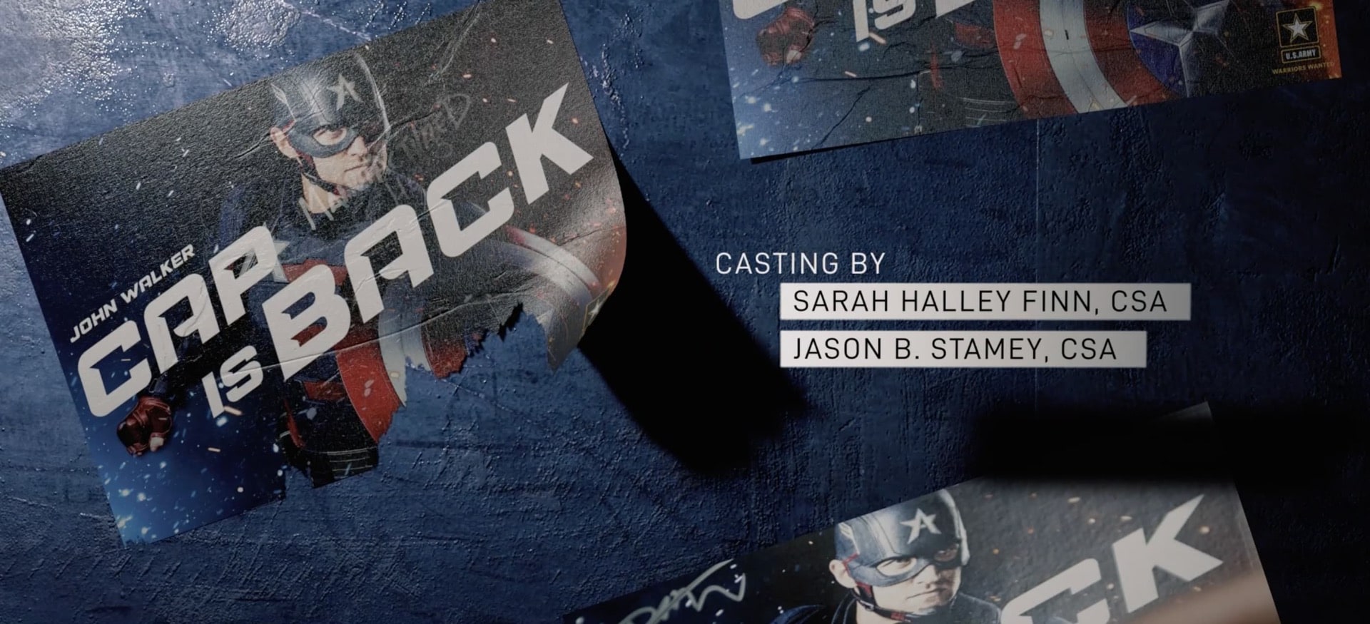
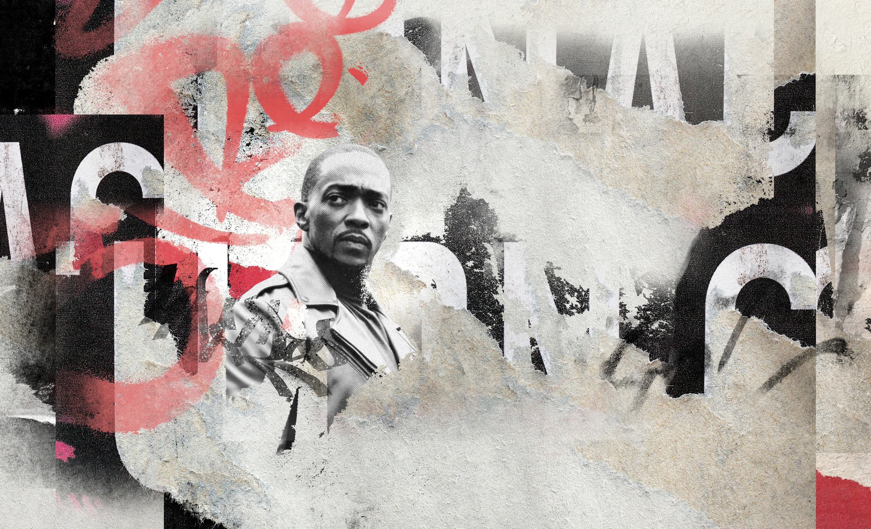
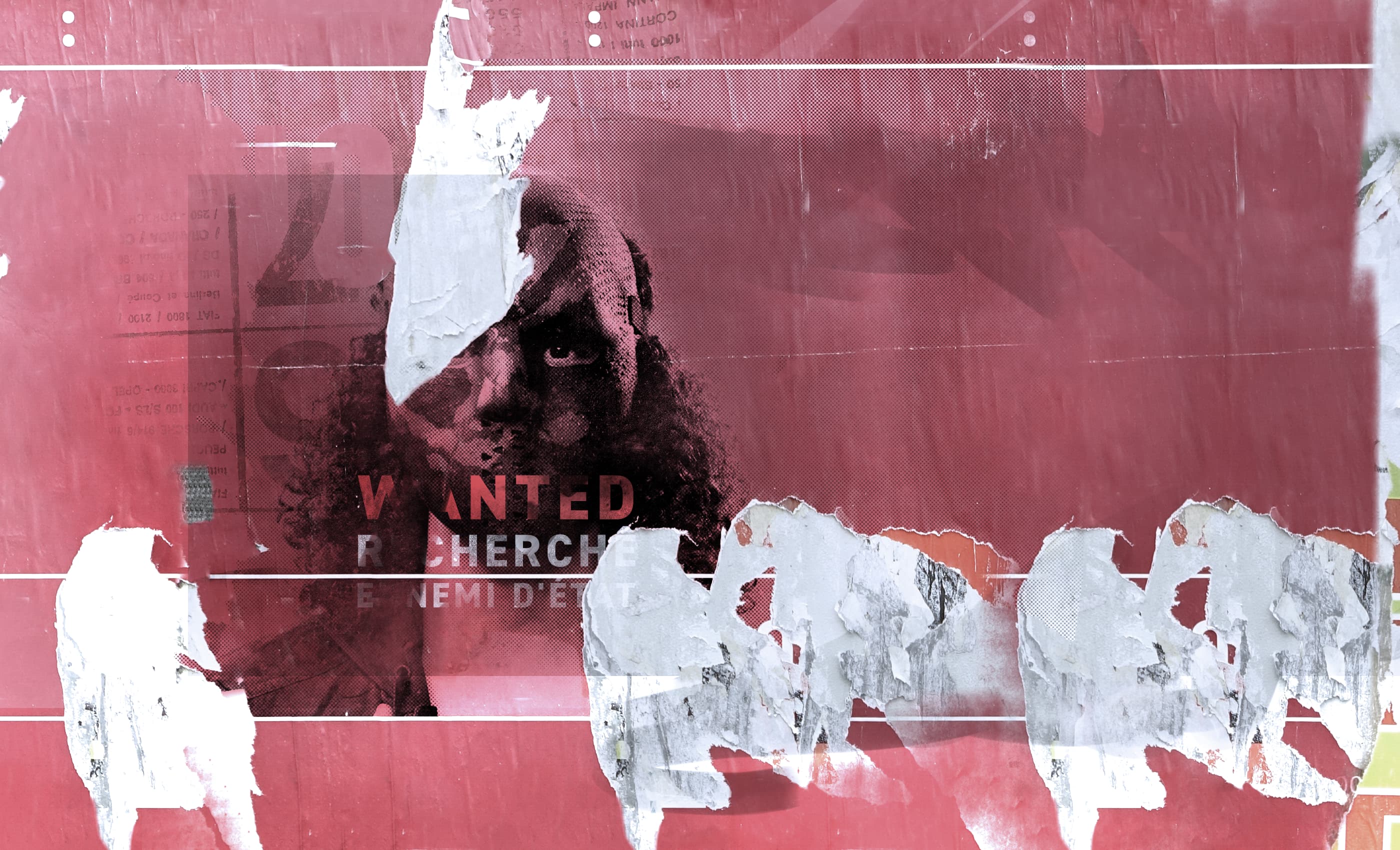
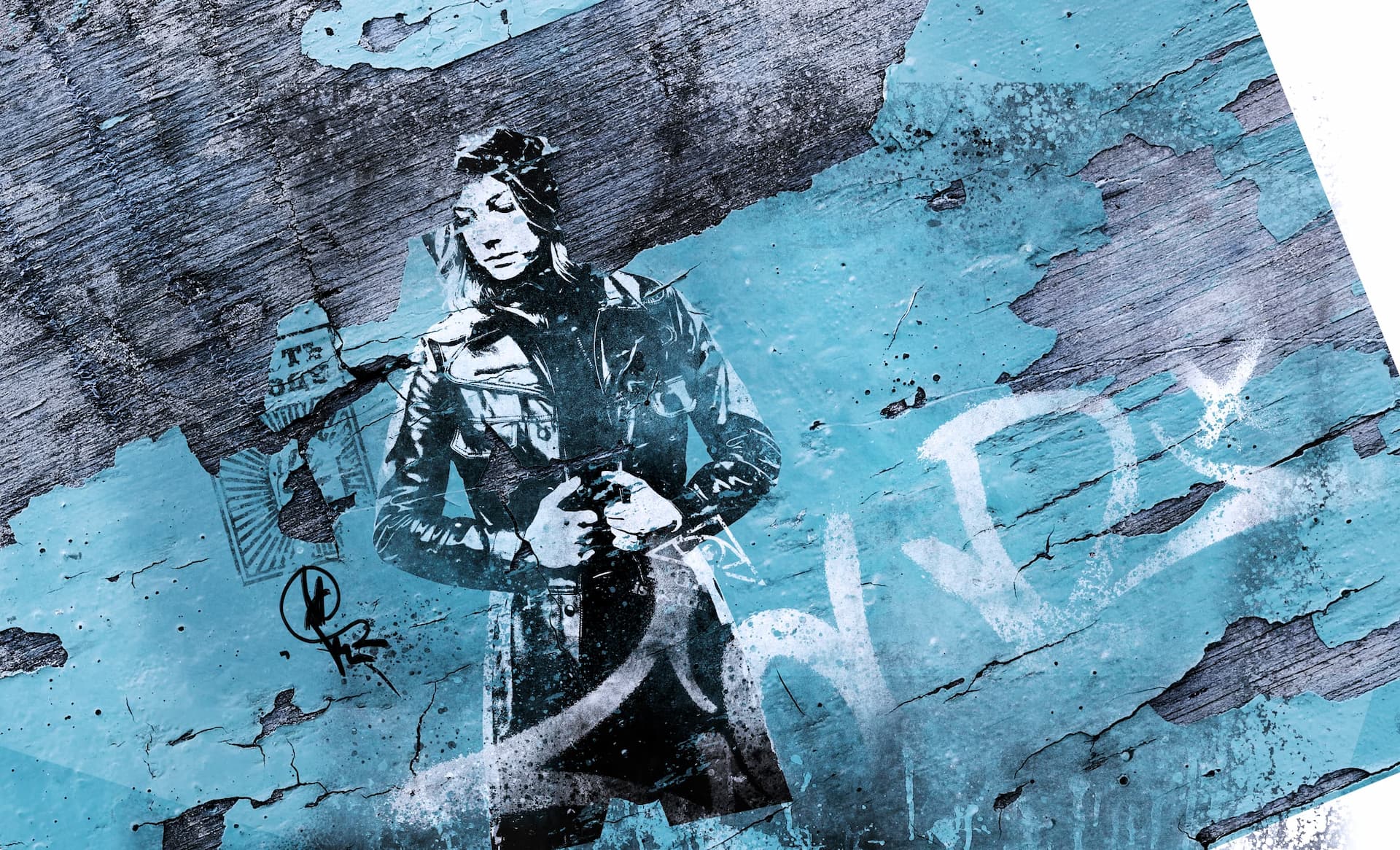
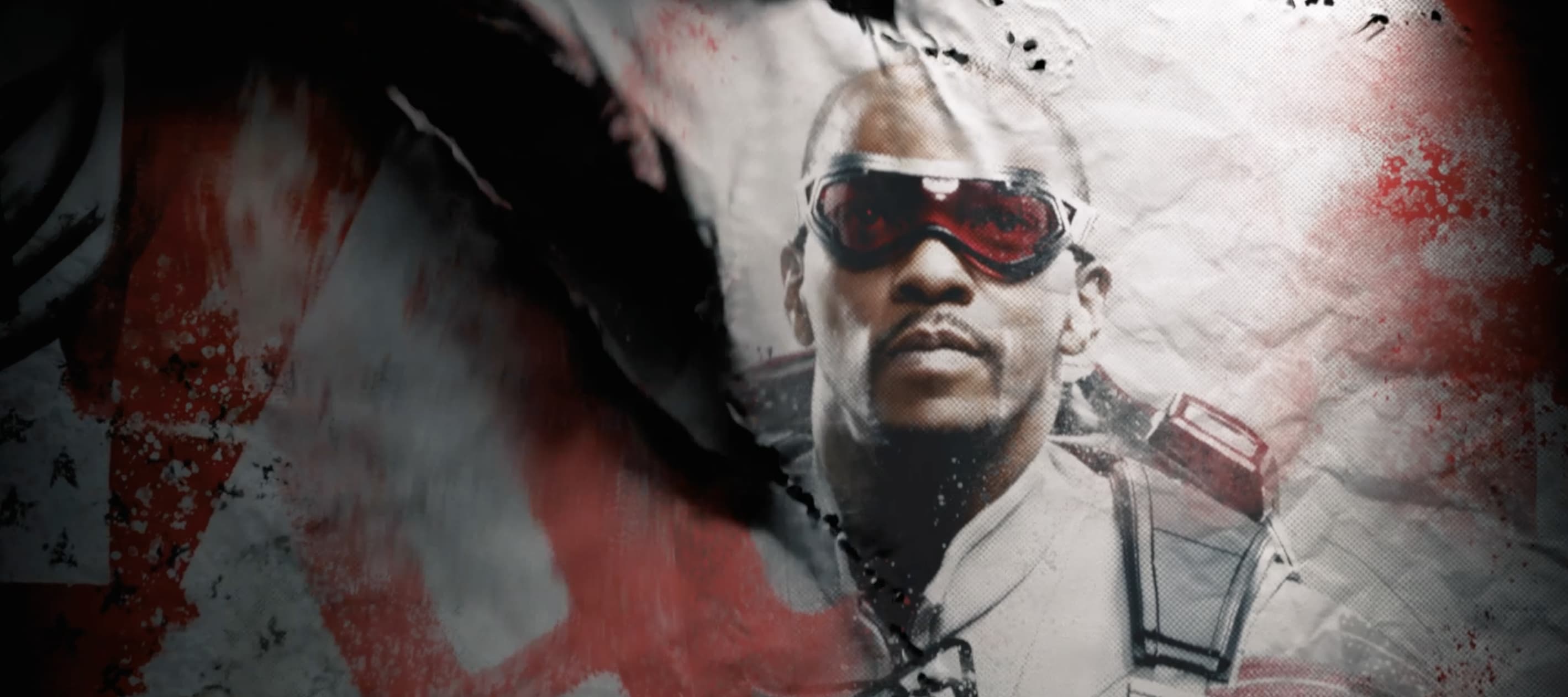
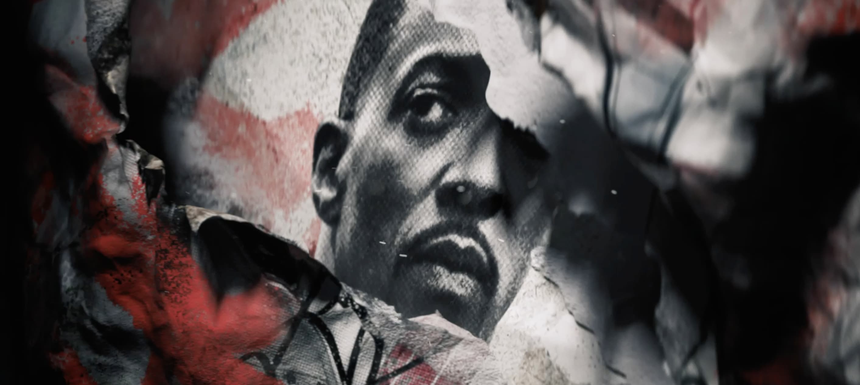
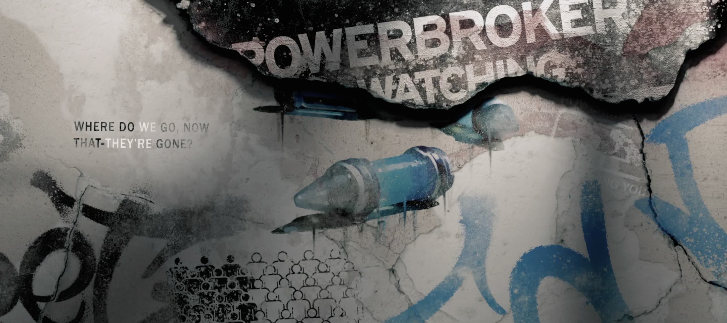
Our design for the Main on End sequence focuses on propaganda plastered across city walls. This sequence is a blend of multiple layers of graffiti and flyers put up, torn down, and defaced, showing how society responds to these messages. Each character has friction with political messaging – Sam doesn’t like the “Cap is Back” notion, Zemo doesn’t agree with the existence of super-soldiers – and these beliefs, disagreements, and ideologies can be seen throughout the sequence.
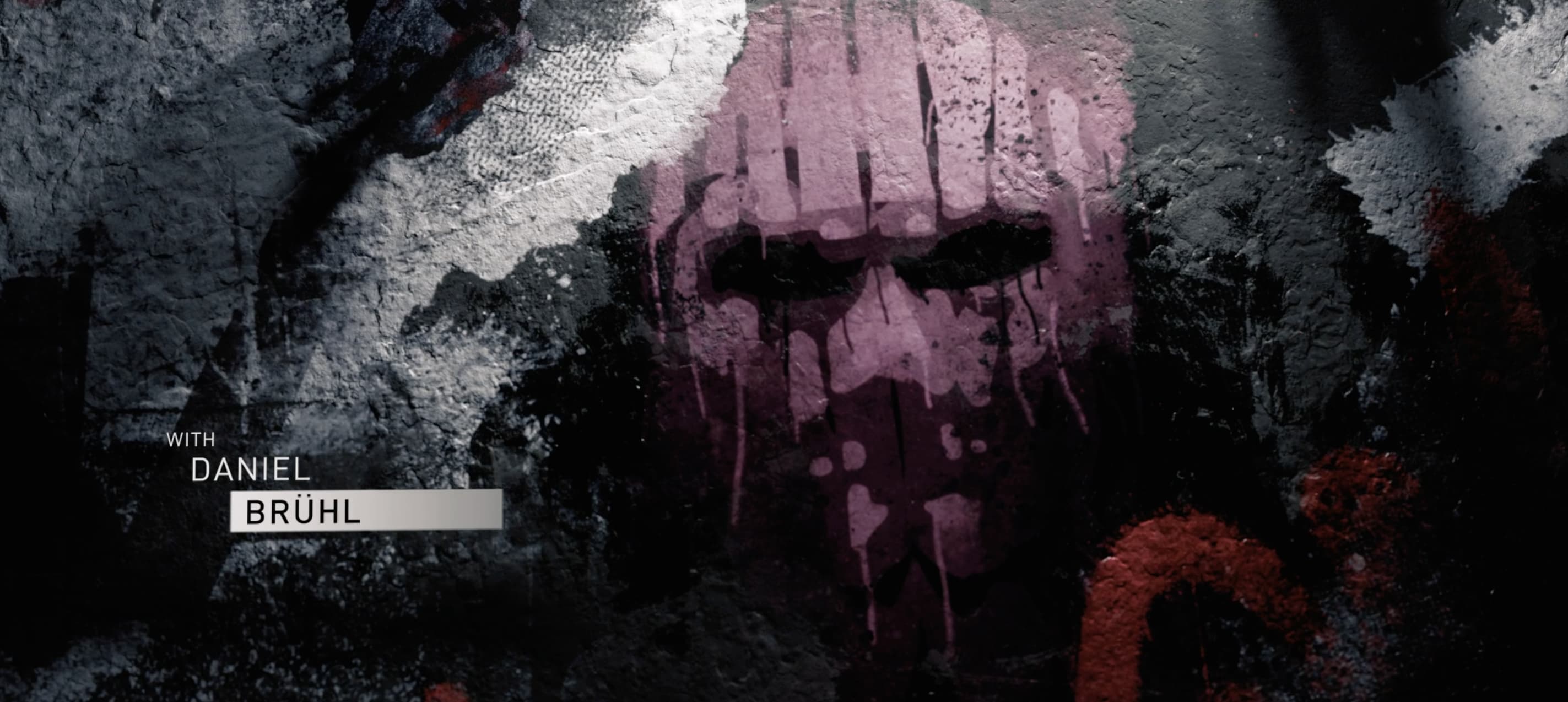
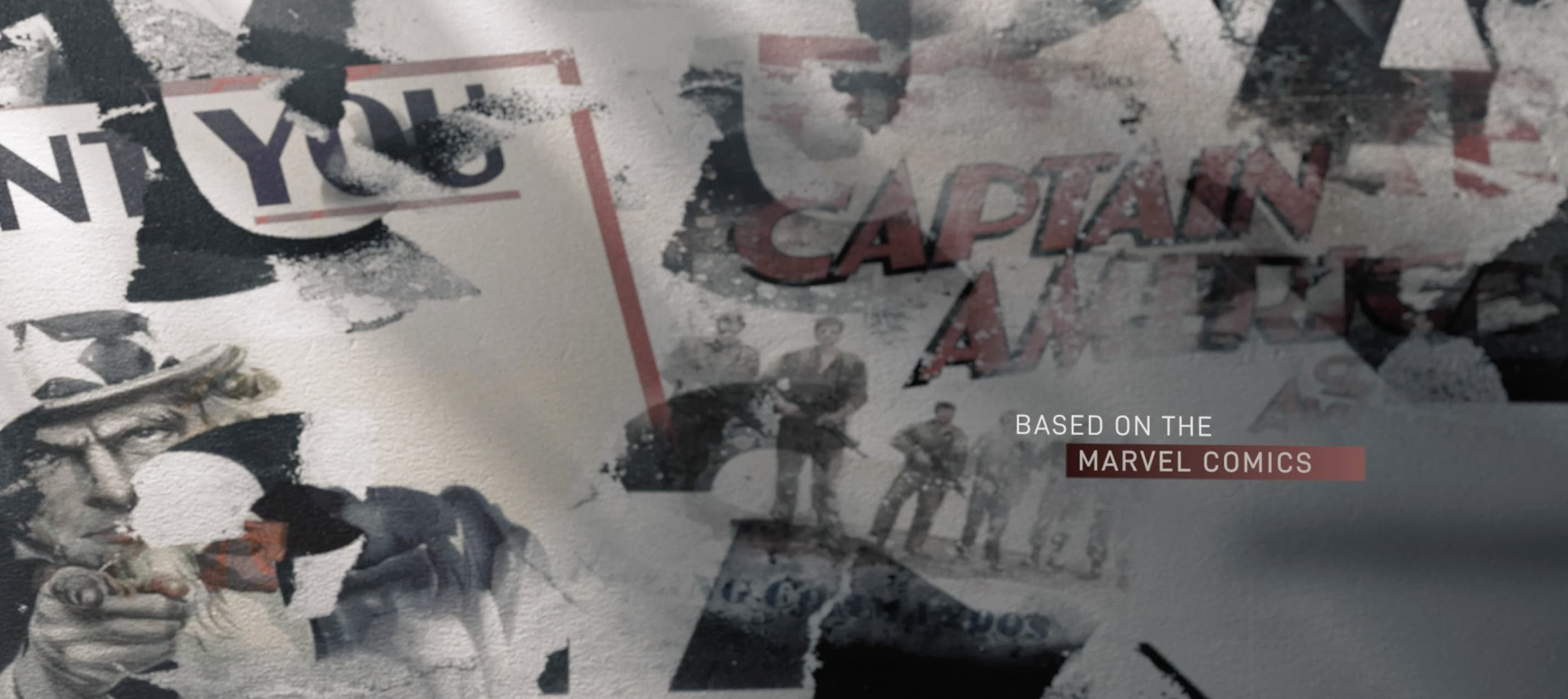
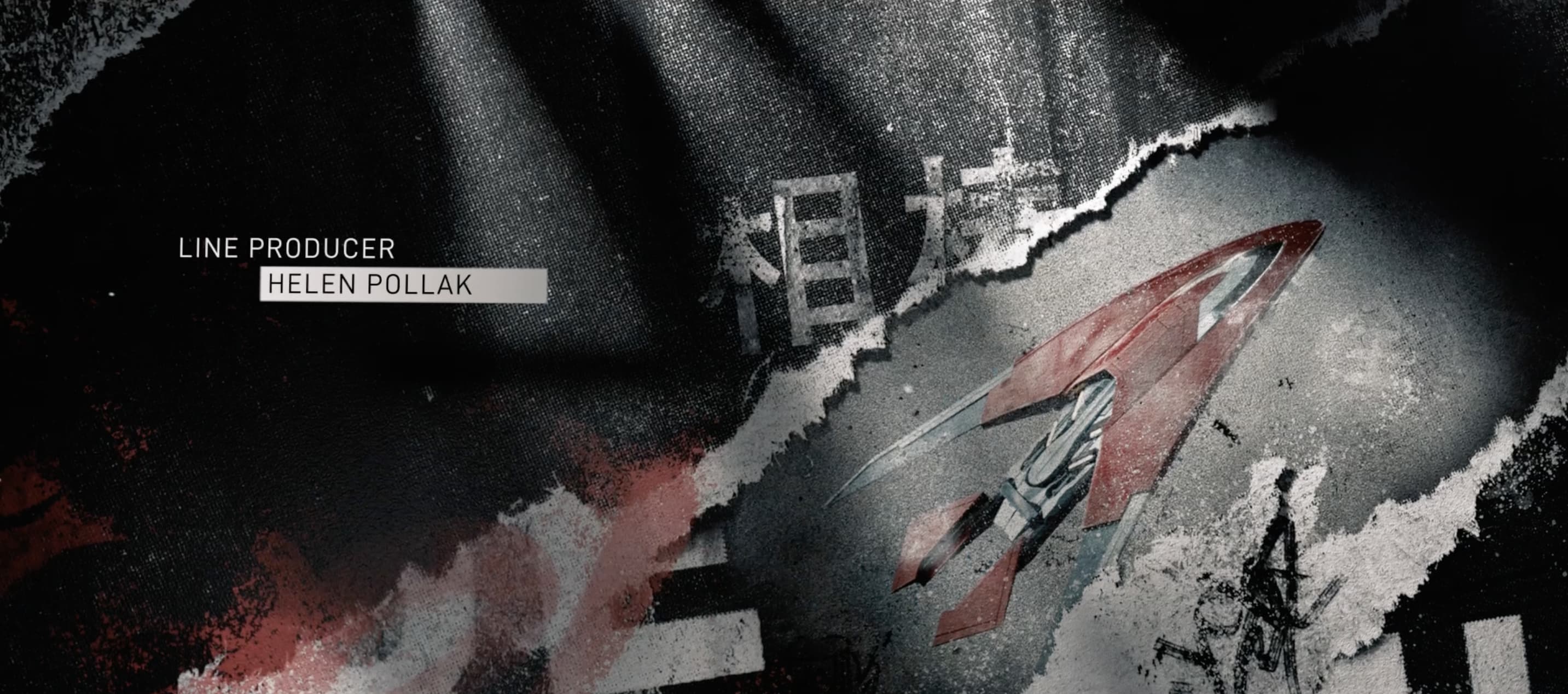
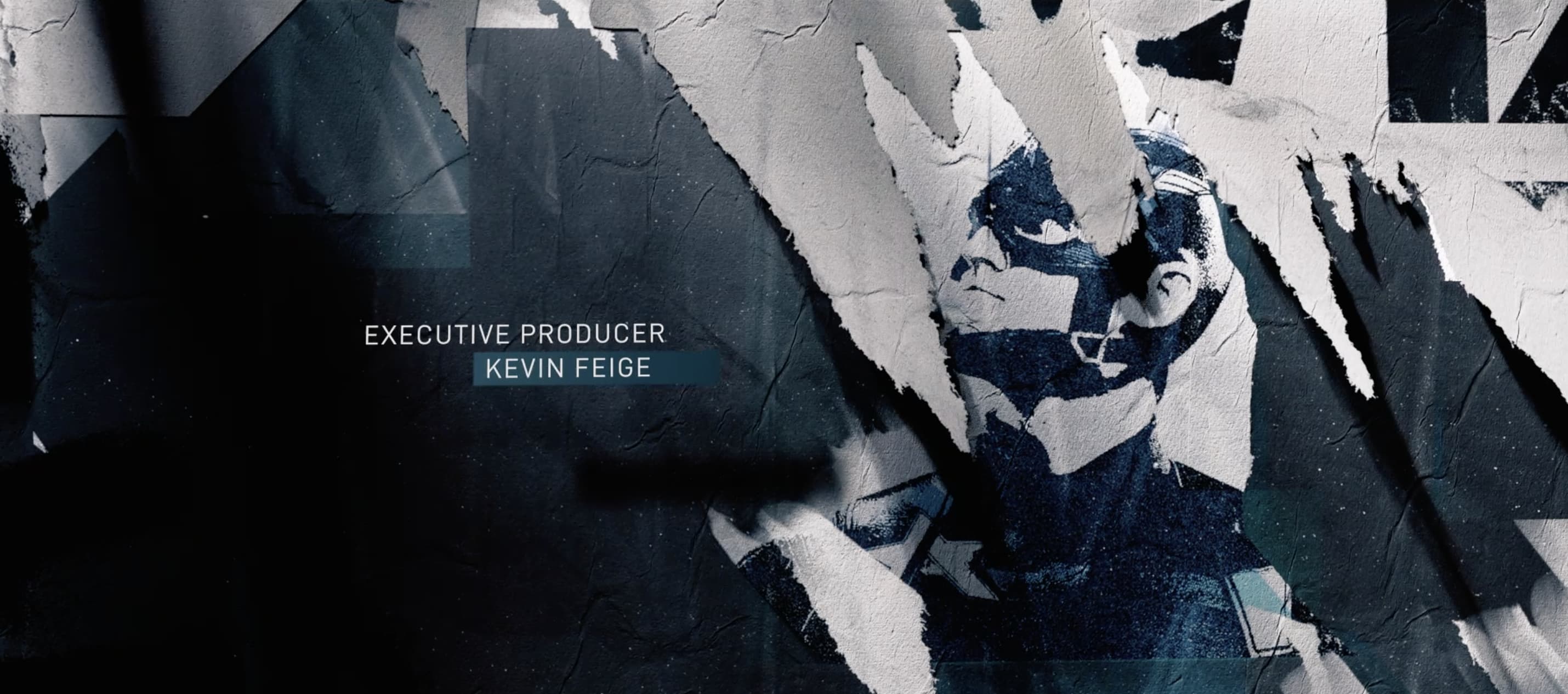
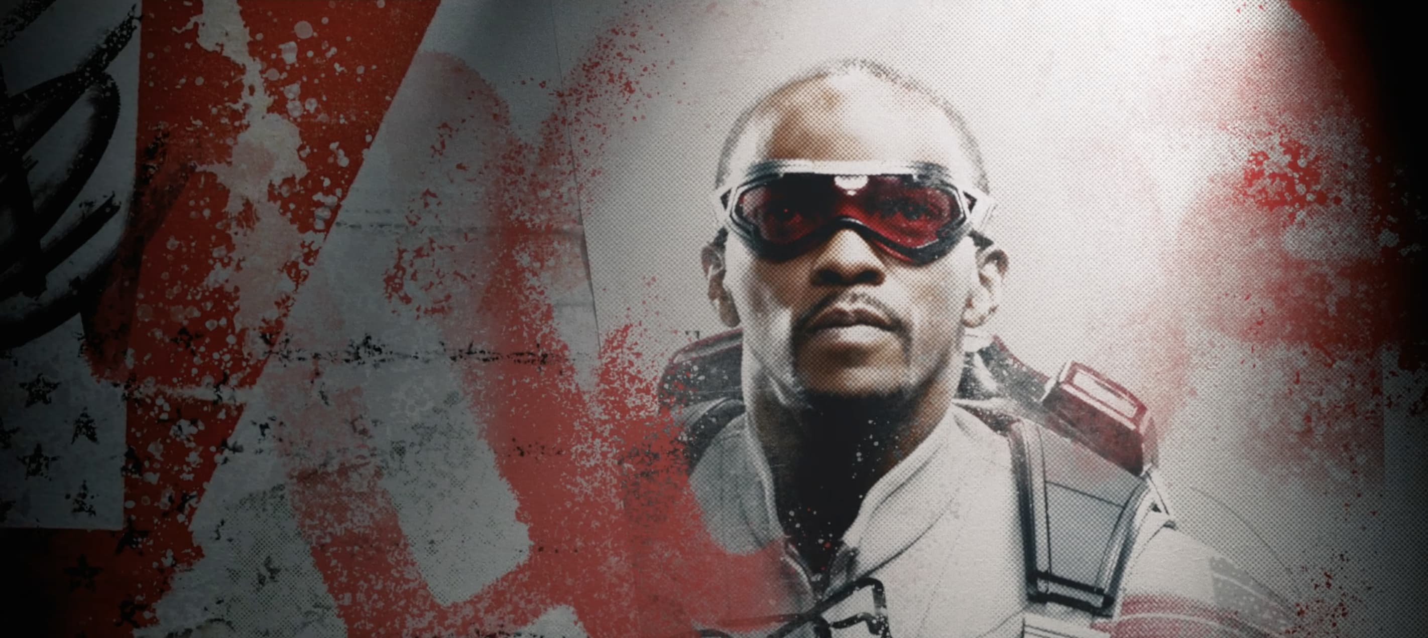
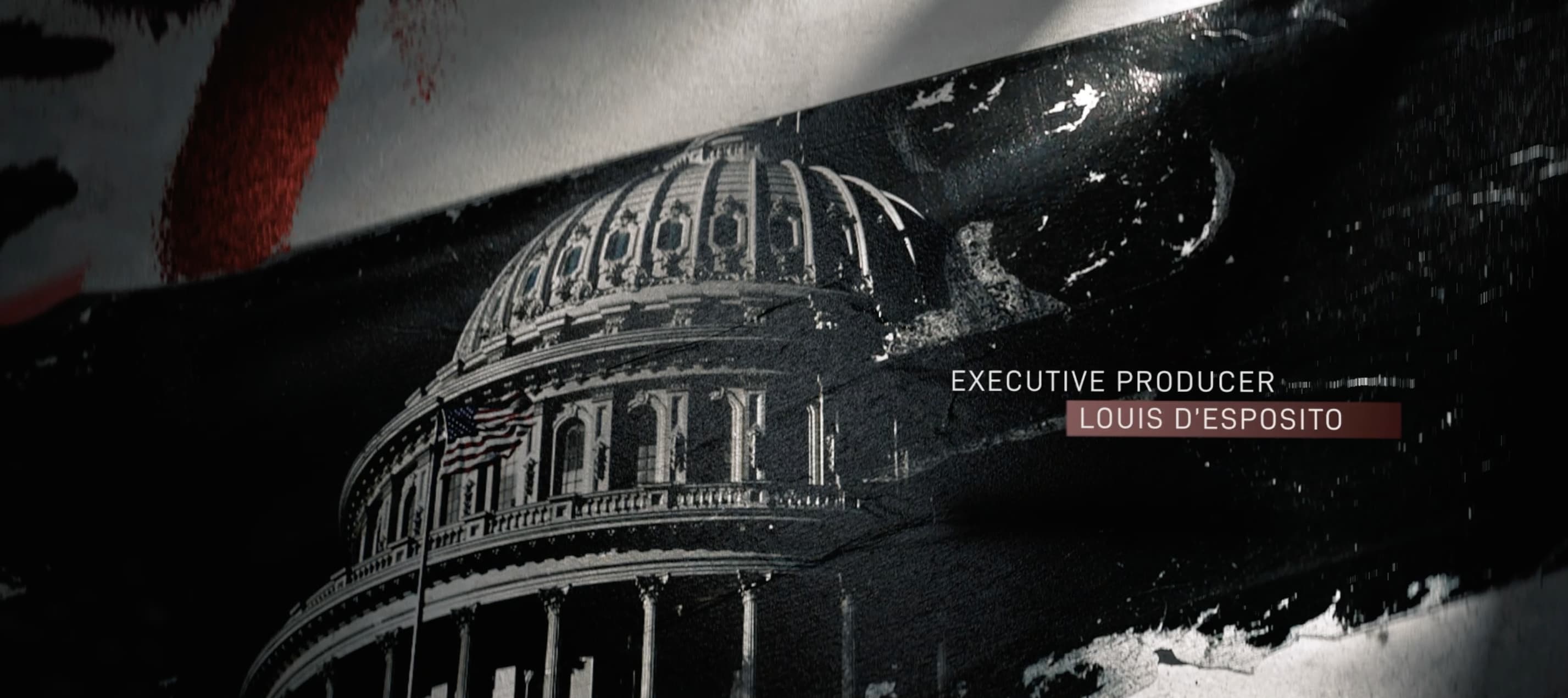
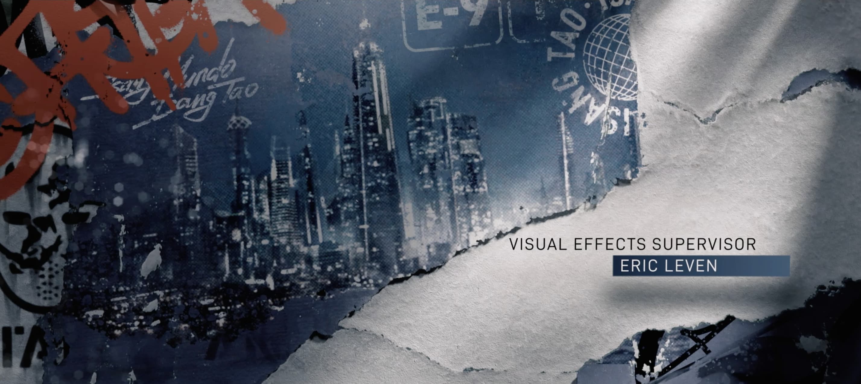
Key messaging, characters, and locations can be seen painted and printed along this city’s walls. Camera sweeps, lighting, and shadows add depth and dimension to the shots, creating a mysterious ambiance to match the show’s atmosphere.
03
INSPIRATION
Since our idea aimed to emulate posters and flyers plastered on city walls, our designers visited and took tours of different cities and captured images of how posters are hung on city walls. We explored textures and colors to make the images and messaging within the Main on End sequence feel as if it could exist in any city around the world.
Another element we studied was the tearing of paper. Many posters are shown as torn or being shredded in the sequence. Paper tears are all very unique and do not occur in one single, uniform fashion. Because of this, we studied how different paper would react to different tears, what they would feel like, and what they would look like after being torn.
After doing studies of crumbling walls and paper tearing, we then applied these looks to notable locations and locations seen throughout the series.
04
EASTER EGGS
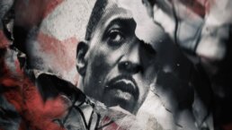
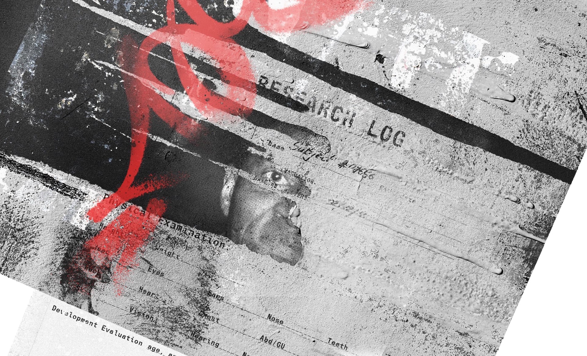
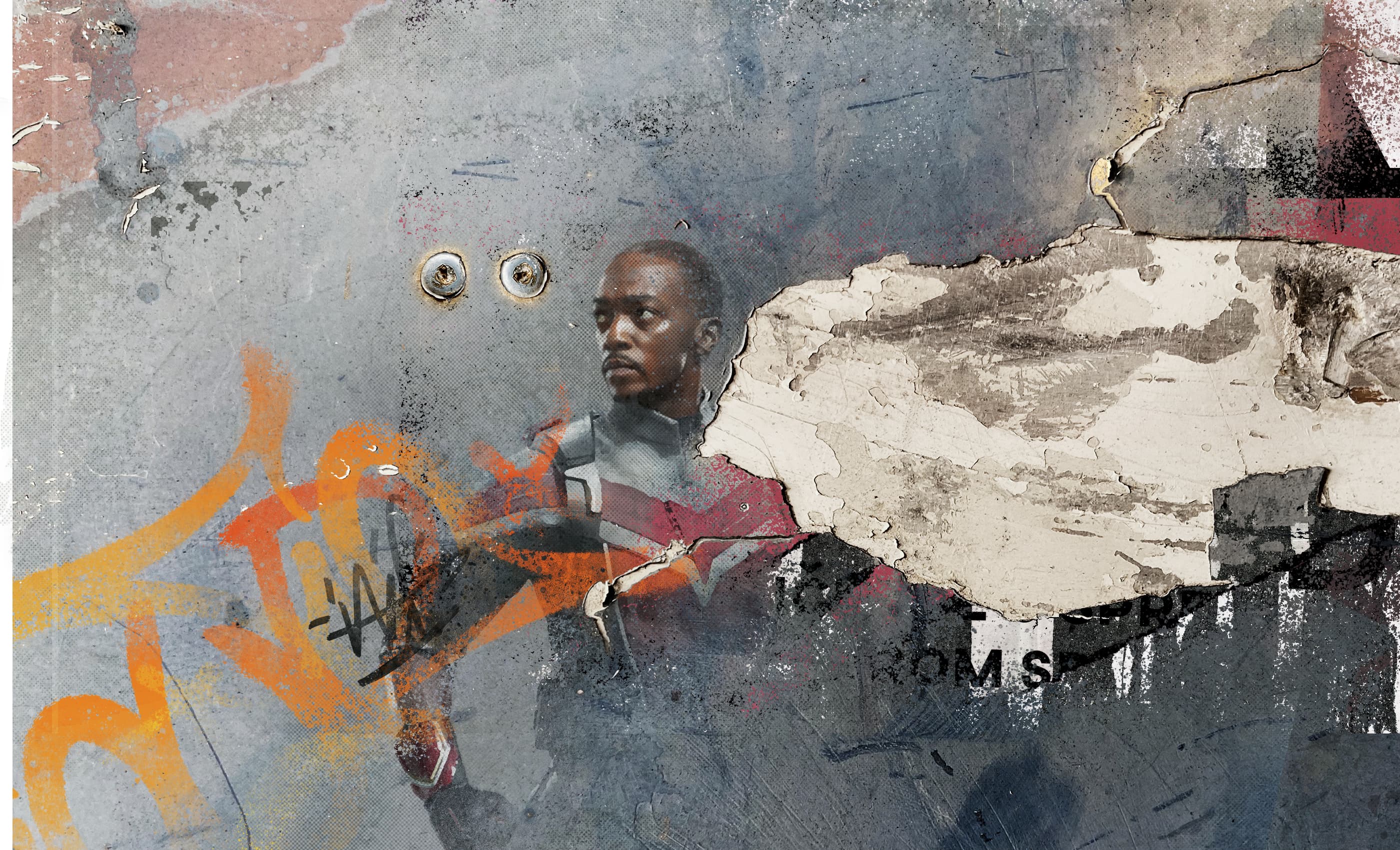
Throughout the sequence, the audience can see little Easter eggs scattered amongst the text, decaying walls, and shredded posters. We crafted these Easter eggs to pay homage to iconic moments within the history of the Marvel Cinematic Universe and subliminal messaging.
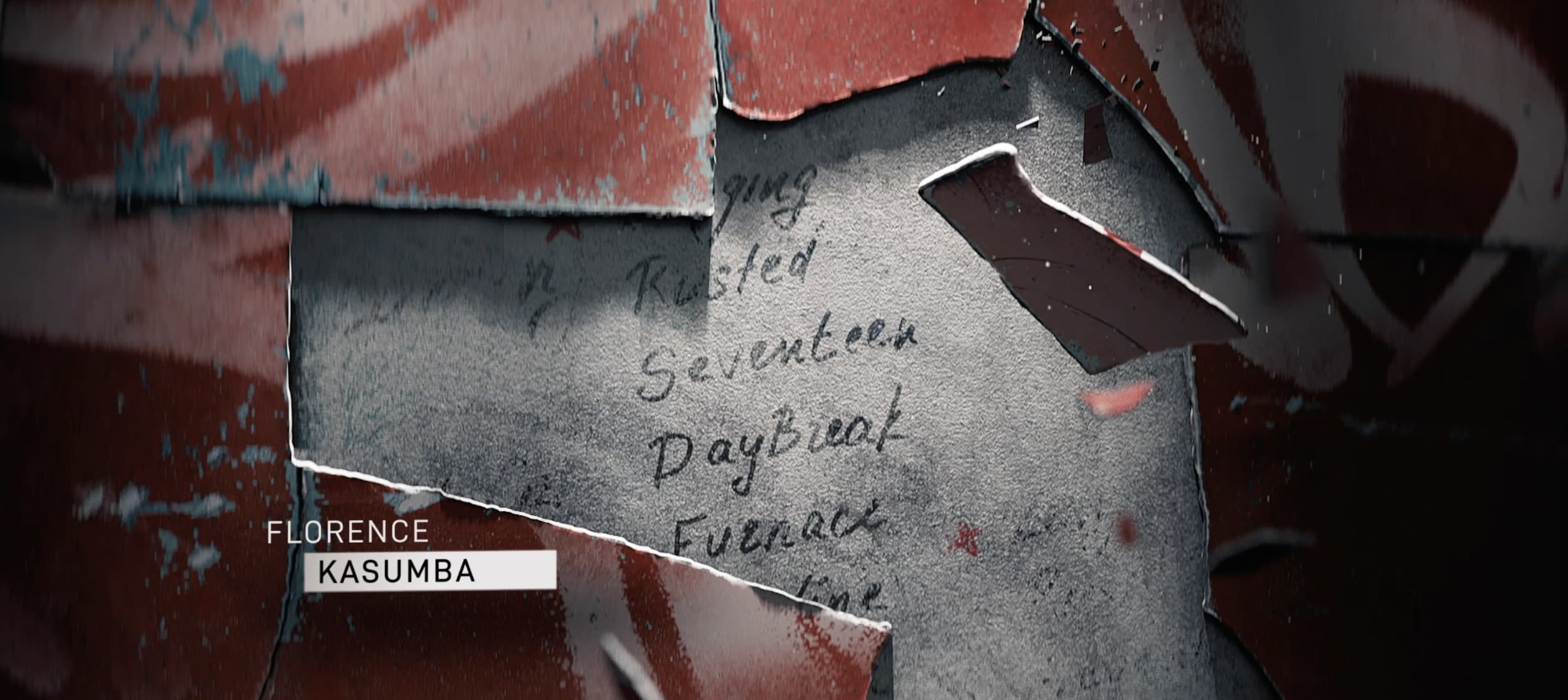
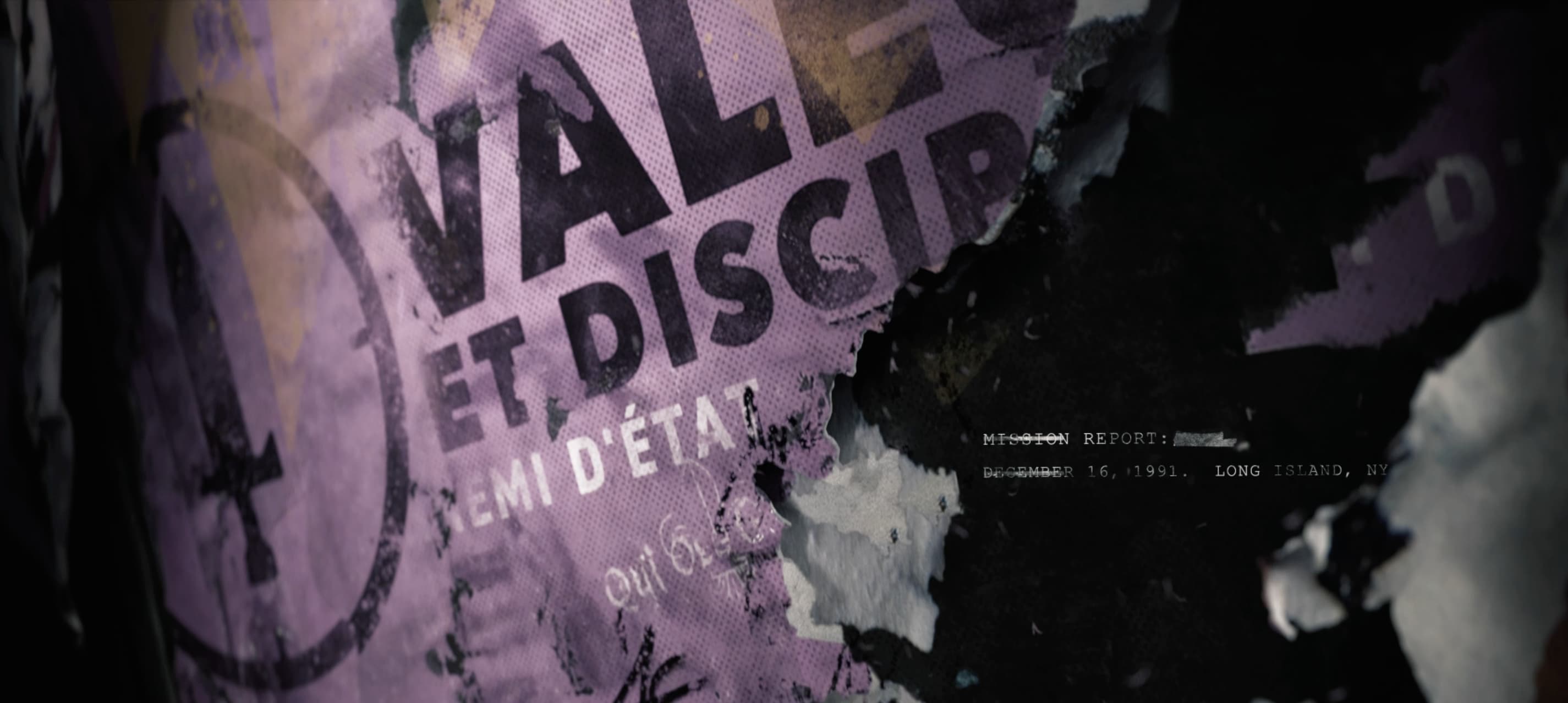
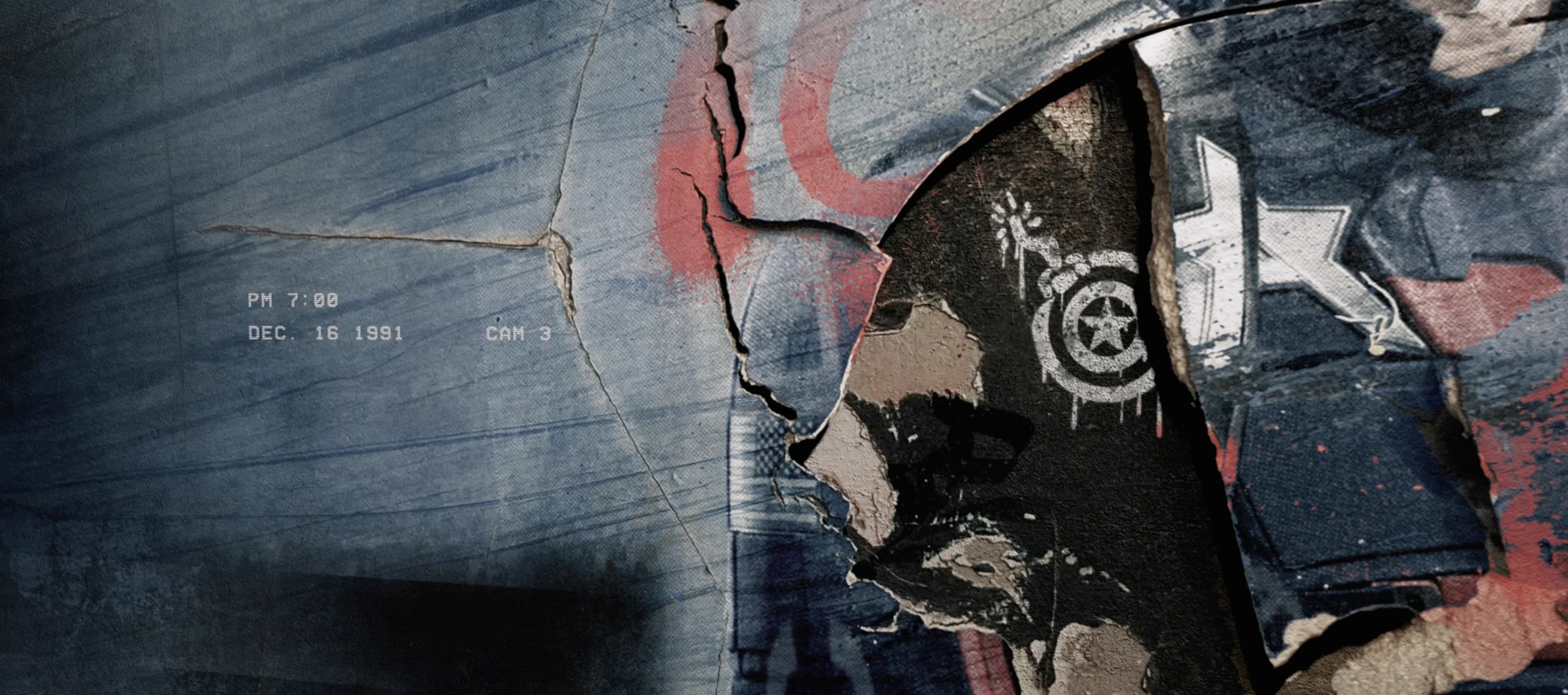
Easter eggs can be seen throughout the sequence. Here, the Winter Soldier’s mission report and trigger words can be spotted. The recording date from the camera feed when the Winter Soldier murdered Tony Stark’s parents and the poster text from the support group that Steve Rogers hosts in Avengers: Endgame are also hidden in the sequence.
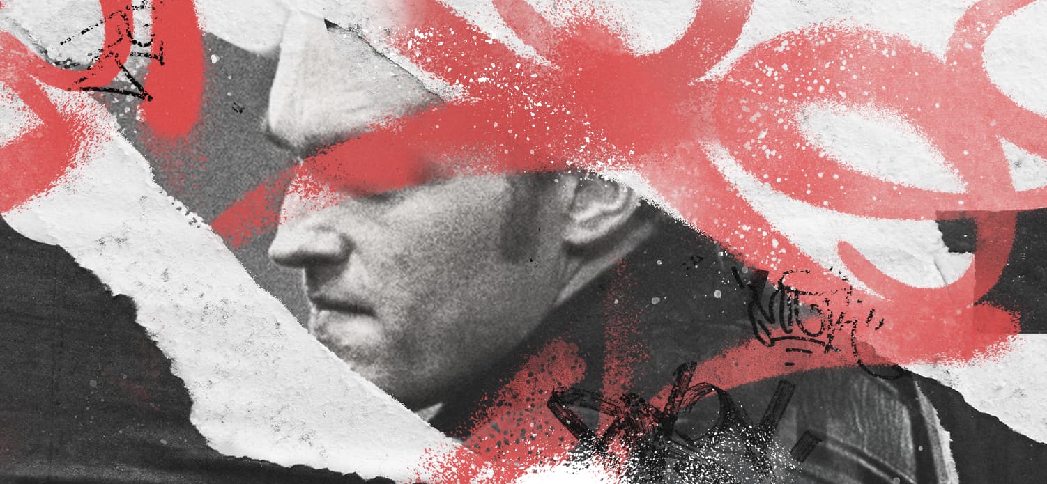
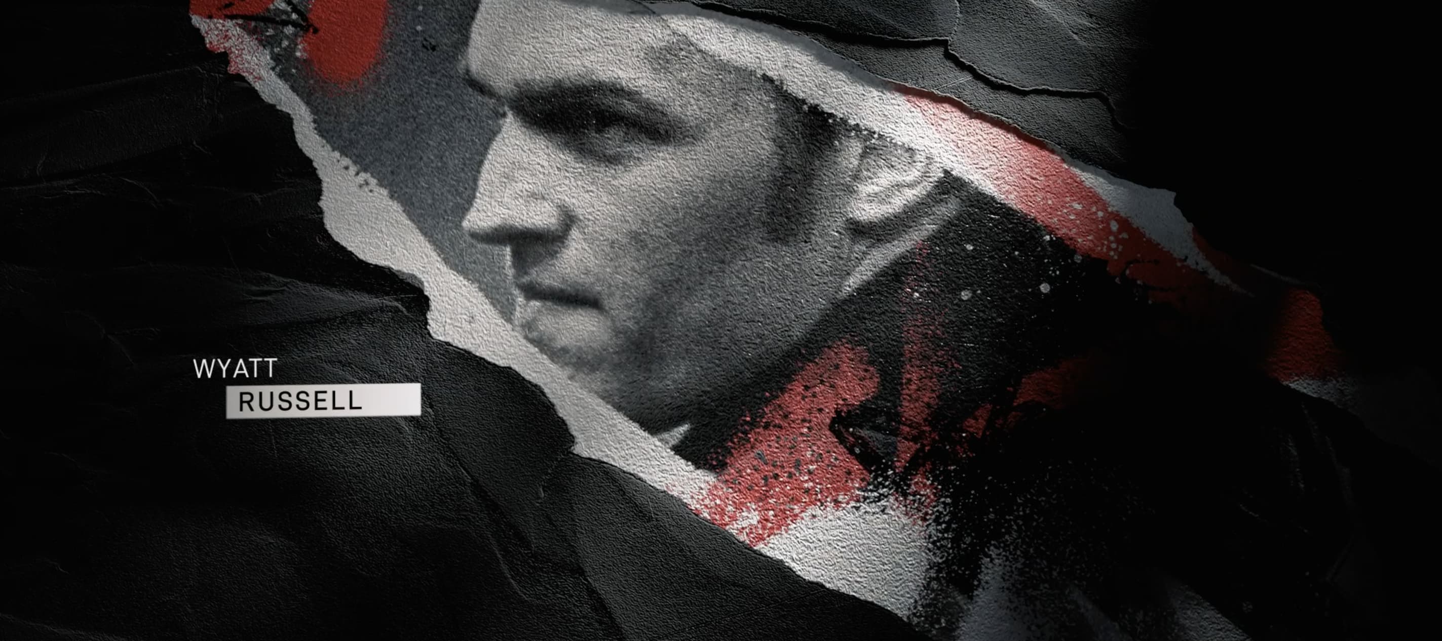
One of the over-arching Easter eggs of the sequence is that we designed the sequence itself to change slightly with every episode. As more information about characters, events, and intentions are revealed, the credit frames shift to align with these new perspectives. For example, in the first episode’s Main on End sequence, Wyatt Russell’s image has red spray paint across his eyes, representing the mystery behind who this man is and what his role in the show will be. As we learn more about his character, his frame becomes clearer and the paint is removed to show his full face.
05
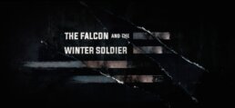
OPENING TITLE
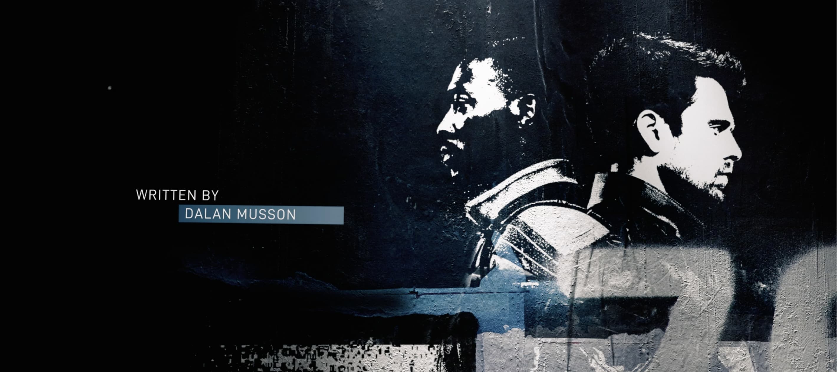
Our team also crafted the opening title for The Falcon and The Winter Soldier. The opening title fades from black to clarity across the screen, revealing each letter swiftly. The letters emerging from the shadows mirrors elements from the show, such as the obtainment of new information and the reveal of new heroes, villains, and characters. “The Falcon” and “Winter Soldier” are bolded, emphasizing the team up between these two characters while also focusing on their individuality in this show.
Falcon and The Winter Soldier Opening Main Title
By the end of the series, our title design of The Falcon and The Winter Soldier changes to Captain America and The Winter Soldier once Sam Wilson takes on the mantle of Captain America.
Falcon and the Winter Soldier Opening Title - Captain America Variant
CONCLUSION
It is always an honor to work with our friends at Marvel Studios. The Falcon and The Winter Soldier has been highly anticipated and the team up between Sam and Bucky was truly an epic, action-packed adventure. Our team is thankful to be able to collaborate with Marvel Studios and contribute to this incredible show!
Check out other work that we have done for Captain America in our Captain America: The Winter Soldier case study and our Captain America: Civil War case study.