01
INTRODUCTION
In preparation for something incredibly exciting and ambitious, Marvel Studios asked our team at Perception to collaborate on their newest series, What If…?. This show is the first animated addition to the Marvel Cinematic Universe and it explores vast new realities that fans could only imagine. What If…? takes stories from the MCU and flips the script on them, answering questions such as what if certain events happened differently and what if characters found themselves in new roles.
The grand scale of this show needed a grand introduction, and that’s exactly what we designed for this series. Our team created the opening title sequence for What If…?, sending the audience traveling through the vast universes with endless possibilities that they have yet to experience.
What If...? Opening Title Sequence
02
THE PITCH
Before even going into the animation stage, we sat down with the team at Marvel Studios to thoroughly discuss the themes and messages of this show. We received concept work that detailed the what the series would focus on and how each tale would unfold. Since the audience would be experiencing so many different possibilities of realities, we knew that our sequence had to showcase these realities, as well as make known the existence of the infinite others that weren’t being shown.
One of our other assets that helped us build this opening title sequence was an early stage voiceover from Jeffrey Wright, who voiced the Watcher, the narrator of this series. This gave us a sense of the tone of the opening title sequence as well as the mood of the series. This sequence had to set up and establish the rules and the groundwork for everything the audience would see in this unique series. With this is mind, our team got started on designing the sequence.
03
LOOK DEVELOPMENT
After deciding that following the concept of multiple realities would be the basis for the opening title sequence, we began to map out how this could be shown to the audience. We explored different concepts and designs, each of which centering around the idea that there are infinite possibilities of realities.
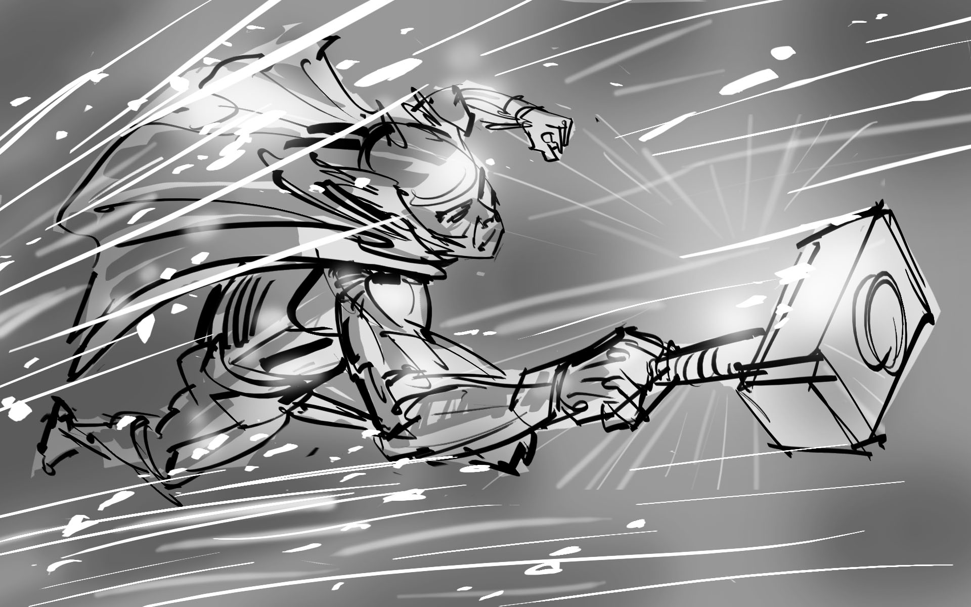
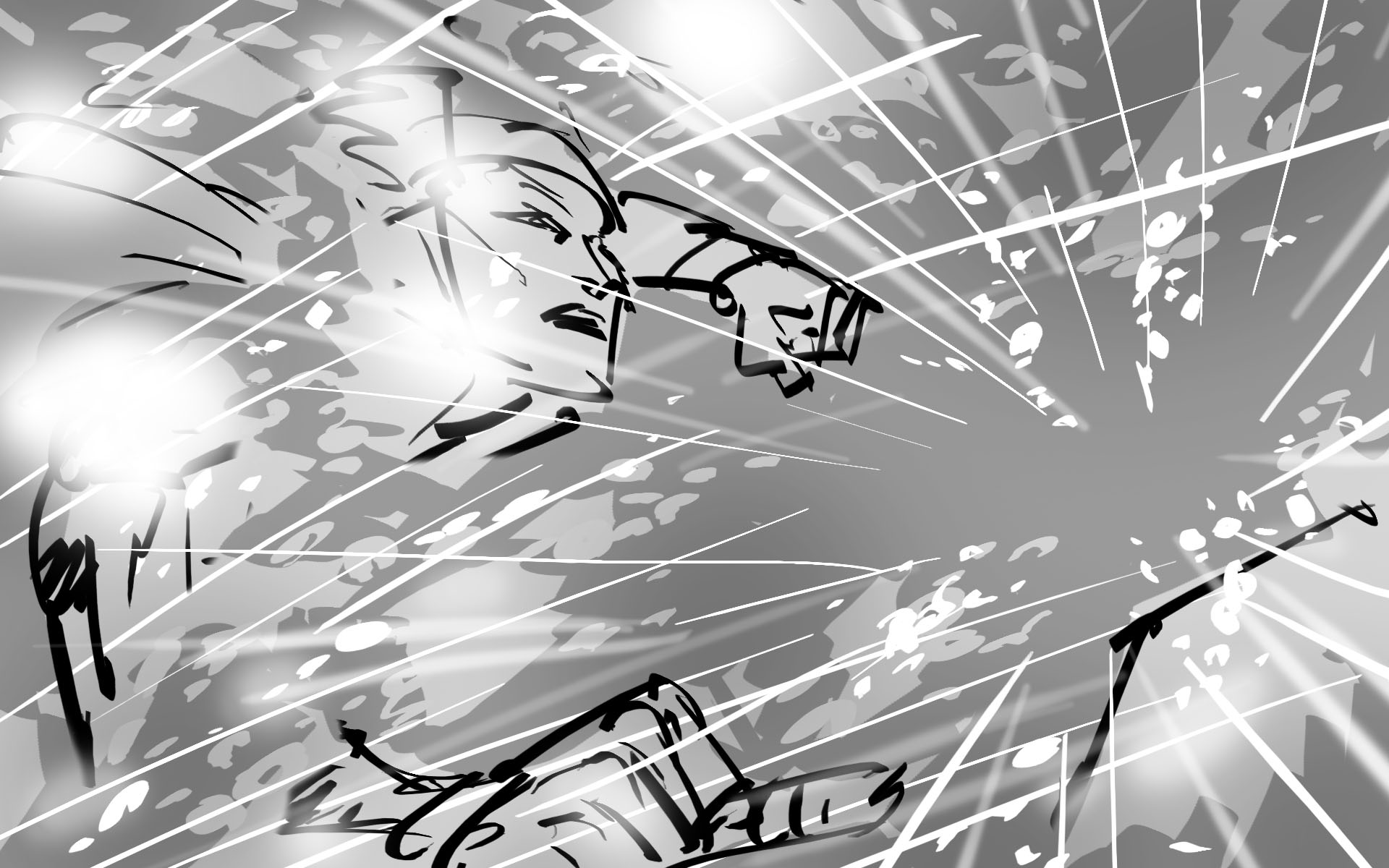
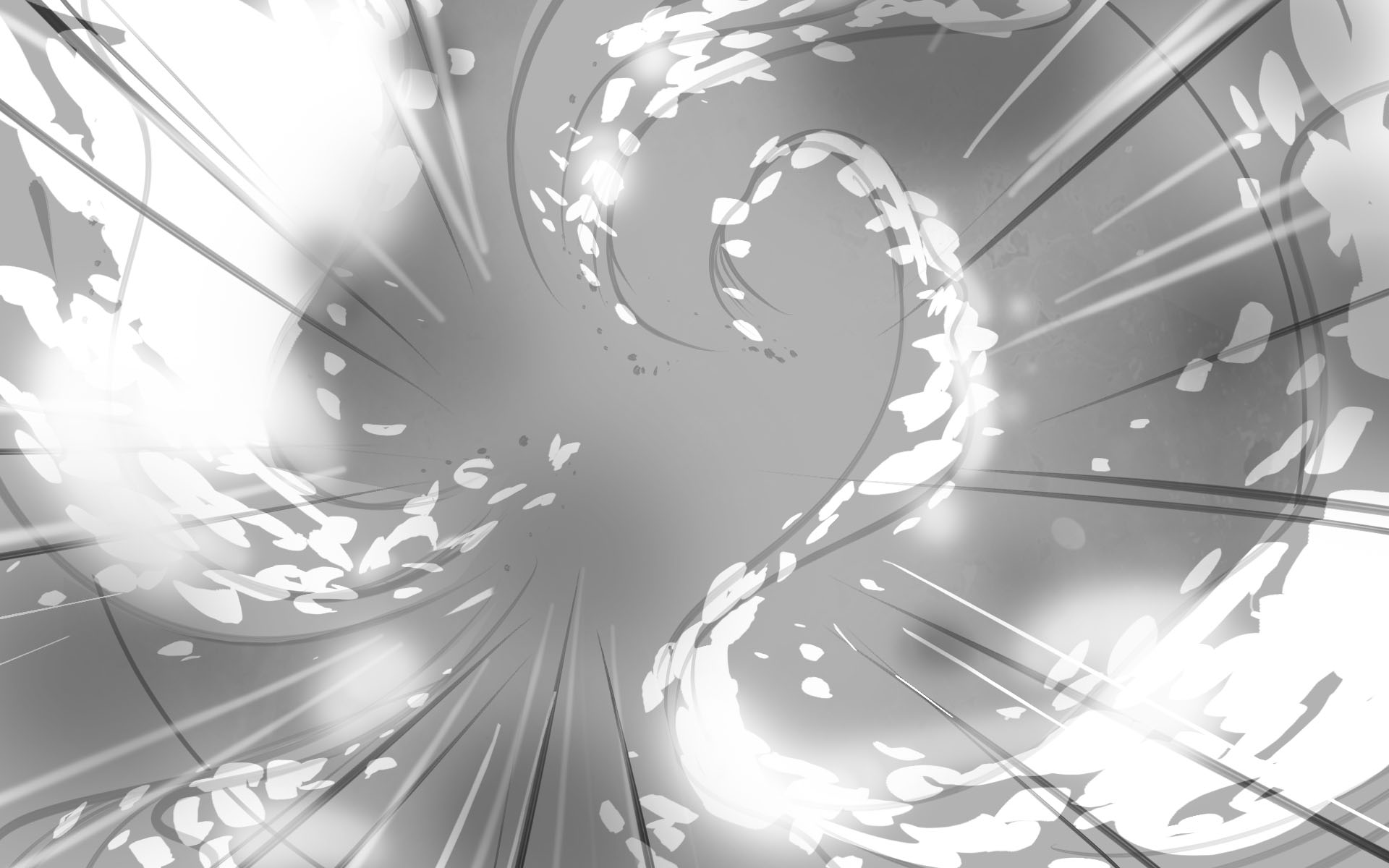
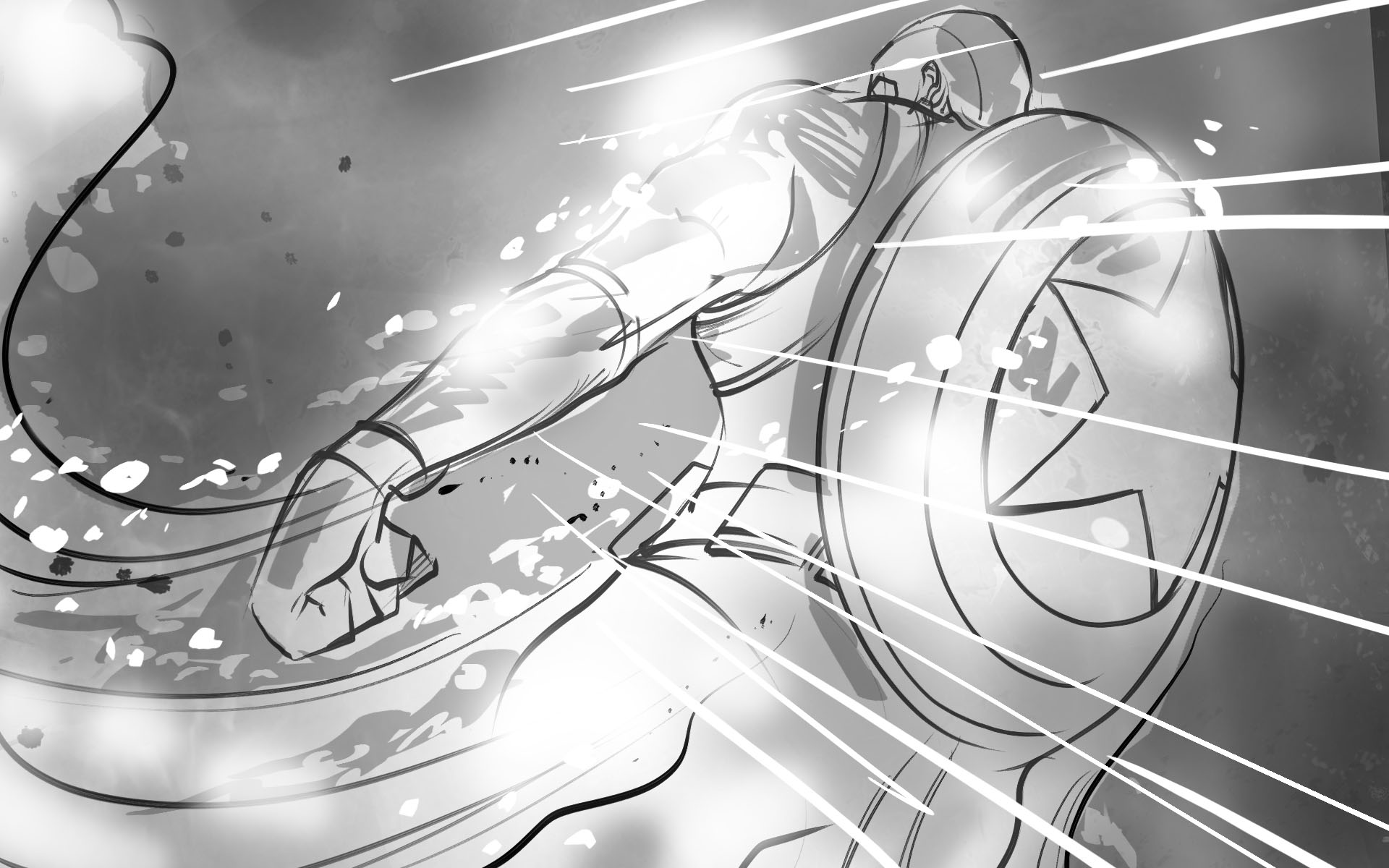
Look Development of Character Visions
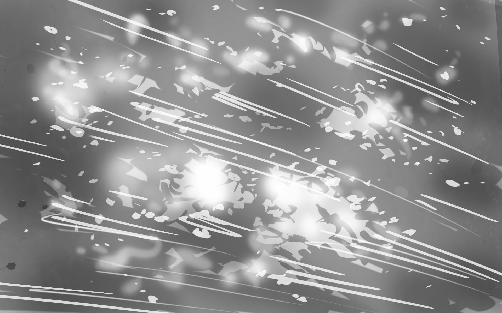
In our process of developing our final look, we found that the beauty and idea of space combined with a display of infinite realities was the best way to showcase the themes of the series. Often times, space is associated with the unknown, and since these realities are unknown to us, we can envision them existing somewhere across space and time. With this in mind, we planned out how space could be used in this sequence.
Refining the Watcher Sequence

04
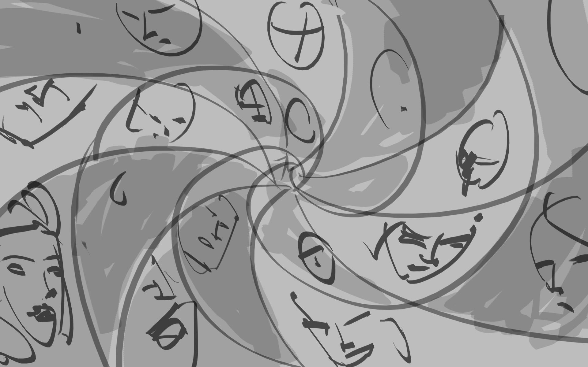
STORYBOARD SKETCHES
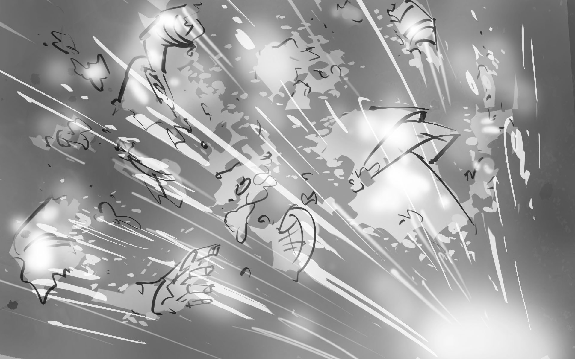
With so many stories being shown and told in this opening title sequence, we wanted to lay out what it was going to look like in accordance with the voiceover. We created storyboard sketches of early development ideas that helped show the story we wanted to tell in the order it would be told. We animated these sketches along with the early voiceover to simulate what the opening title sequence would look like as a whole.
Initial Storyboard Sketches
05
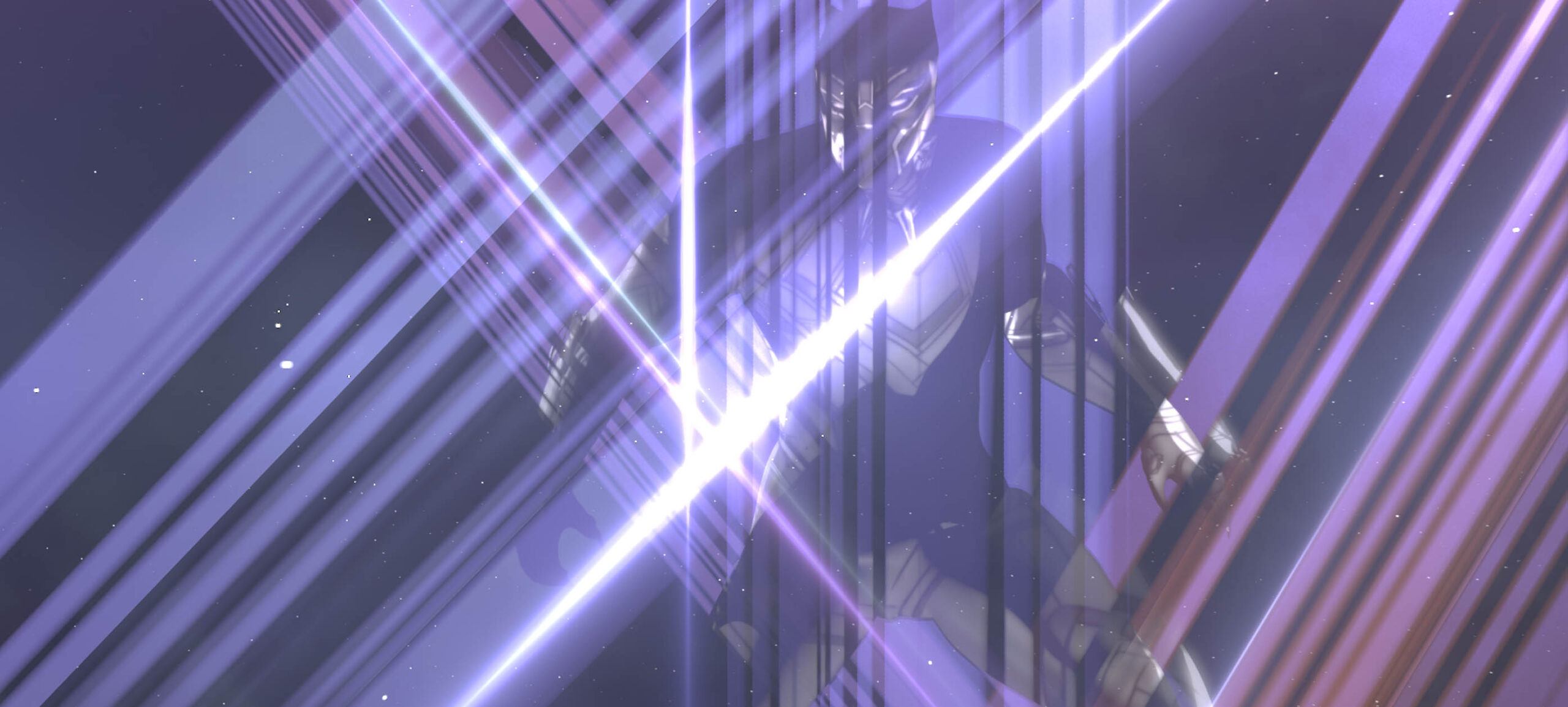
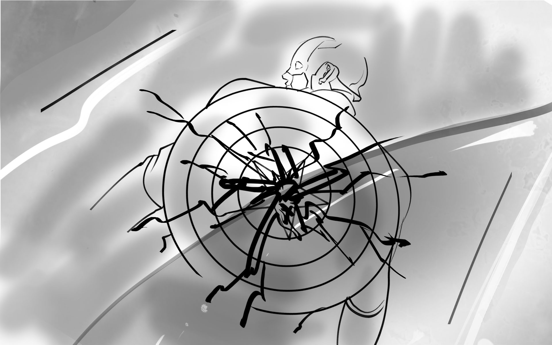
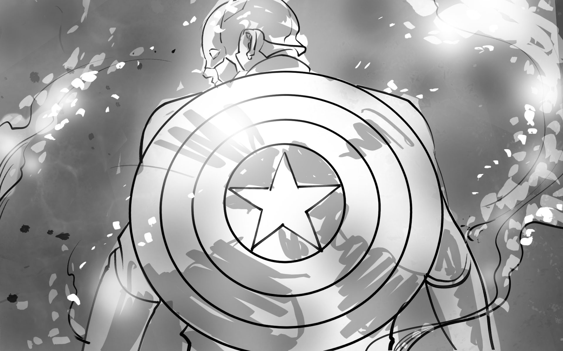
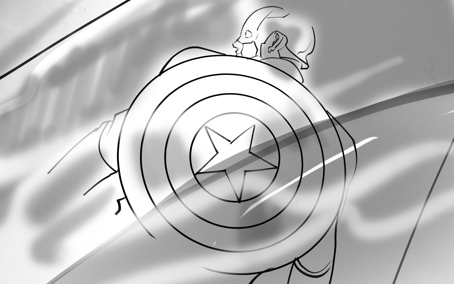
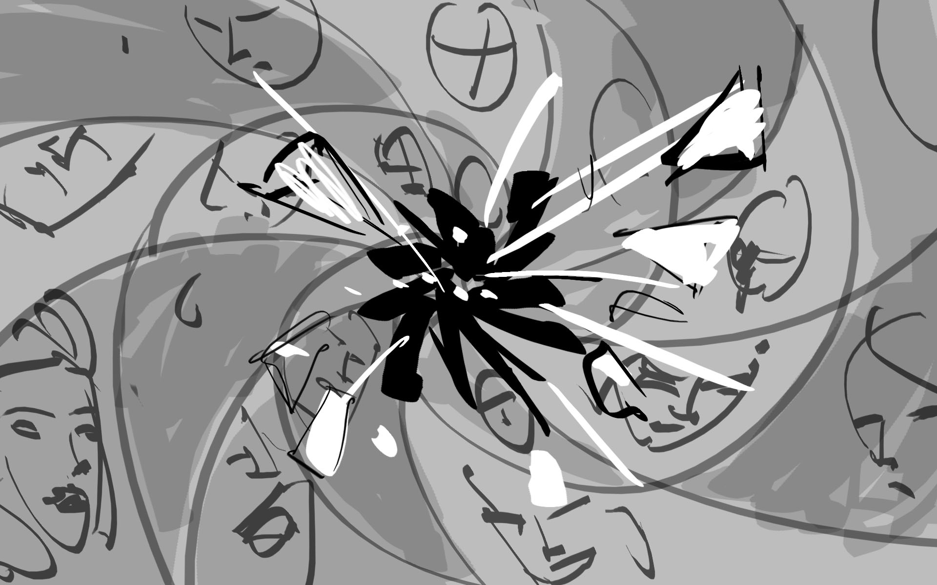
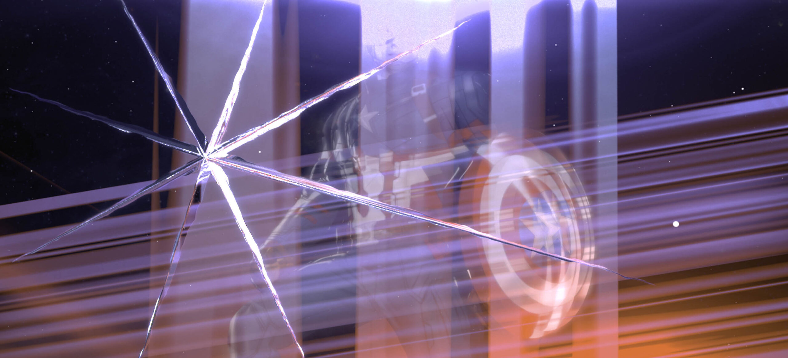
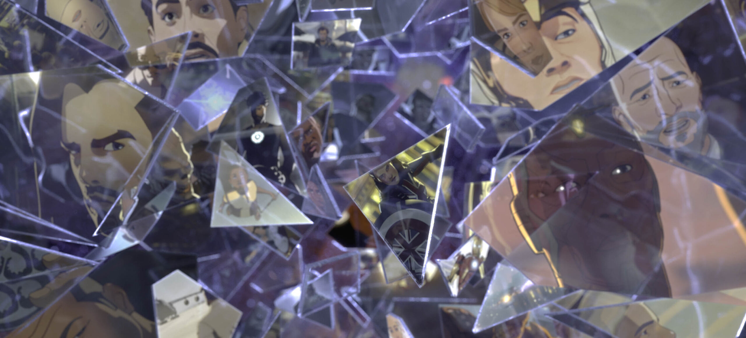
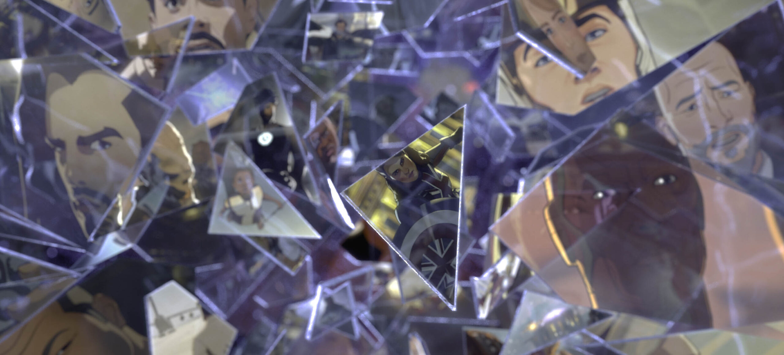
UTILIZING GLASS
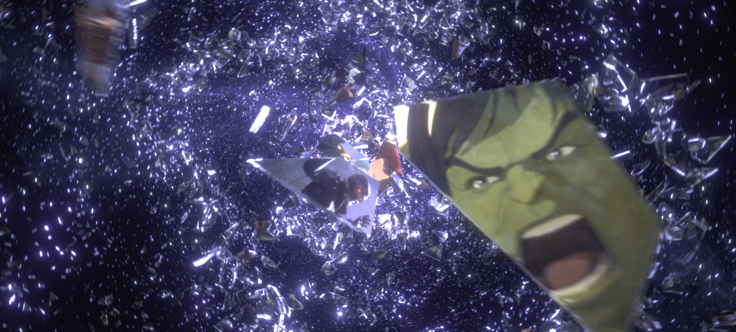
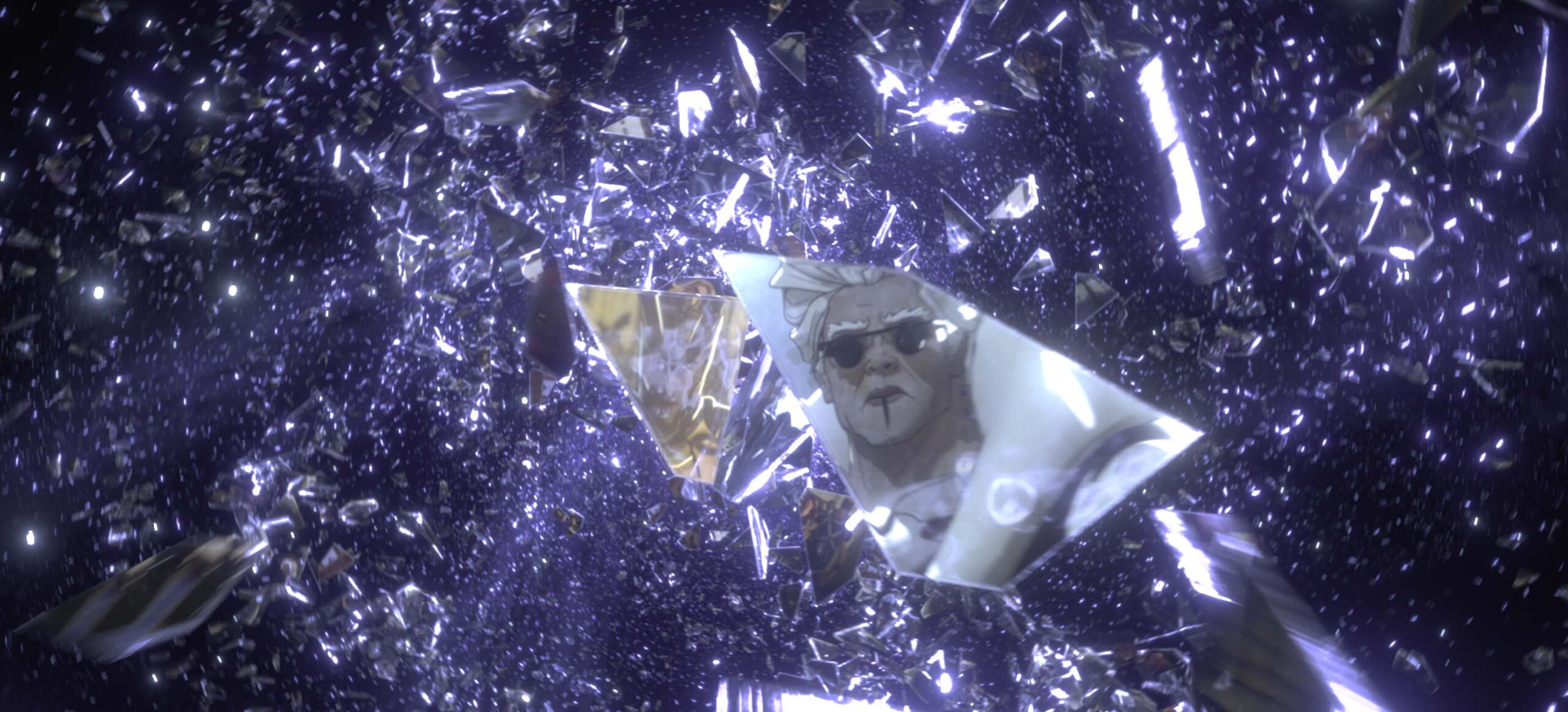
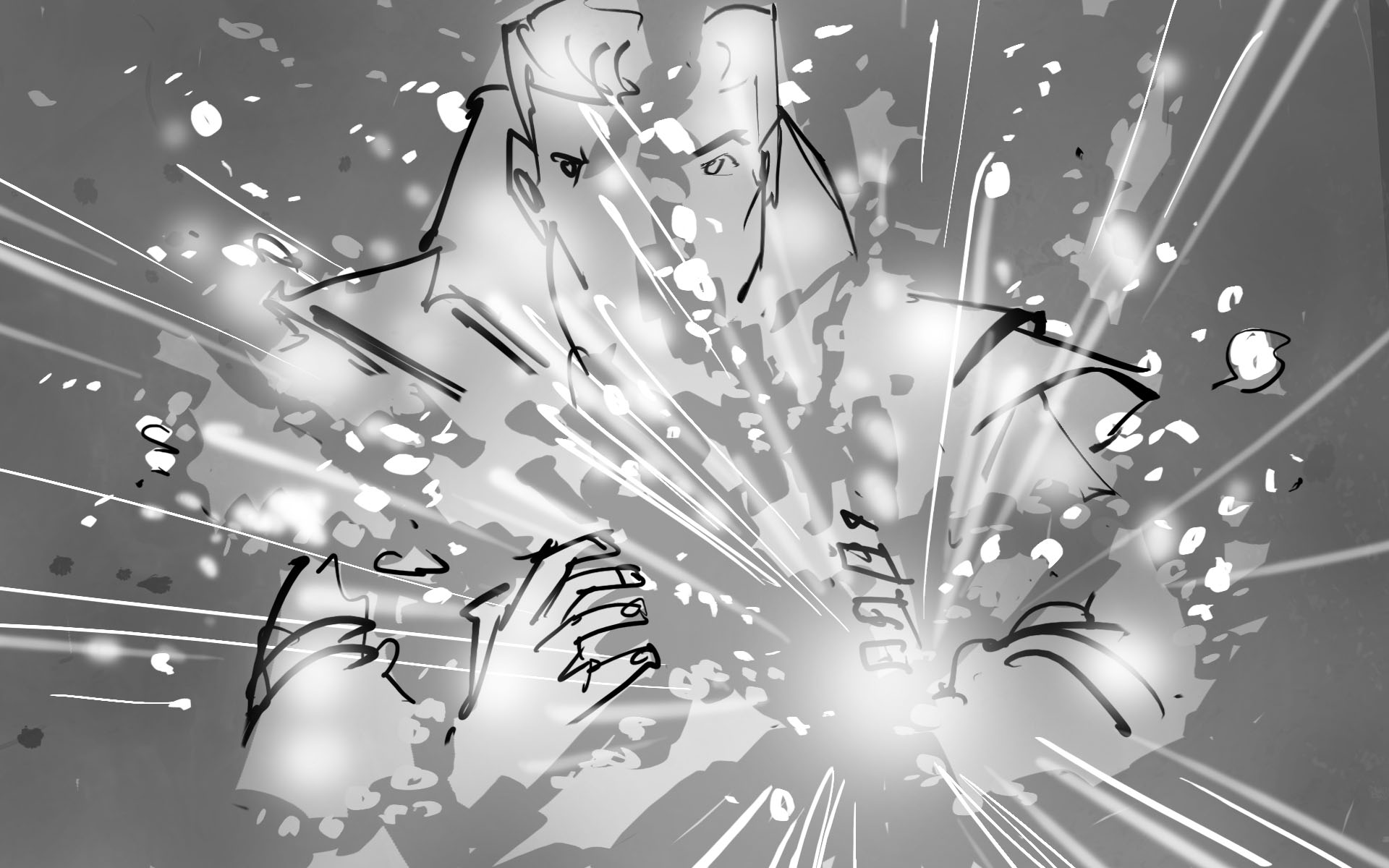
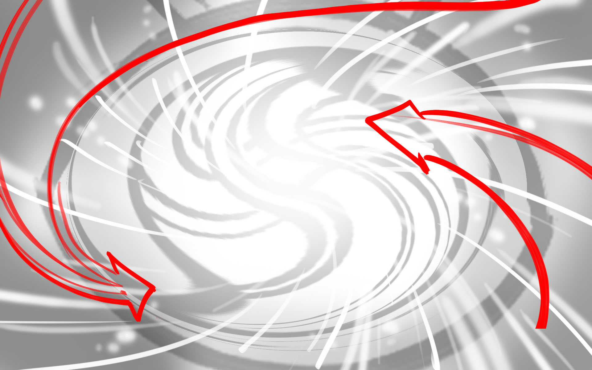
Glass has been a key piece of symbolism in film for many years. The use of one solid piece of glass fragmenting to show multiple facets of that glass can symbolism many things - the different sides of a character, a mutation, the breaking down of something. For this sequence, we wanted glass to symbolize a timeline.
In the Marvel Cinematic Universe as we know it, there has been one consistent timeline (referred to as the Sacred Timeline in Loki). With one solid piece of glass, we are showing images from this main timeline. However, once the glass breaks and shatters, we begin to see multiple different realities. The glass breaking symbolizes the branching of the main timeline into infinite alternate timelines with different characters and scenarios.
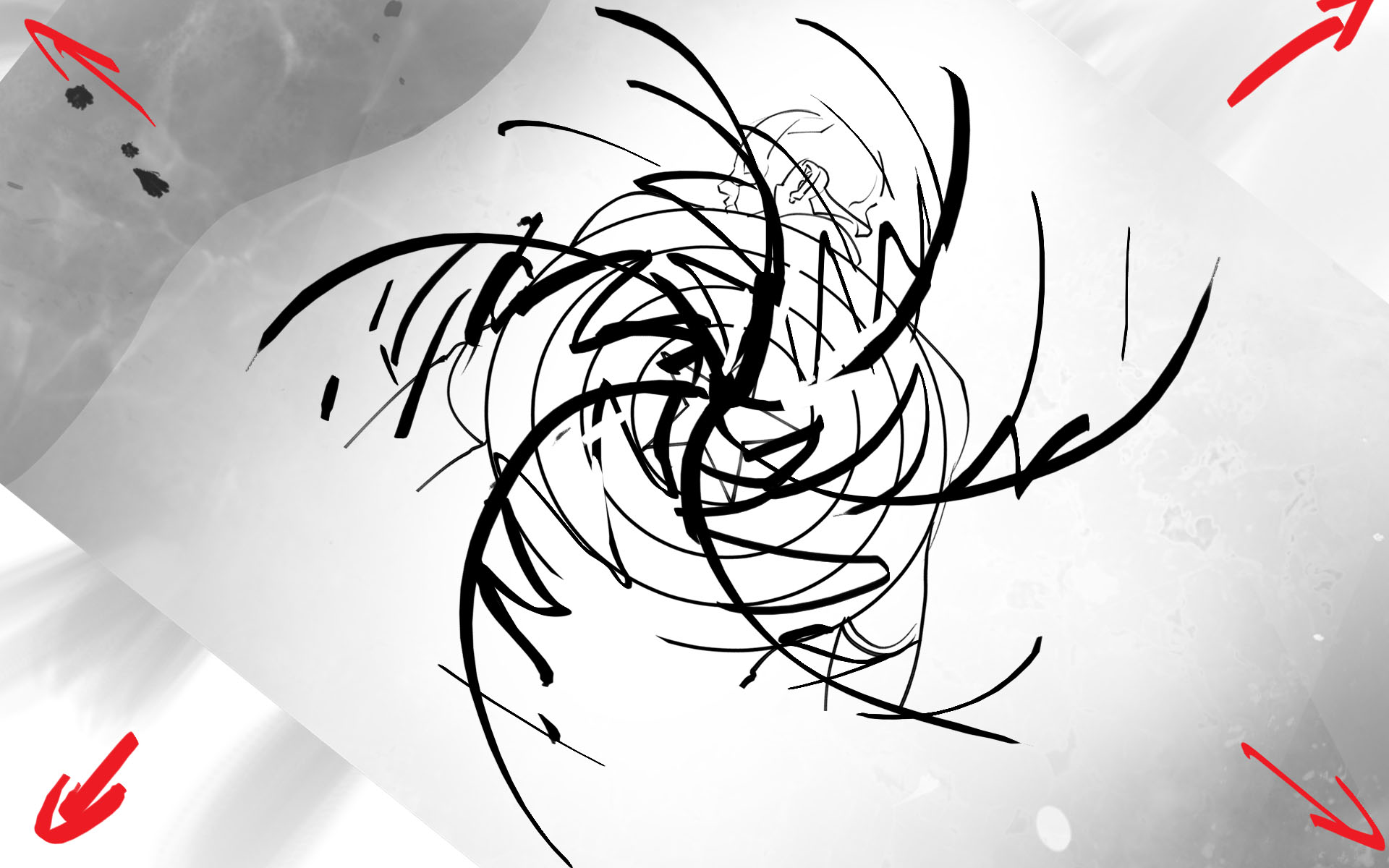
Glass Shatter and Portal Motion Test
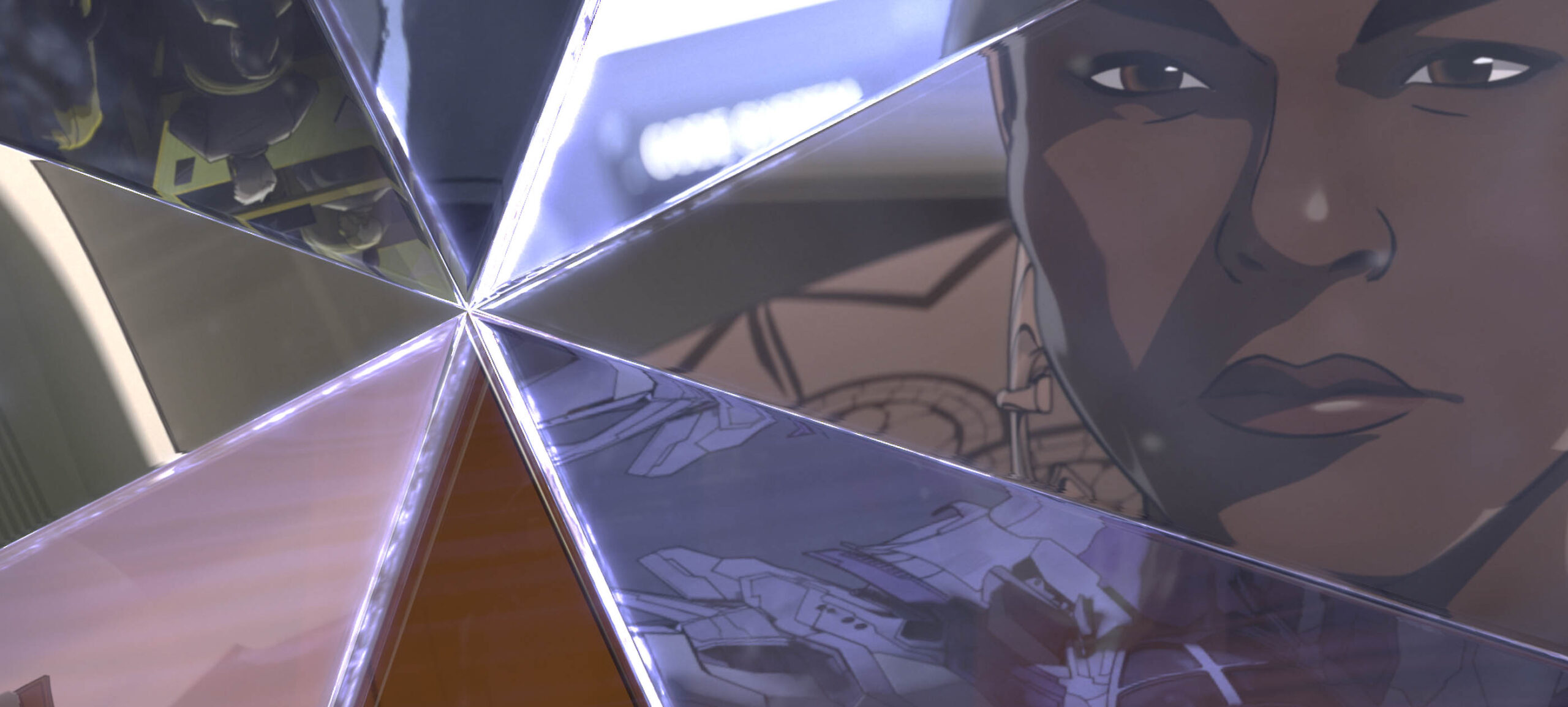
Another way of using glass was by thinking of it as a lens. When you look at a piece of glass one way, it reflects a certain image. Though when you look at it from a different angle, it can show something entirely different. We practiced this idea by showing that when you look at this glass from one way, you see the main timeline. However, when the glass shifts, you can see a different image of an alternate timeline. This other timeline has always existed, but we are only seeing it now by looking at it from a changed perspective.
In order to properly convey these ideas, we studied reflections on glass, the way lighting hits glass, and how glass shatters and breaks into multiple pieces.
Glass Shatter Refinement
06
INSPIRATION AND LIGHTING
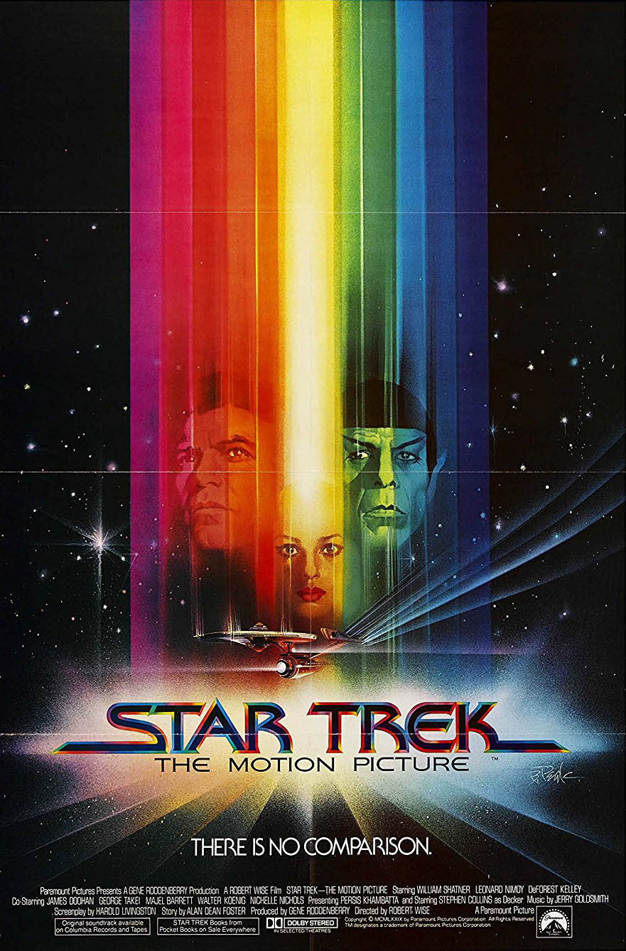
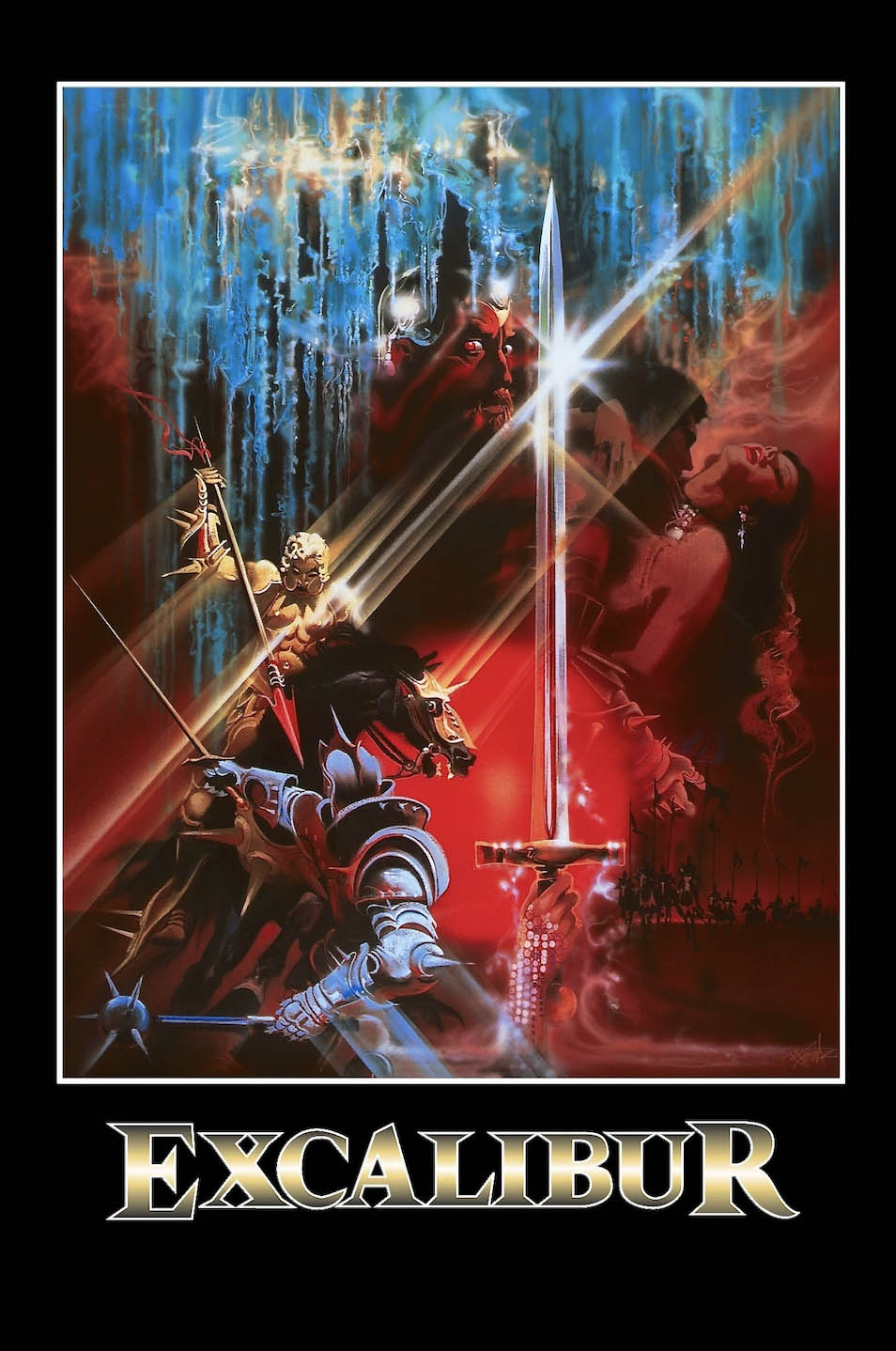
Our design for the opening title sequence was heavily inspired by Bob Peak, a famous movie poster artist in the 1970’s and 1980’s. In particular, the posters for Star Trek and Excalibur were big inspiration pieces for our sequence. Much of Bob Peak’s work includes streaking of light and color, which we included in the beginning of our opening title sequence. As a kick off for our final lighting streaks in our title sequence, we ran several lighting tests that would showcase the reveals of the characters in the opening sequence to find a balance between clarity and mystery.
07
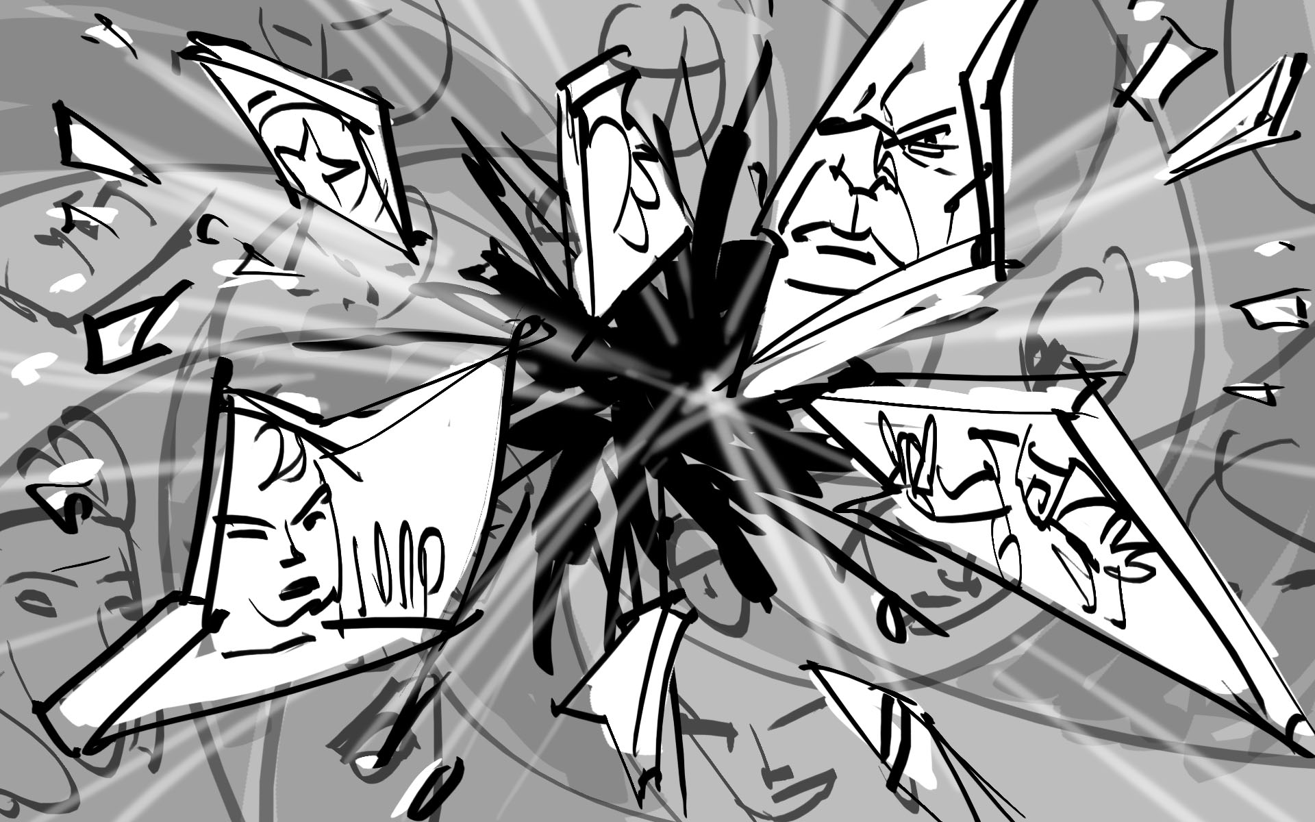
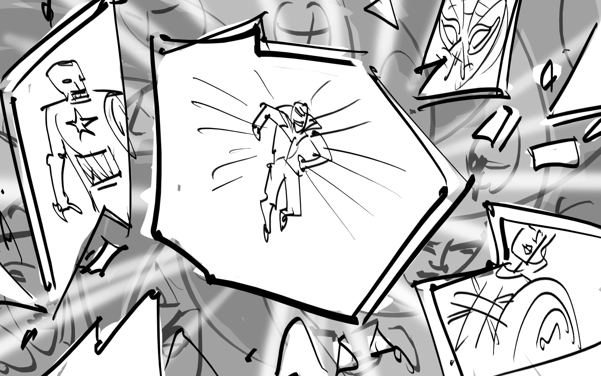
FINAL TITLE SEQUENCE
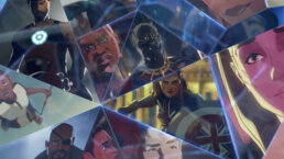
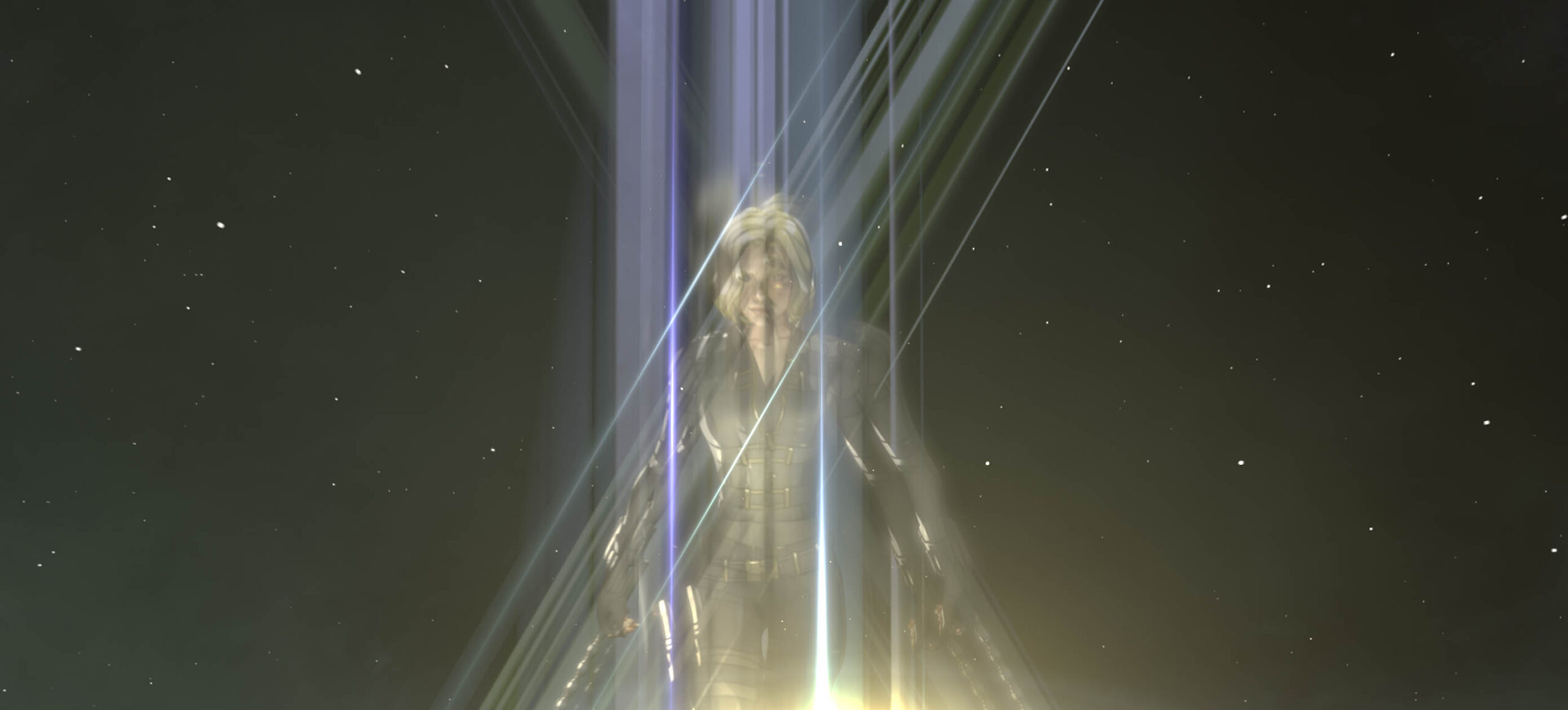
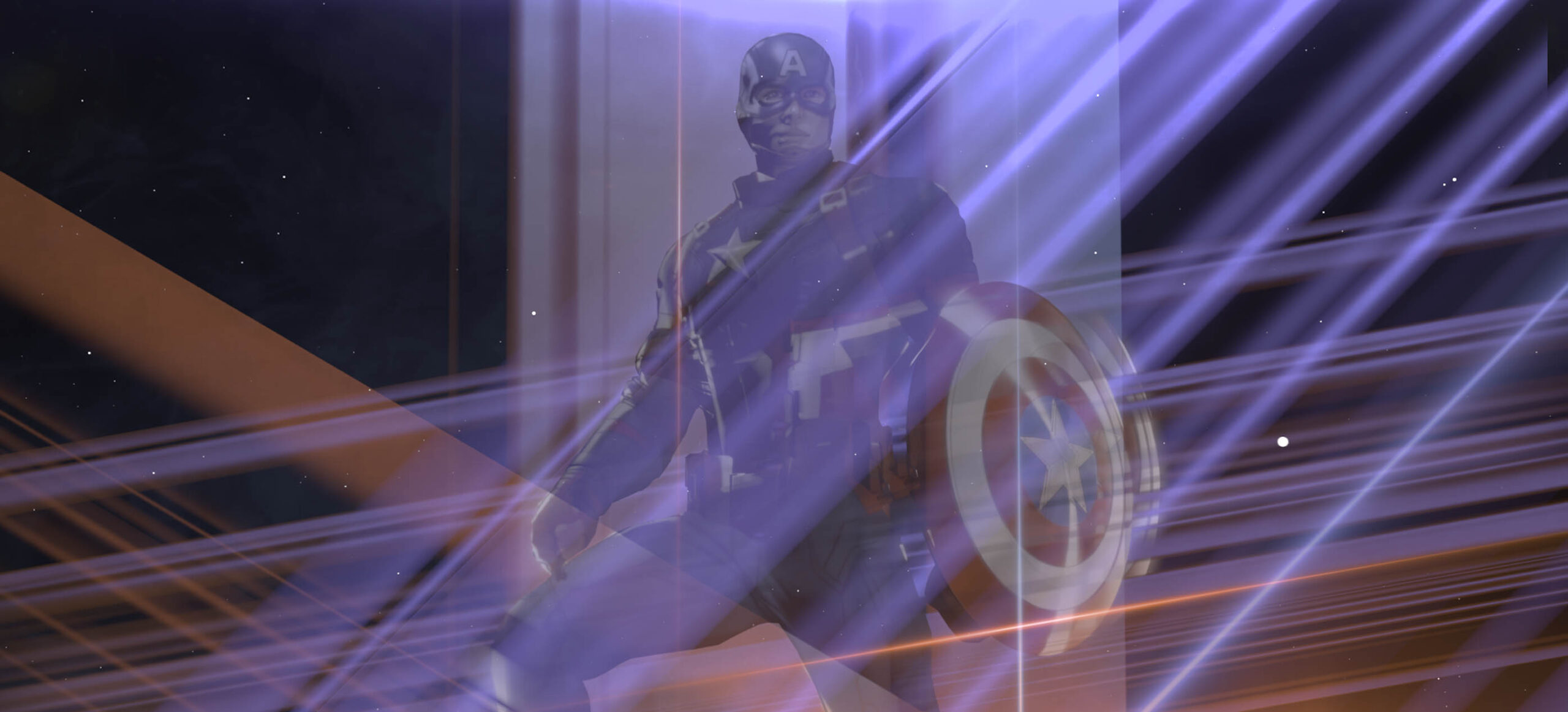
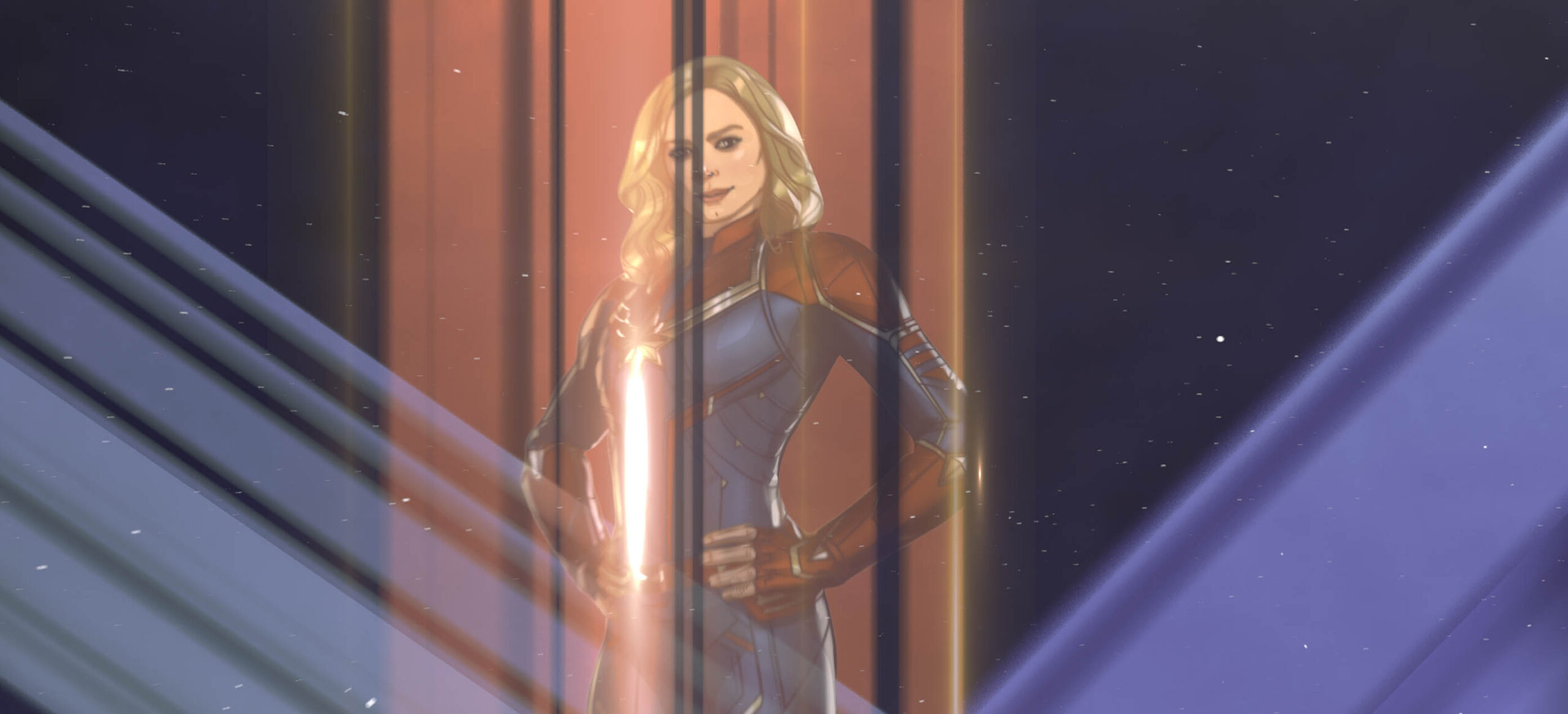
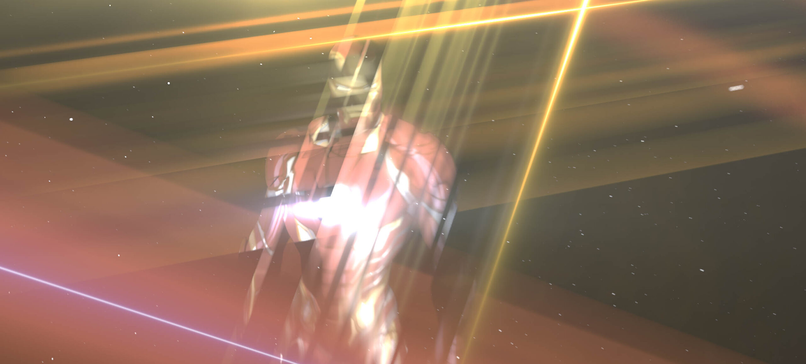
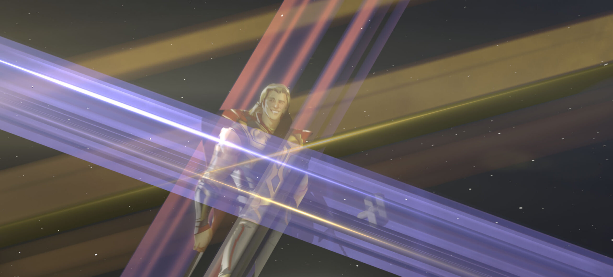
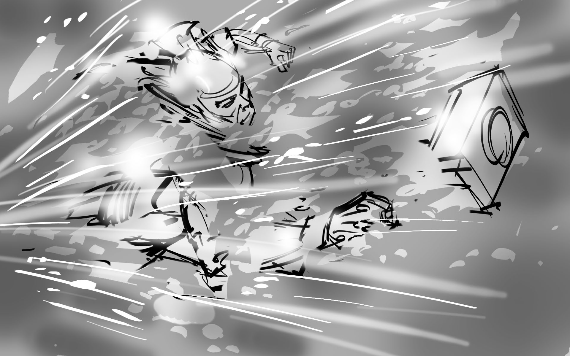
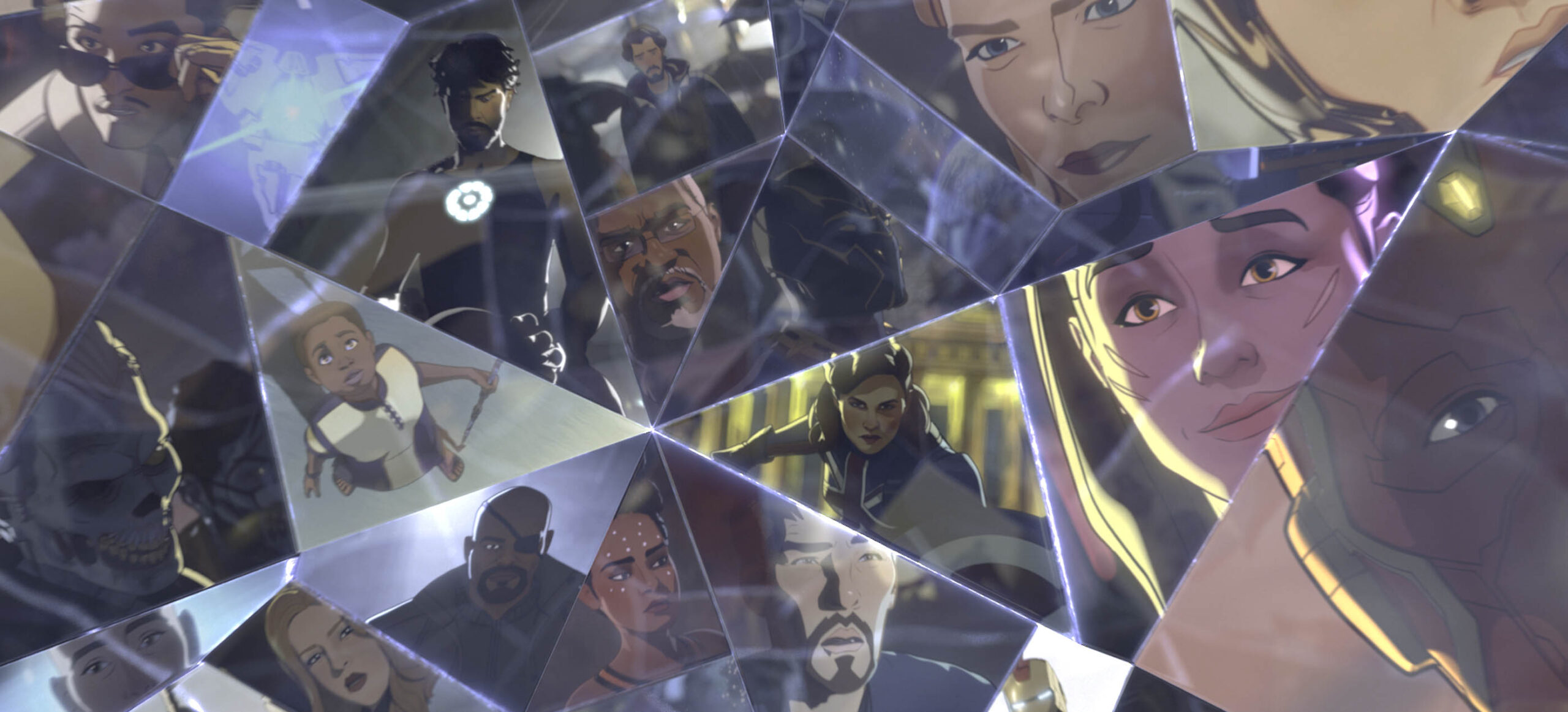
Our final opening title sequence focuses on the different realities that exist outside of the one we know and all of the possibilities of what could exist in those realities. In order to convey this, our sequence begins by forming characters we know in their traditional roles, such as Natasha Romanoff as Black Widow, Carol Danvers as Captain Marvel, and Steve Rogers as Captain America. These characters are formed by rays of colorful light shining in from an external source.
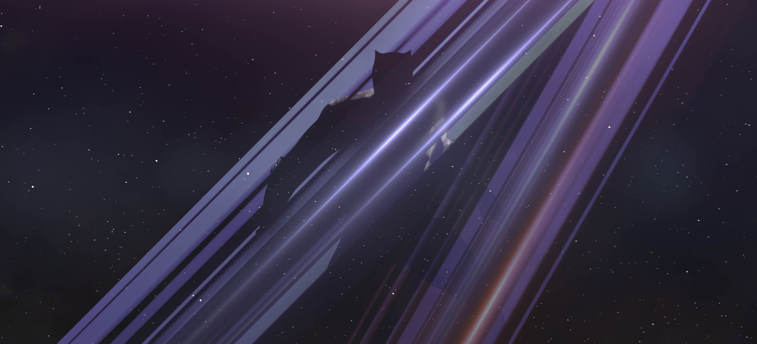
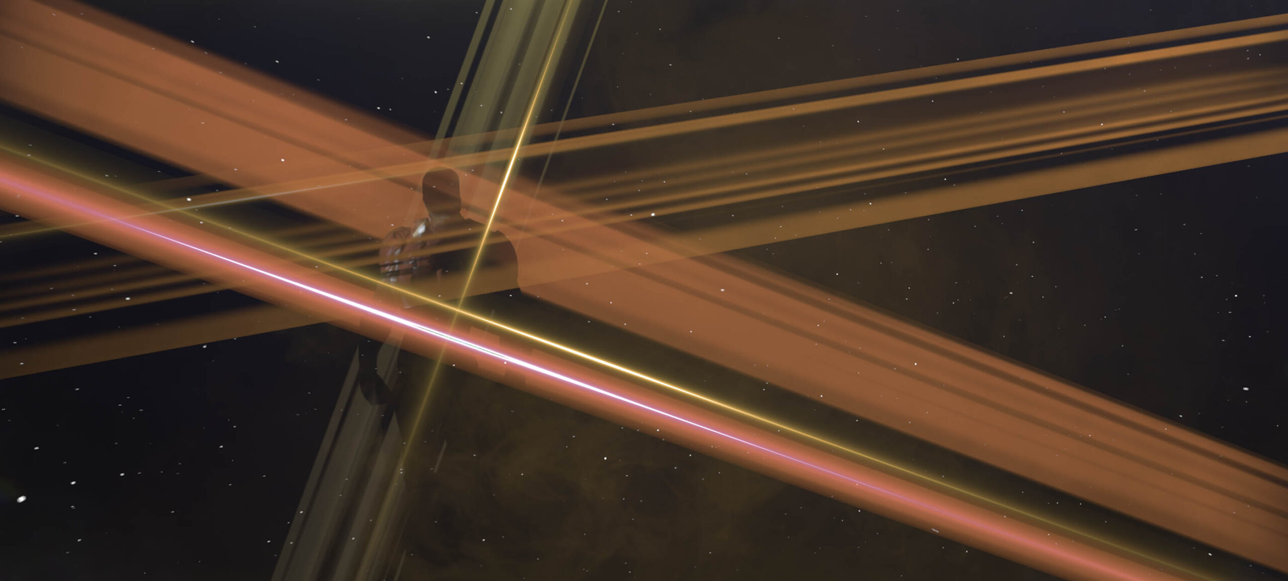
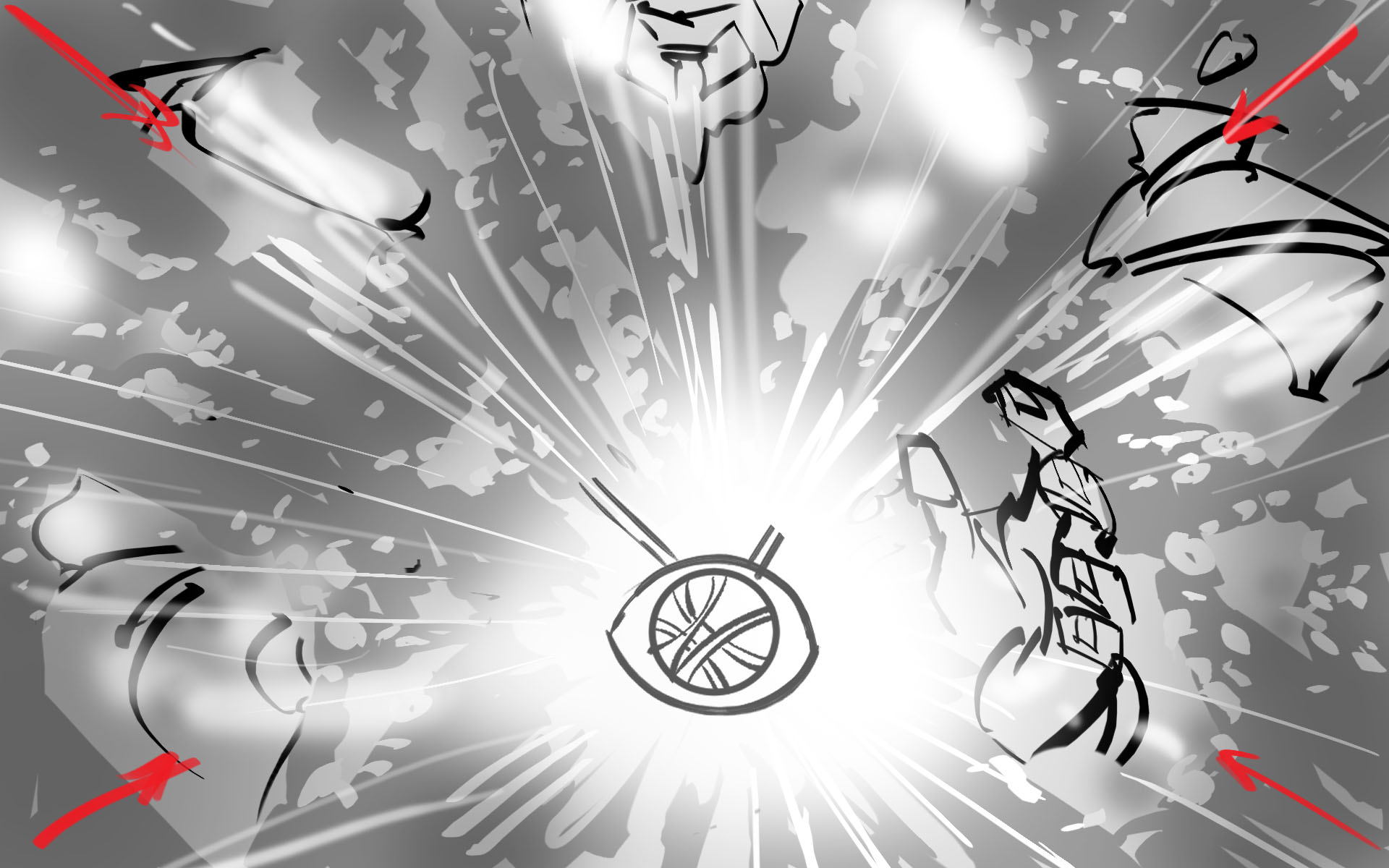
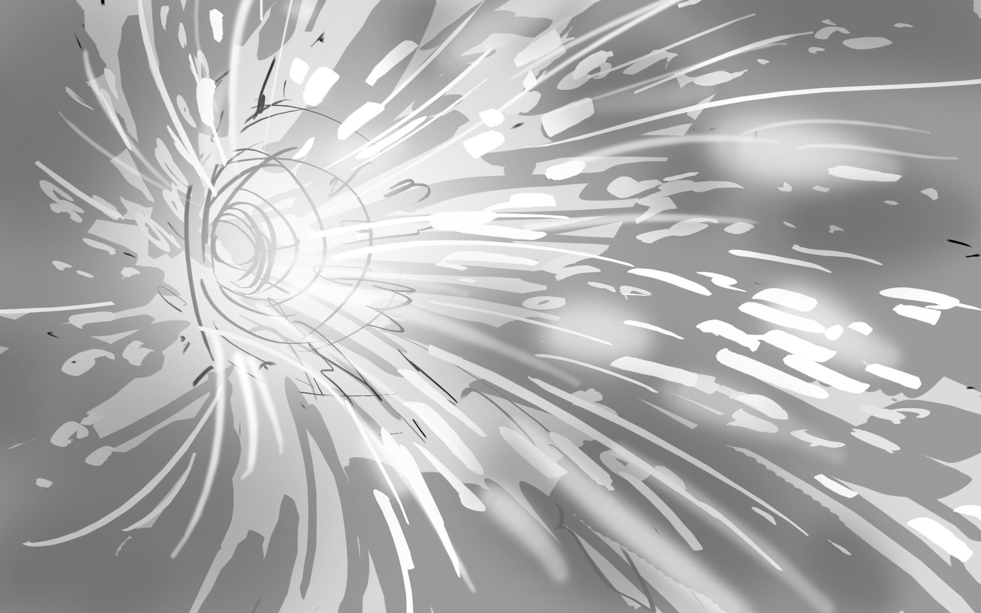
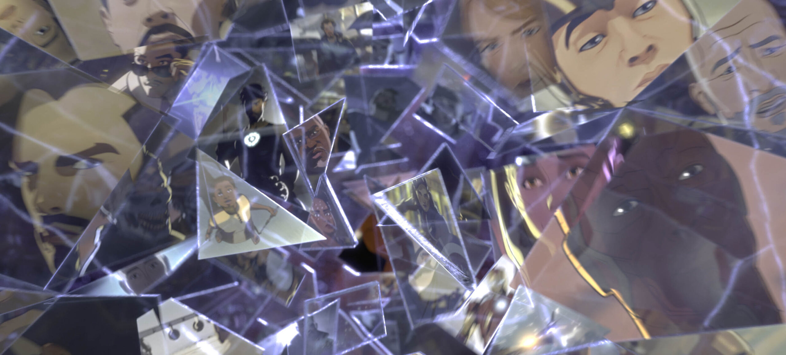
We then see a break in the screen where a glass prism forms. In each piece of this prism, we can see different realities that we are about to explore in What If…?. These realities appear as glimpses and facets that keep breaking until the prism shatters into thousands of glass shards. These shards soar past the camera, each one representative of a different reality.
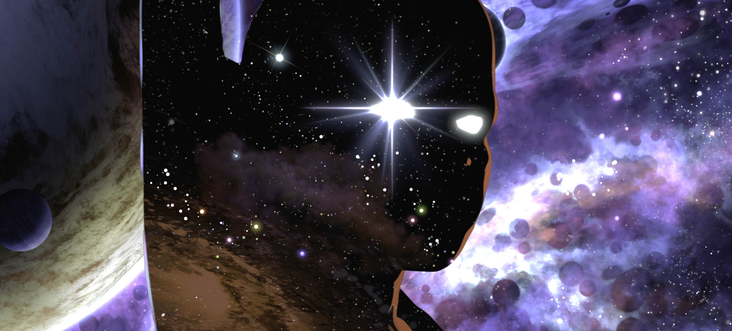
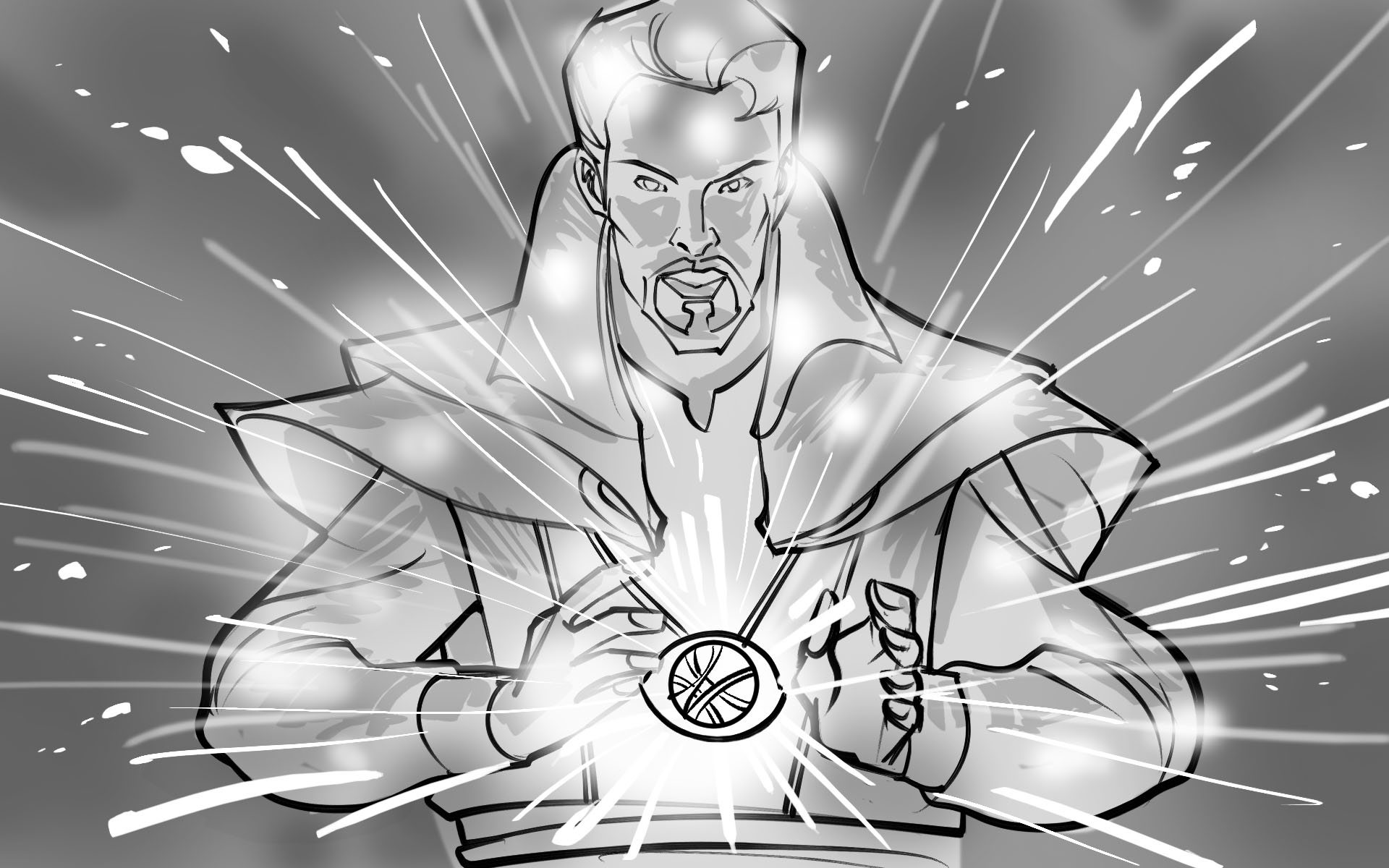
The glass pieces then fly quickly past the camera, which zooms in on a cosmic white light in the center of a collection of distant stars. This white light is revealed to be the eye of the Watcher. This ending of the sequence both introduces the Watcher and symbolizes that even though there are infinite possibilities, the Watcher has the power to see all of them.
08
SEASON 2 TITLE SEQUENCE
In addition to designing the title sequence for What If...? Season 1, our team was also brought on to craft the sequence for What If...? Season 2 This title sequence is an updated version of the title sequence for What If…? Season 1. Filled with new characters from Season 2 and fan favorites from Season 1, this title sequence explores the infinite realities of the multiverse through reflections in light and shattered glass. Our team created this title sequence using Cinema 4D and Adobe After Effects.
WHAT IF...? SEASON 2 OPENING TITLE SEQUENCE
09
ANIMATED MARVEL STUDIOS LOGO
Another interesting addition we created for What If...? Season 2 was an entirely animated Marvel Studios logo, airing for the final episode of the series. For every Marvel Studios film and series, our team updates and customizes the Marvel Studios logo that we originally designed for Doctor Strange (2016). This logo is a fun, animated take on the original, completely overlayed with characters and moments from the What If…? Series. Nearly every part of this animation has been customized, including the art sketches, character quotes and final logo design.
WHAT IF...? SEASON 2 ANIMATED MARVEL STUDIOS LOGO
10
CONCLUSION
Collaborating on Marvel Studios’ first animated series has been a huge honor for our team at Perception. We love telling stories with our title work and it was so much fun to tell so many of them within these title sequences. What If…? is such a unique concept for a show and it was incredible to be a part of it.
See other ways that our team at Perception has developed the multiverse of the Marvel Cinematic Universe in our Doctor Strange in the Multiverse of Madness Technology Design case study and our Doctor Strange in the Multiverse of Madness Title Design case study!