01
INTRODUCTION
In December 2014, Marvel Studios invited our team at Perception to present ideas for the Main-On-End and Main Titles for Avengers: Age of Ultron. We designed a wide range of concepts. Ultimately Marvel Studios selected a direction that depicted a larger-than-life monument that paid tribute to Earth’s Mightiest Heroes.
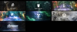
Behind the scenes case study montage
02
THE PITCH
As with all of our design explorations, our team likes to create a variety of frames that span multiple styles while still staying true to the initial brief. For this film, the brief was open ended which allowed us to flex our Marvel knowledge and explore a wide range of creative solutions. A few of those directions can be seen below.
DIRECTION A - THE HIVE MIND
Inspired by Ultron’s hive mind ability, which enables him to animate and control entire armies of robots simultaneously, this direction uses swarms to create and reveal imagery and character specific objects for each title card.
DIRECTION B - CRACKLE
For generations, Marvel fans have loved the incredible renderings of power and pure energy that have lifted off the comic pages emanating from their favorite heroes and this direction takes its inspiration from those classic panels.
DIRECTION C - ICONIC MOMENTS
Bold icons encapsulate characters, locations, and plot points into simple and clever forms while rich environments give moody context to each symbol, suggesting endless layers of iconic moments.
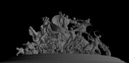
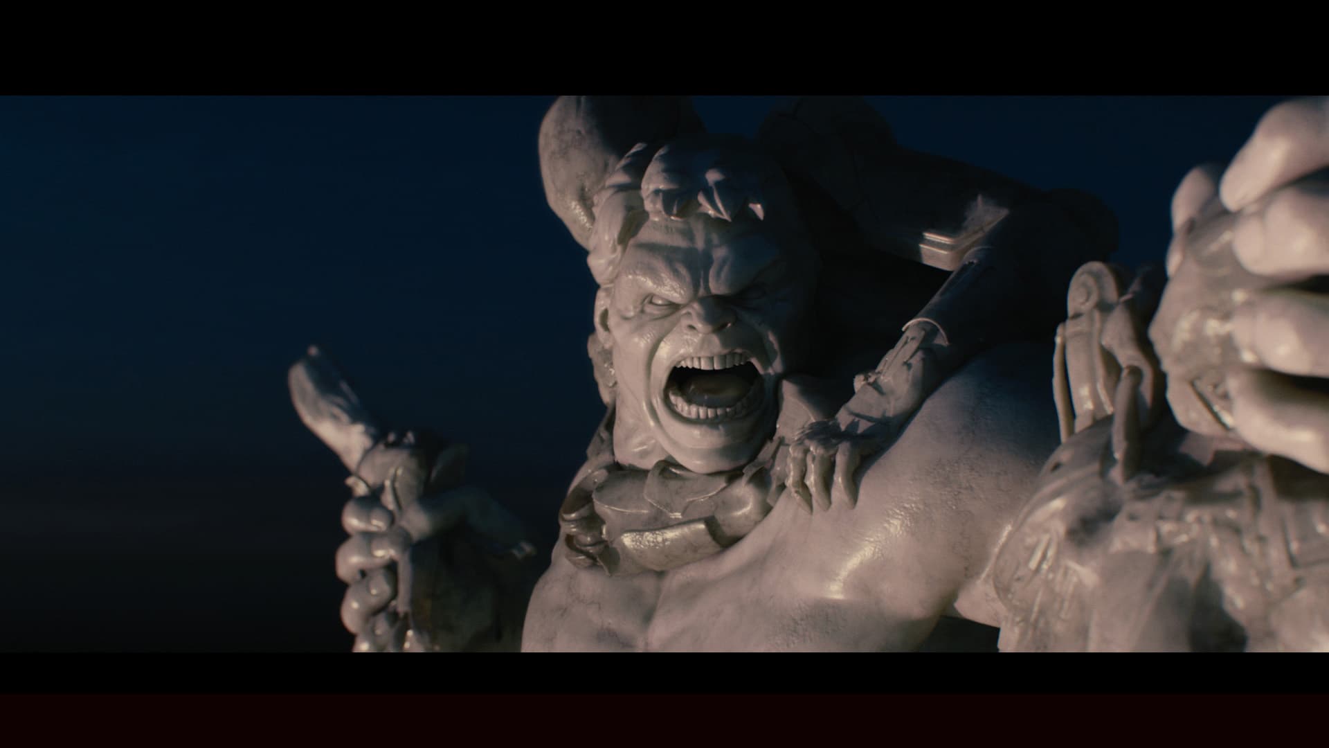
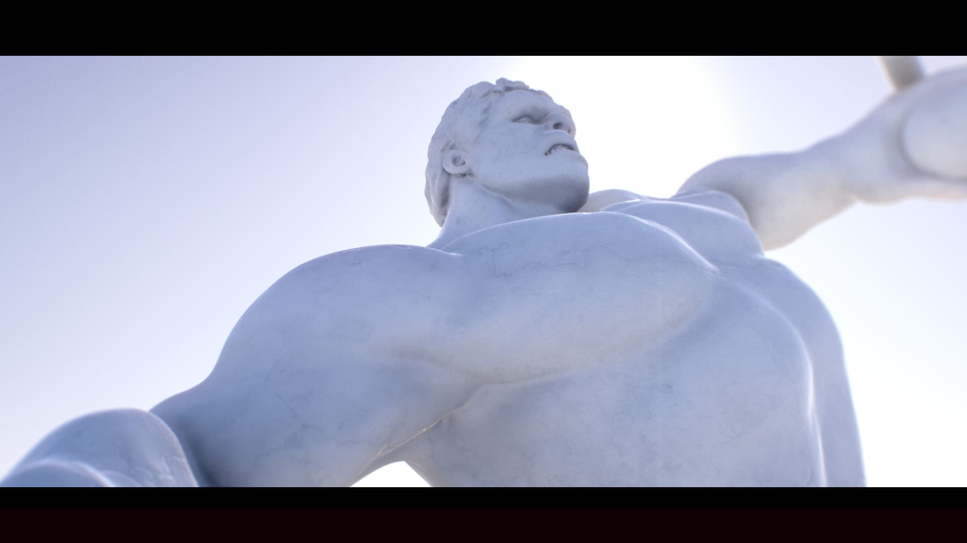
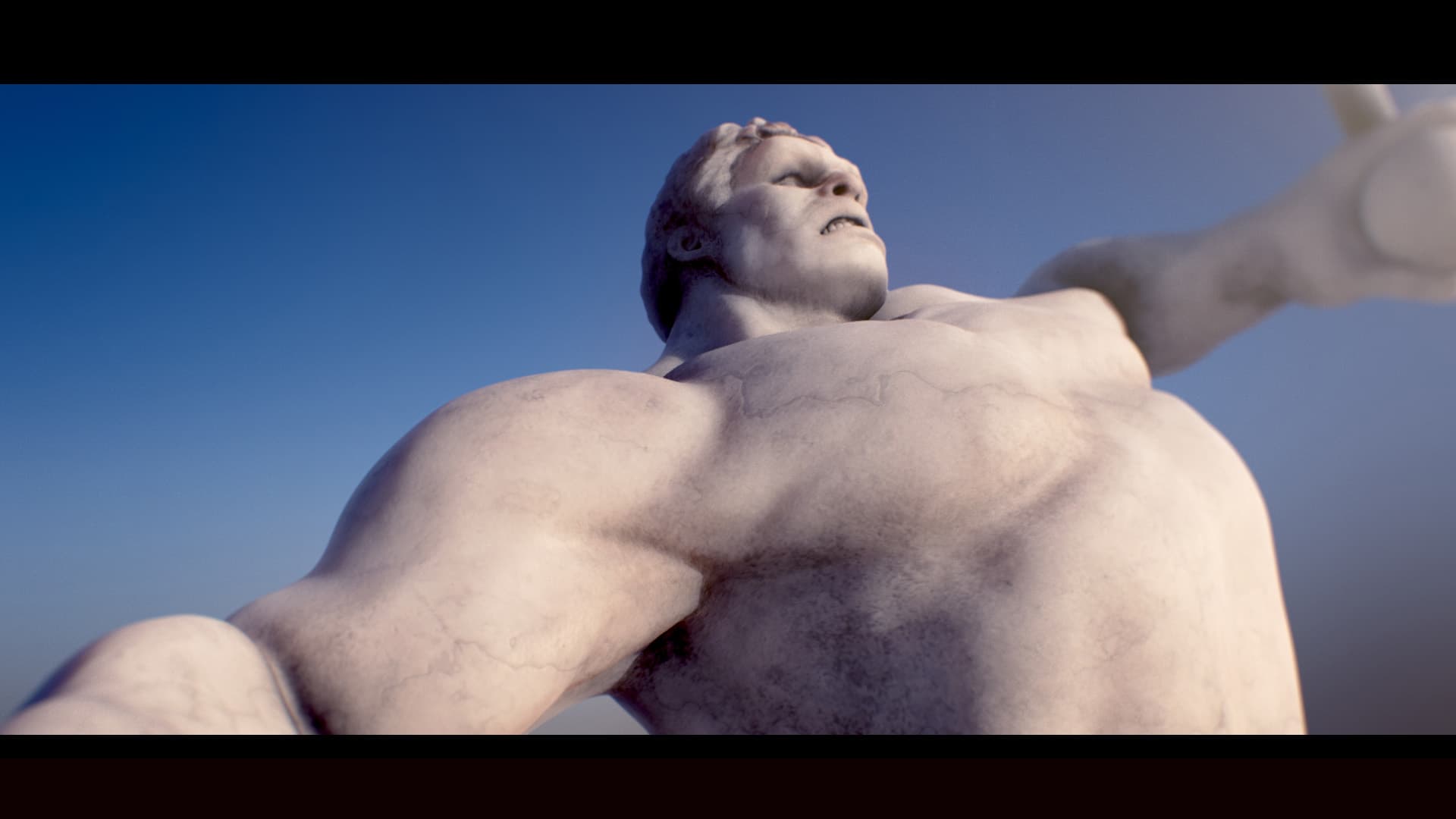
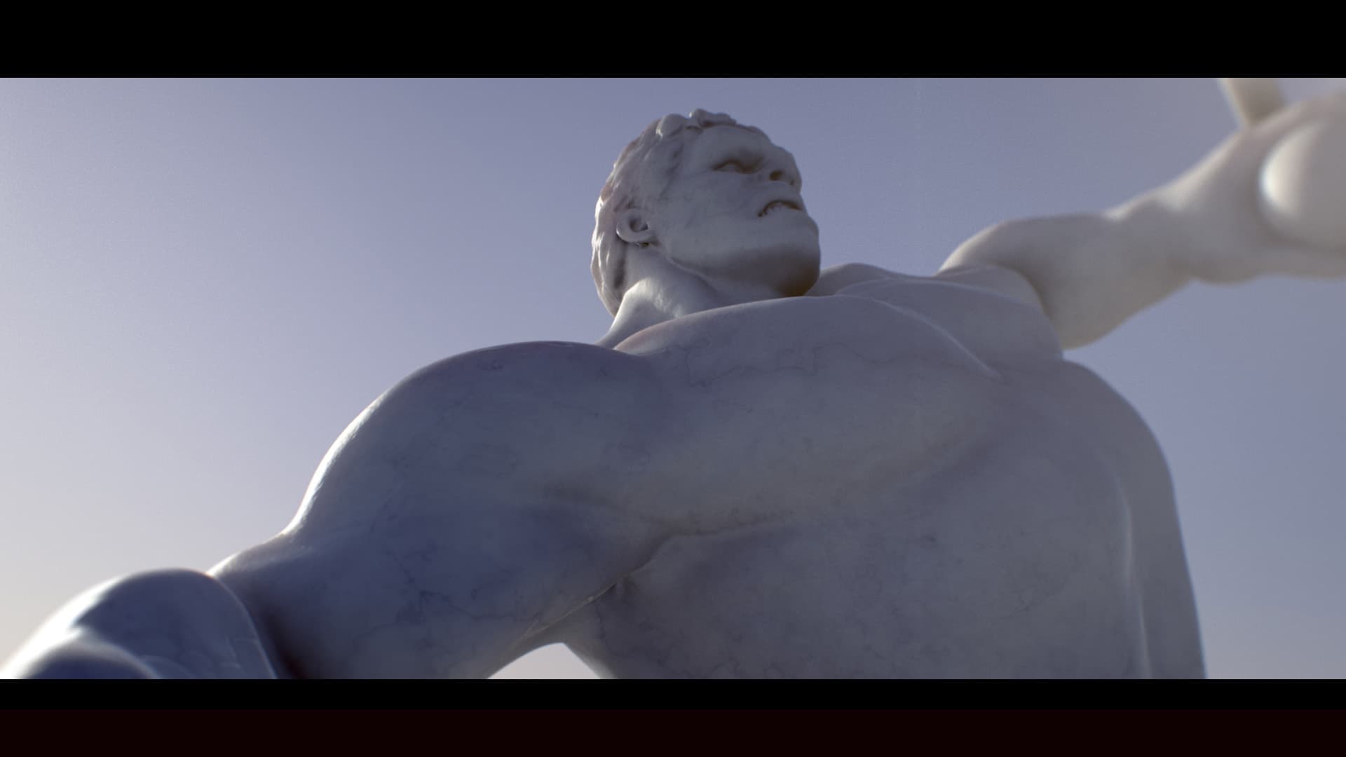
DIRECTION D - EARTH'S MIGHTIEST HEROES
Inspired by heroic war monuments and classical sculpture, this direction involves the crafting of a full Avengers sculpture that freezes their most epic face-offs within the monument of war.
03
INSPIRATION
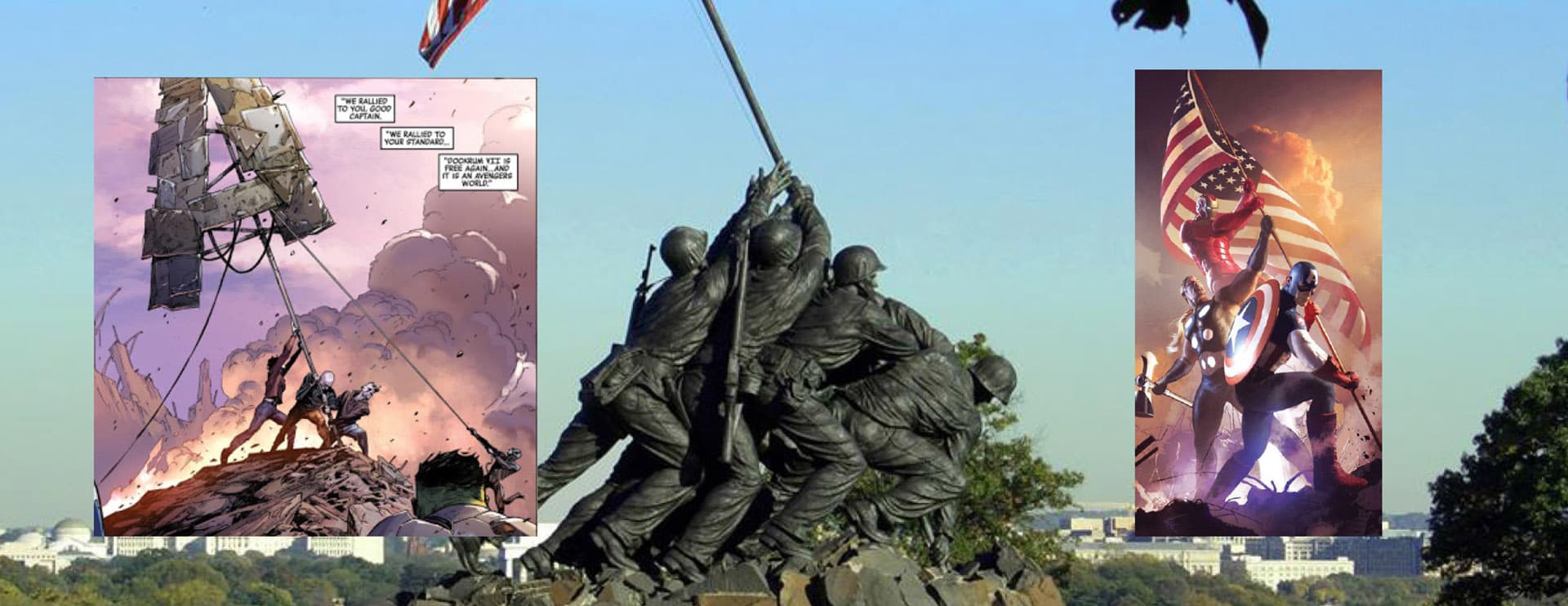
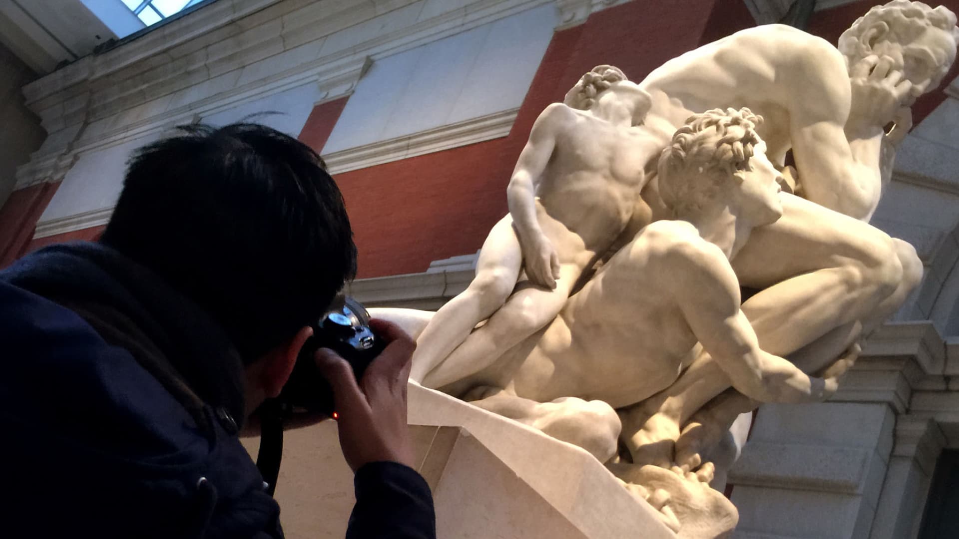
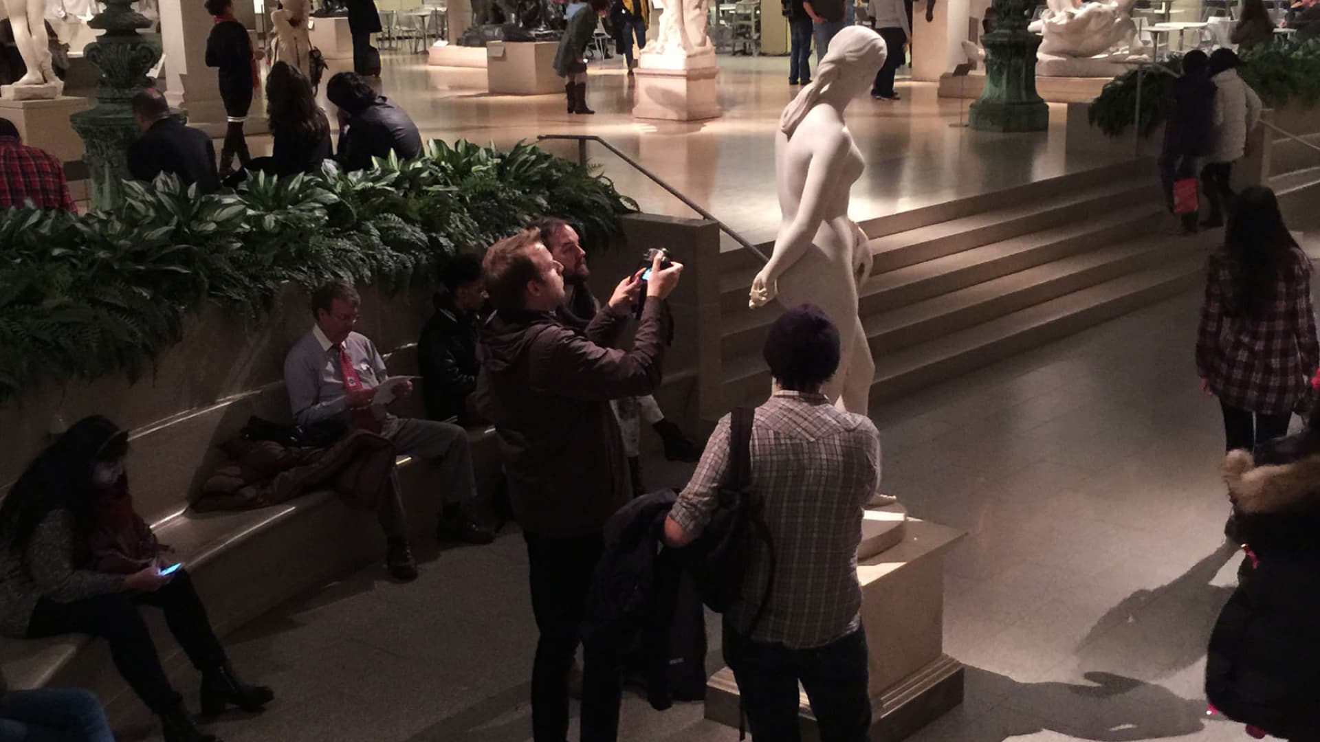
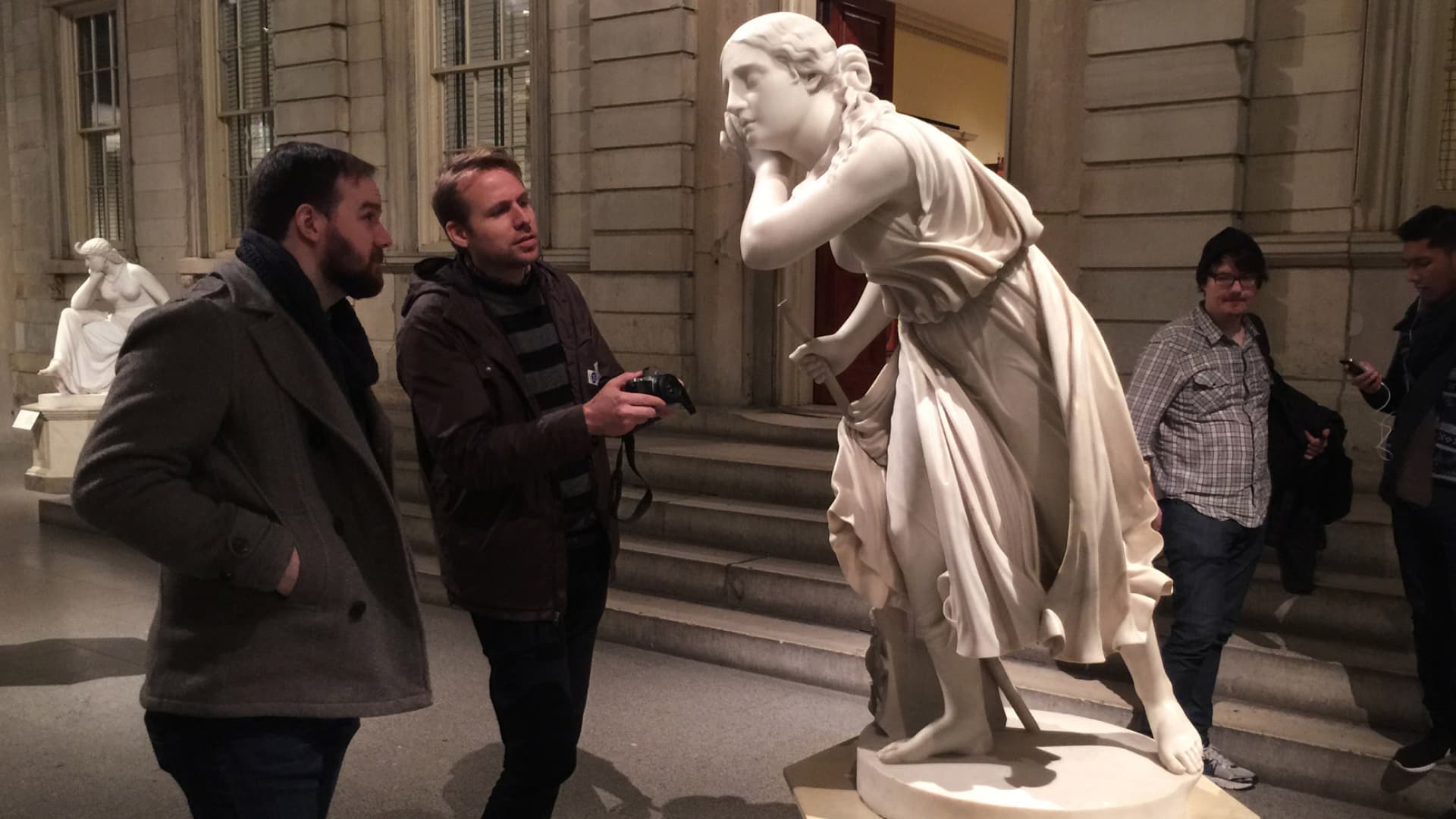
With every project, it’s incredibly important for our team to gather as much inspiration and reference as possible. We were inspired by the 9/11 imagery of first responders and the Iwo Jima sculpture. Luckily, we were also able to take several trips to The Metropolitan Museum of Art to get a first hand look at some of the world’s finest sculptures.
04
PROCESS
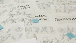
SKETCHING IDEAS
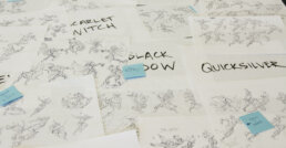
Nothing is quite as helpful to the early design phase as sketching ideas. This allowed our team to quickly work out poses for each of the characters to get a great sense of how they would work together before refining in CG.
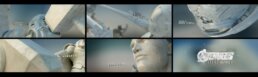
MODELING
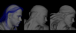
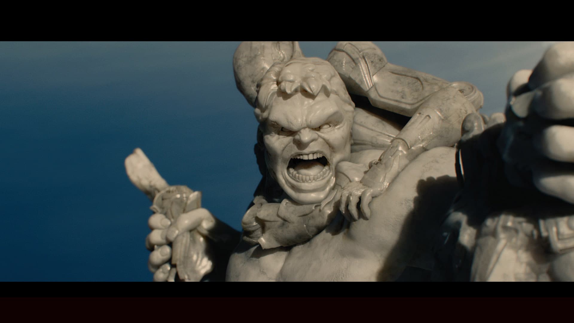
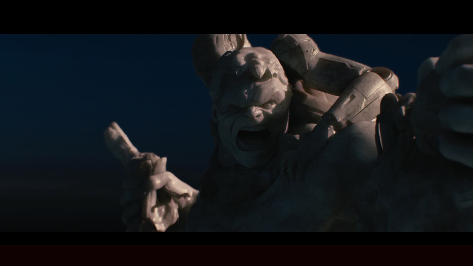
We were provided models from Marvel Studios and went through several steps to get them ready for production. The models were first rigged so that they could be posed quickly. They were then exported into Zbrush where they were turned into one solid piece as if they were sculpted out of marble. This meant merging and cleaning up hundreds of pieces of geometry to work as a solid object. Our artists then added details back into the model, as well as new details that were not in the original models. This included hair, beards, and other details that were created from displacement maps.
LAYOUT
Once our team had the poses dialed in, our artists then built the monument to life-sized scale preparing it to be handed off for camera choreography.
ANIMATIC
Since the monument had been built first, the animation process was one of discovery, finding the most interesting camera moves possible. Over 200 camera moves were created and cut down to just 27 shots in the animatic. These shots told the story perfectly and were composed to allow room for the titles.
LOOK DEVELOPMENT
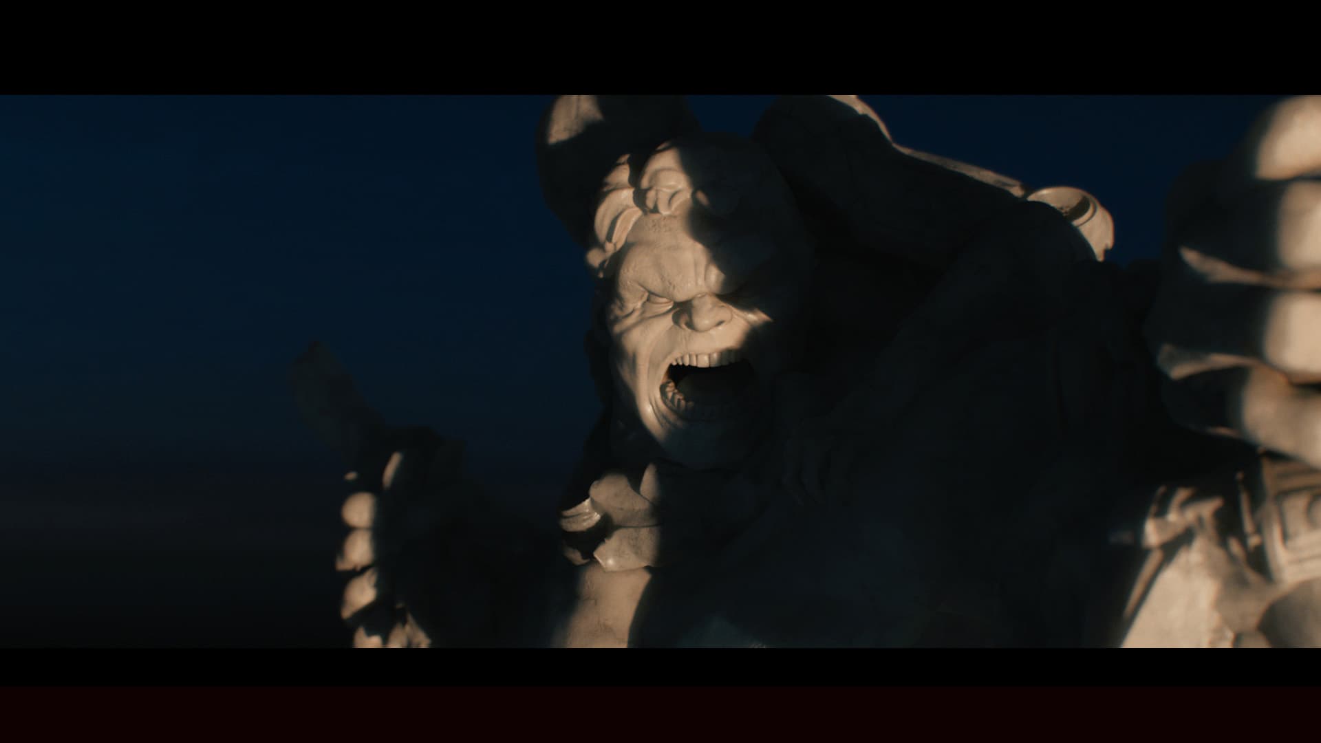
Our look development process explored different types of marble, various lighting scenarios and different times of day.
TYPE EXPLORATION
The typography was designed to be classic and elegant to evoke the spirit of Greco Roman Sculpture.
QUALITY CONTROL
Every shot is scrutinized for imperfections as well as refining the depth for stereo.

05
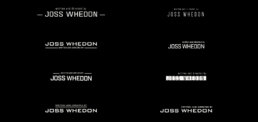
FINAL DELIVERY
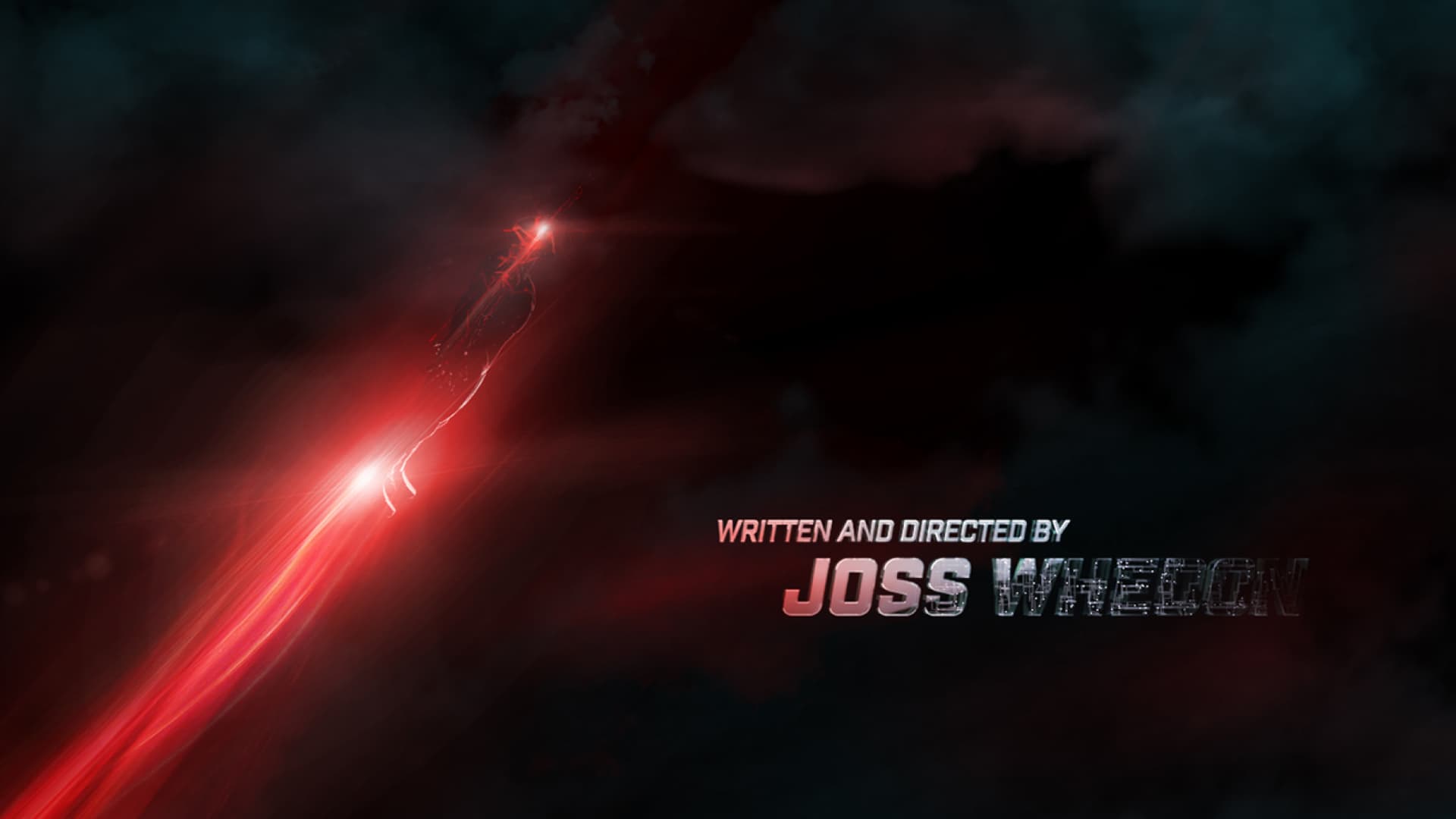
“TO PUT THESE GUYS IN MARBLE, IT ELEVATES THEM BUT IT ALSO GROUNDS THEM IN A WAY, SAYING, ‘YEAH, THESE GUYS ARE VETERANS OF A WAR THAT THEY FOUGHT TO THE LAST AND, IN SOME CASES, GAVE THE LAST FULL MEASURE…
THAT THEY SHOULD BE REMEMBERED.”
—JOSS WHEDON
06
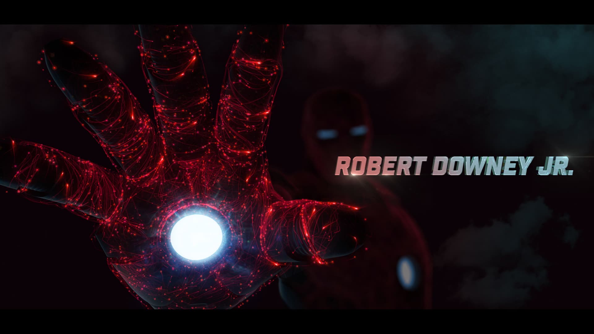
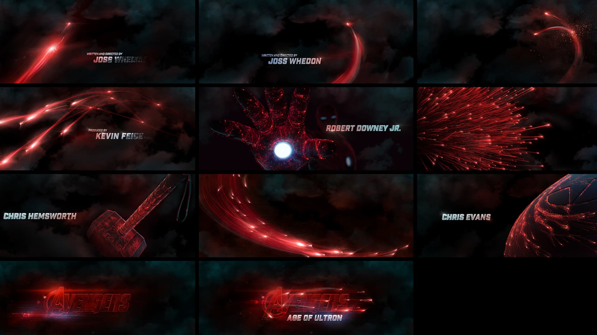
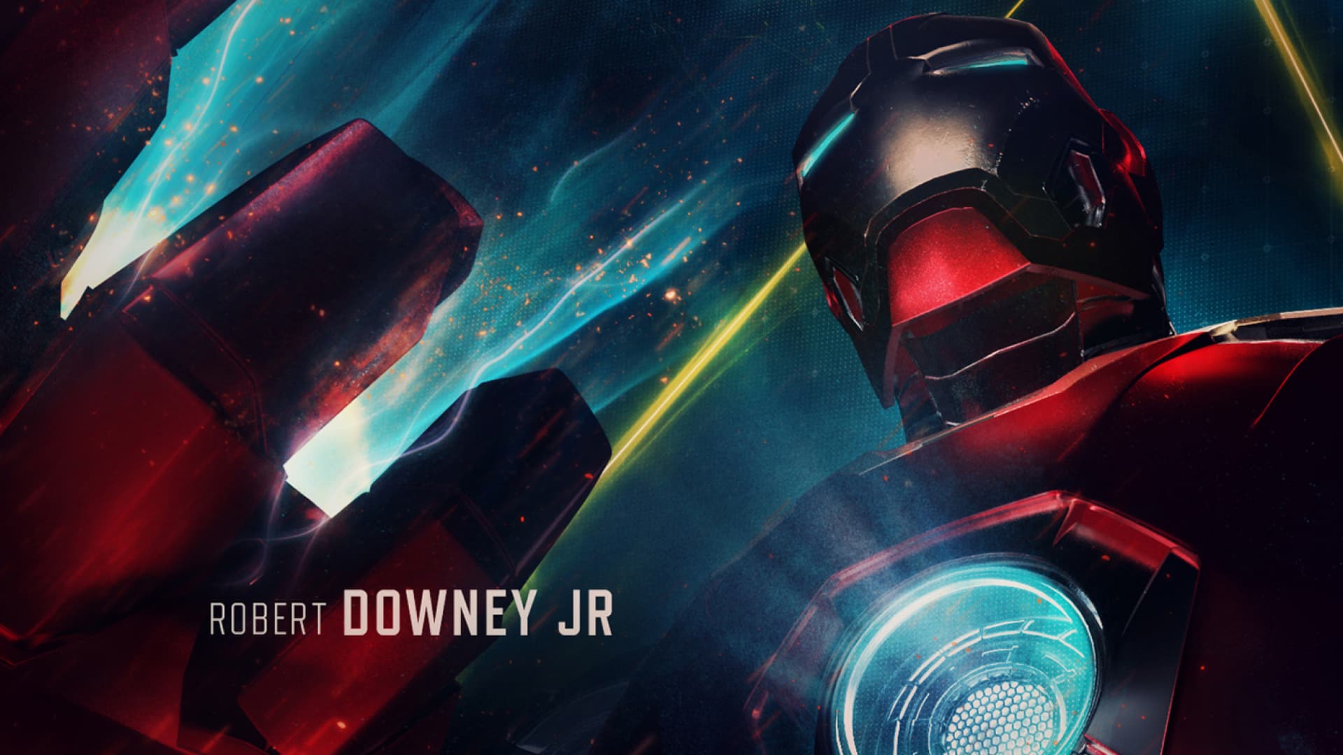
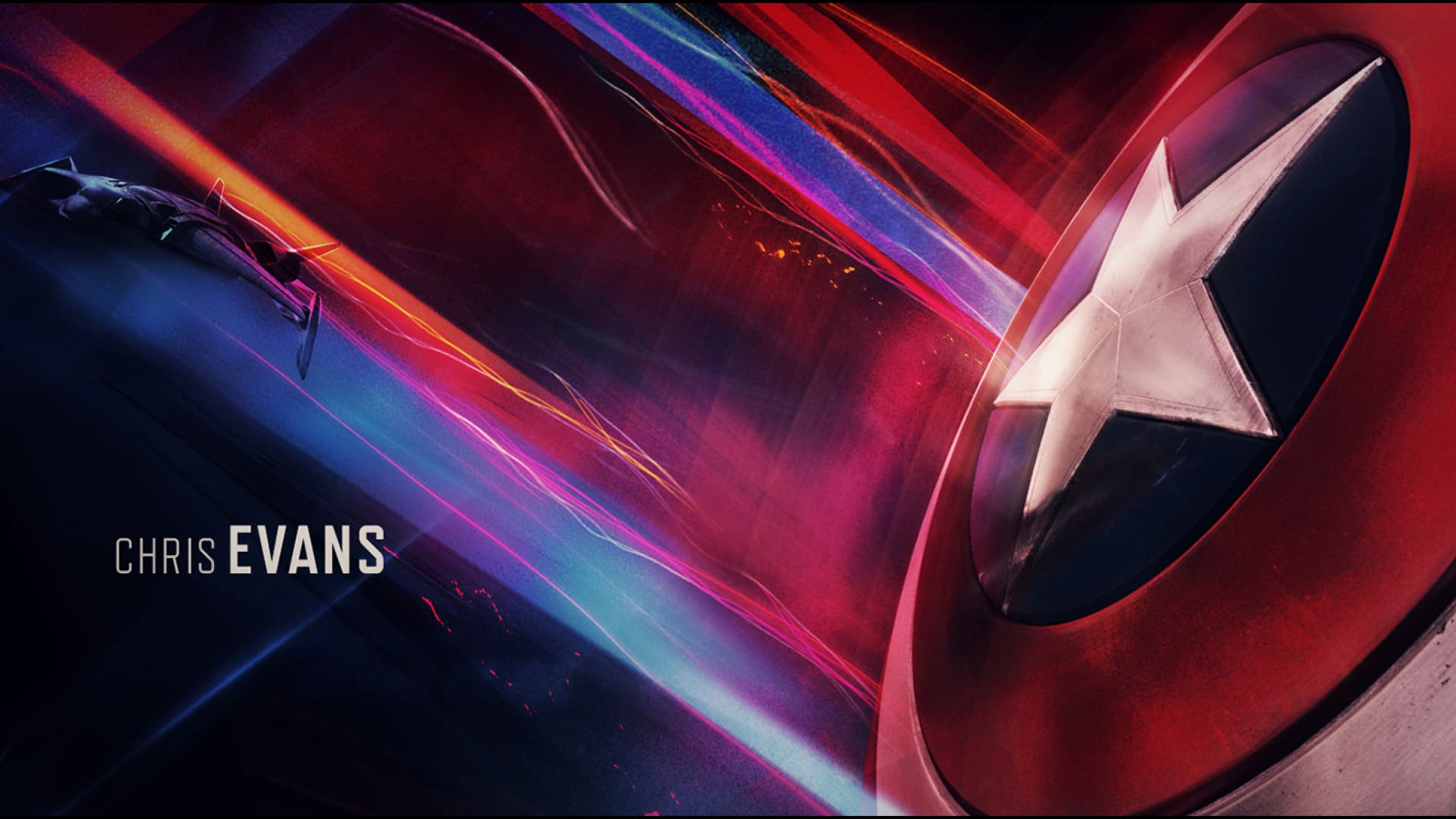
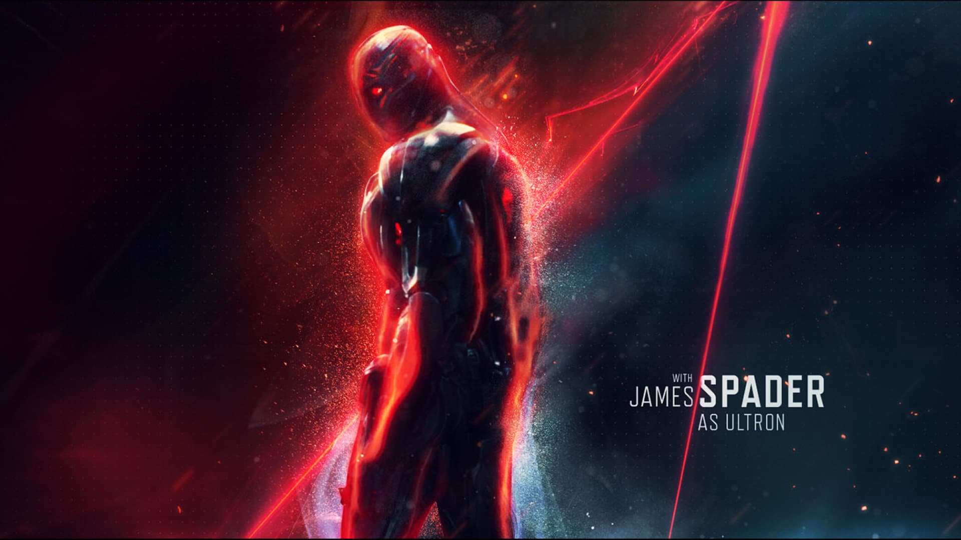
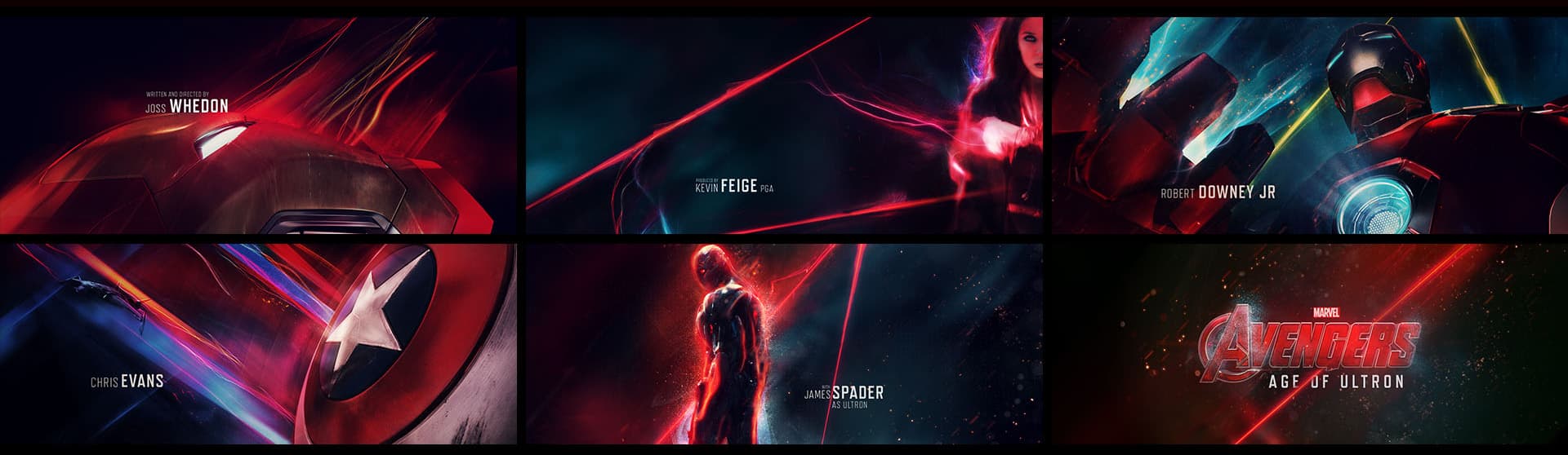
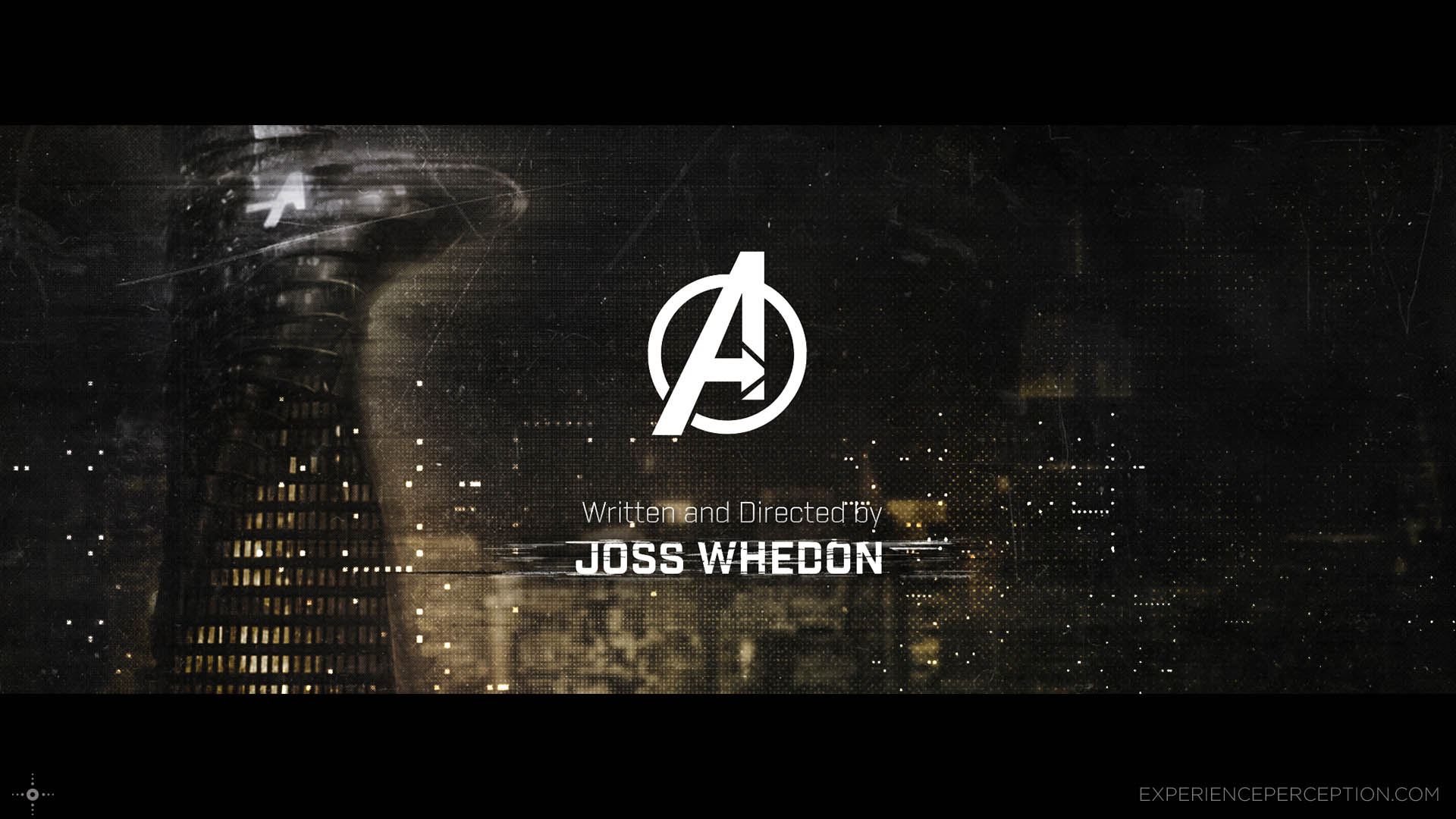
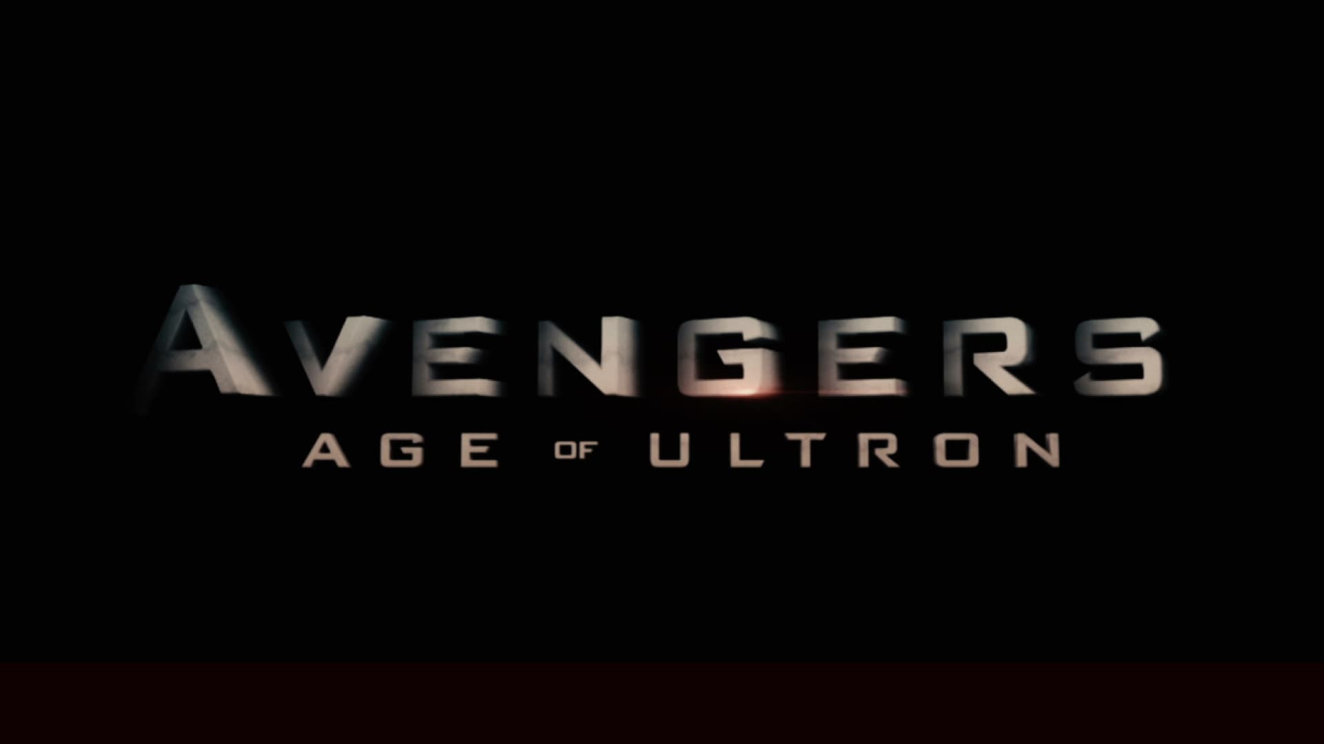
OPENING TITLES
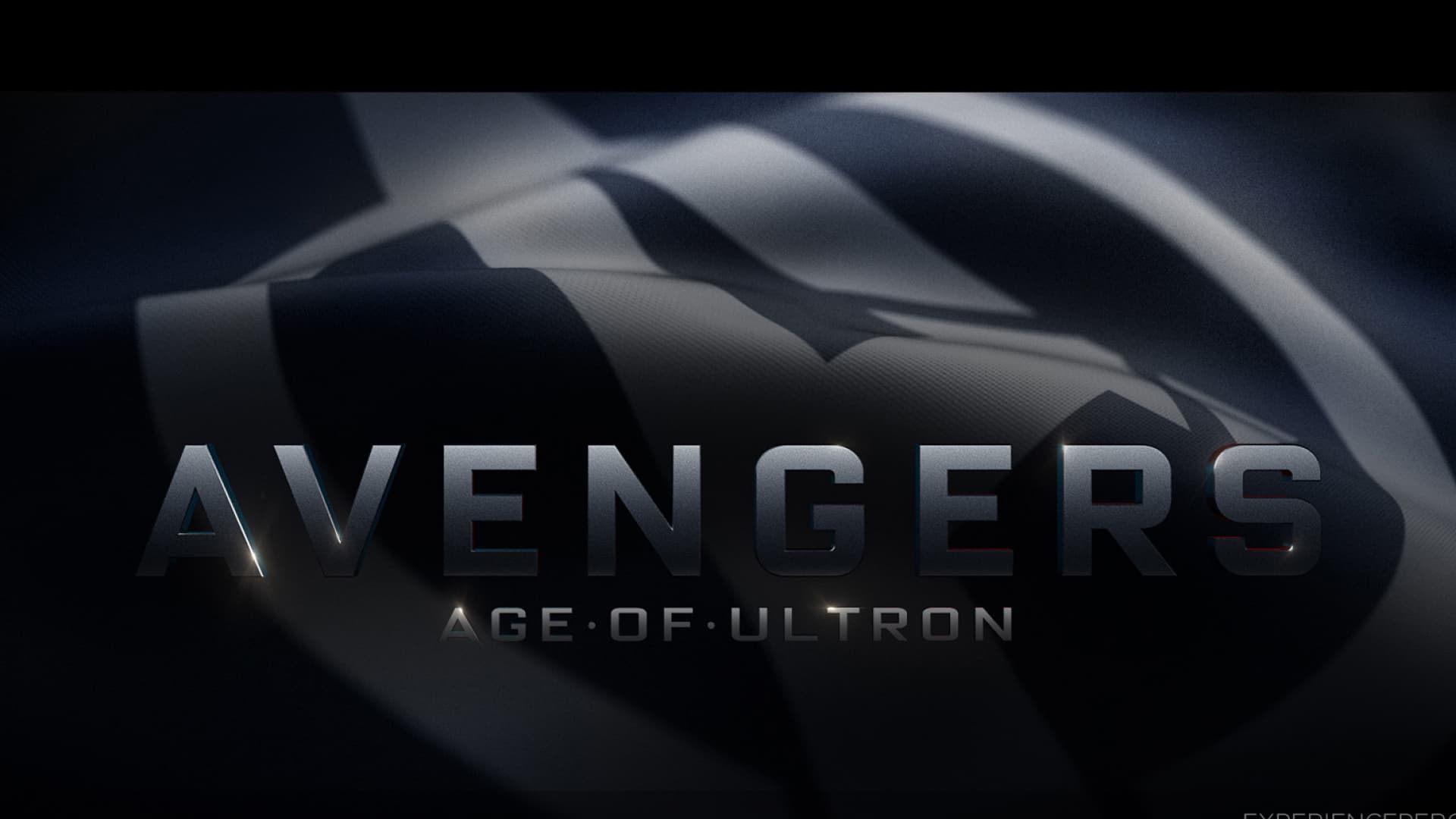
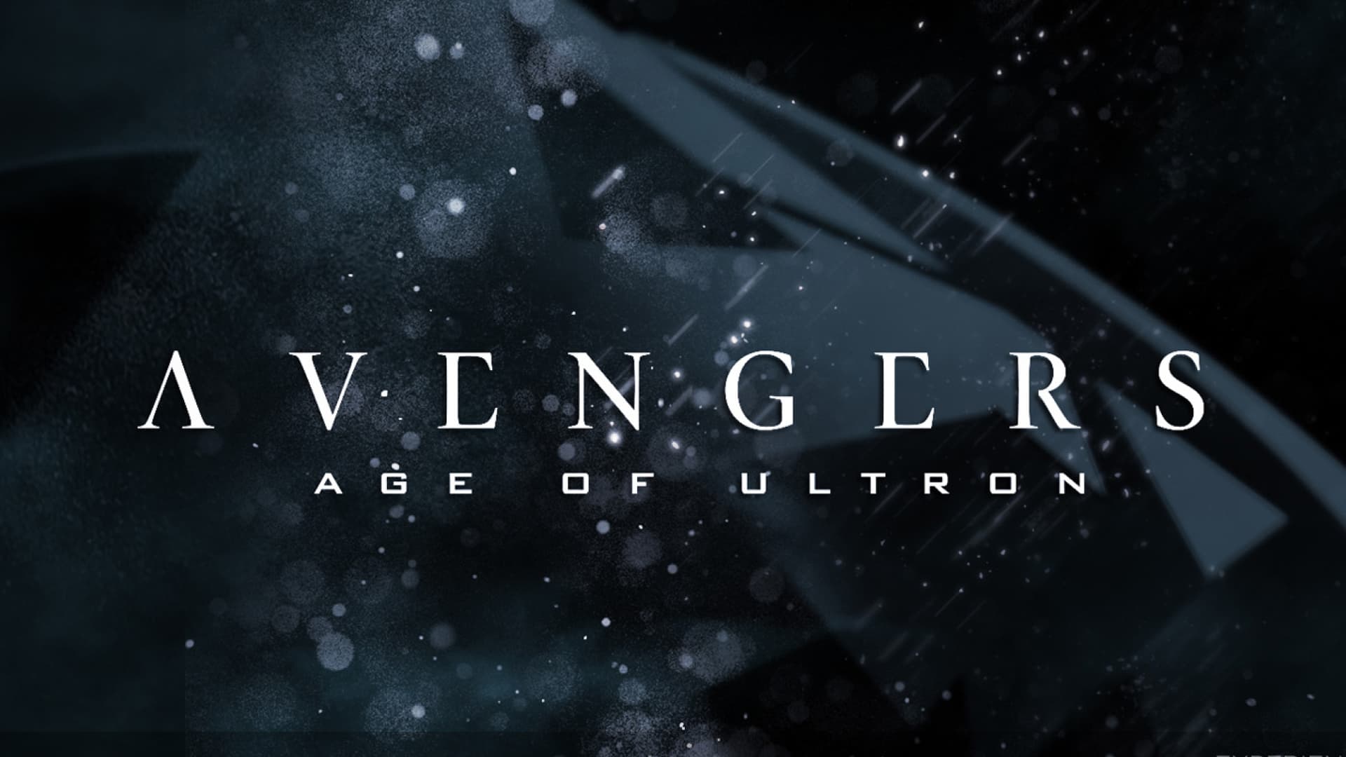
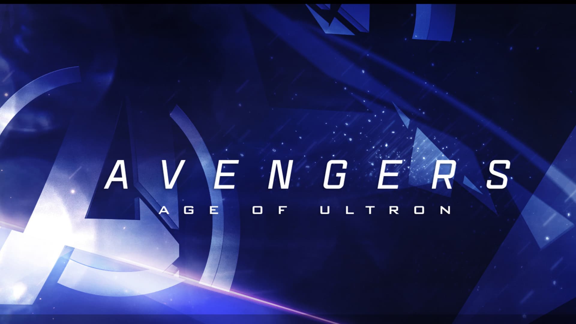
THE PITCH
Marvel Studios’ main direction was: “If the first Avengers film could be described as ‘sunrise’, the sequel can be described as ‘night is falling’”. Taking that direction, our team put together several frames with a darker tone than the original film.
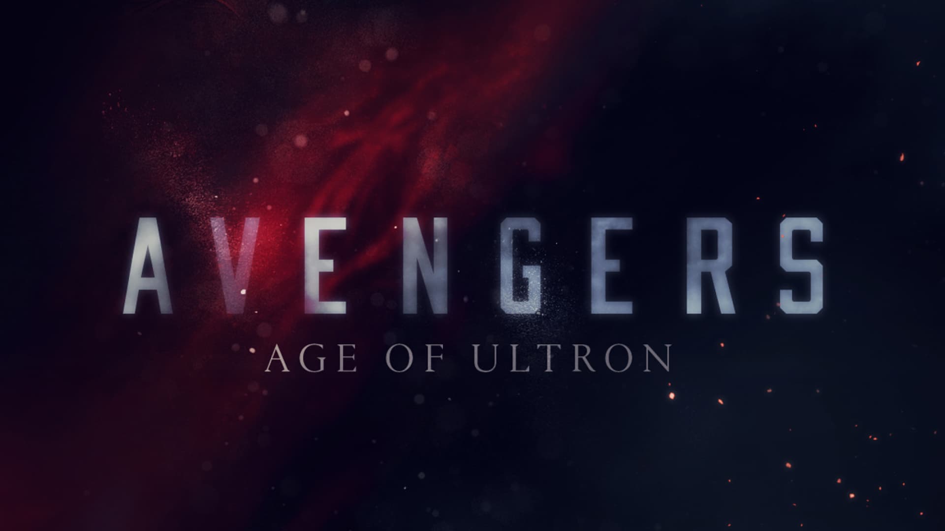
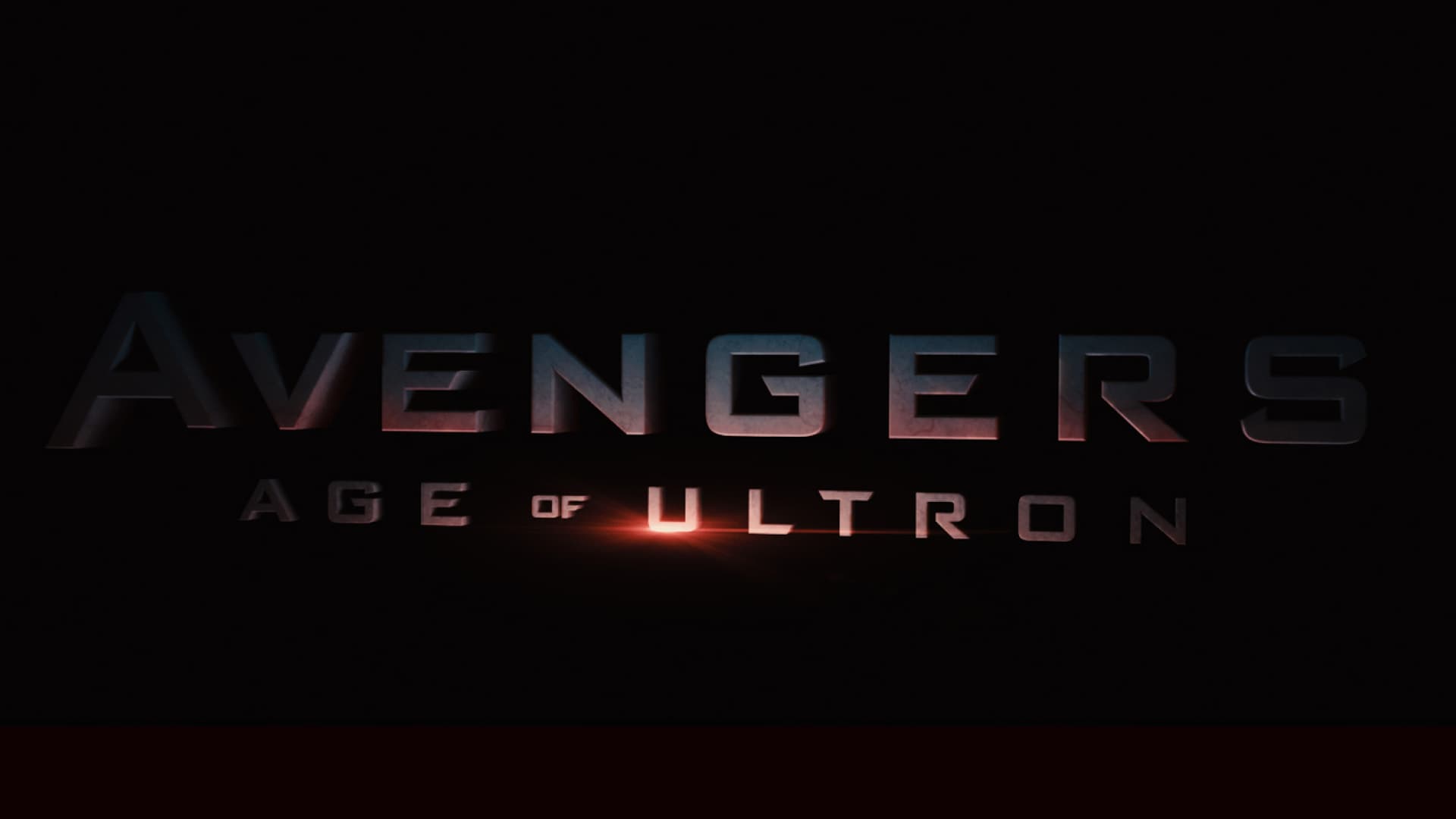
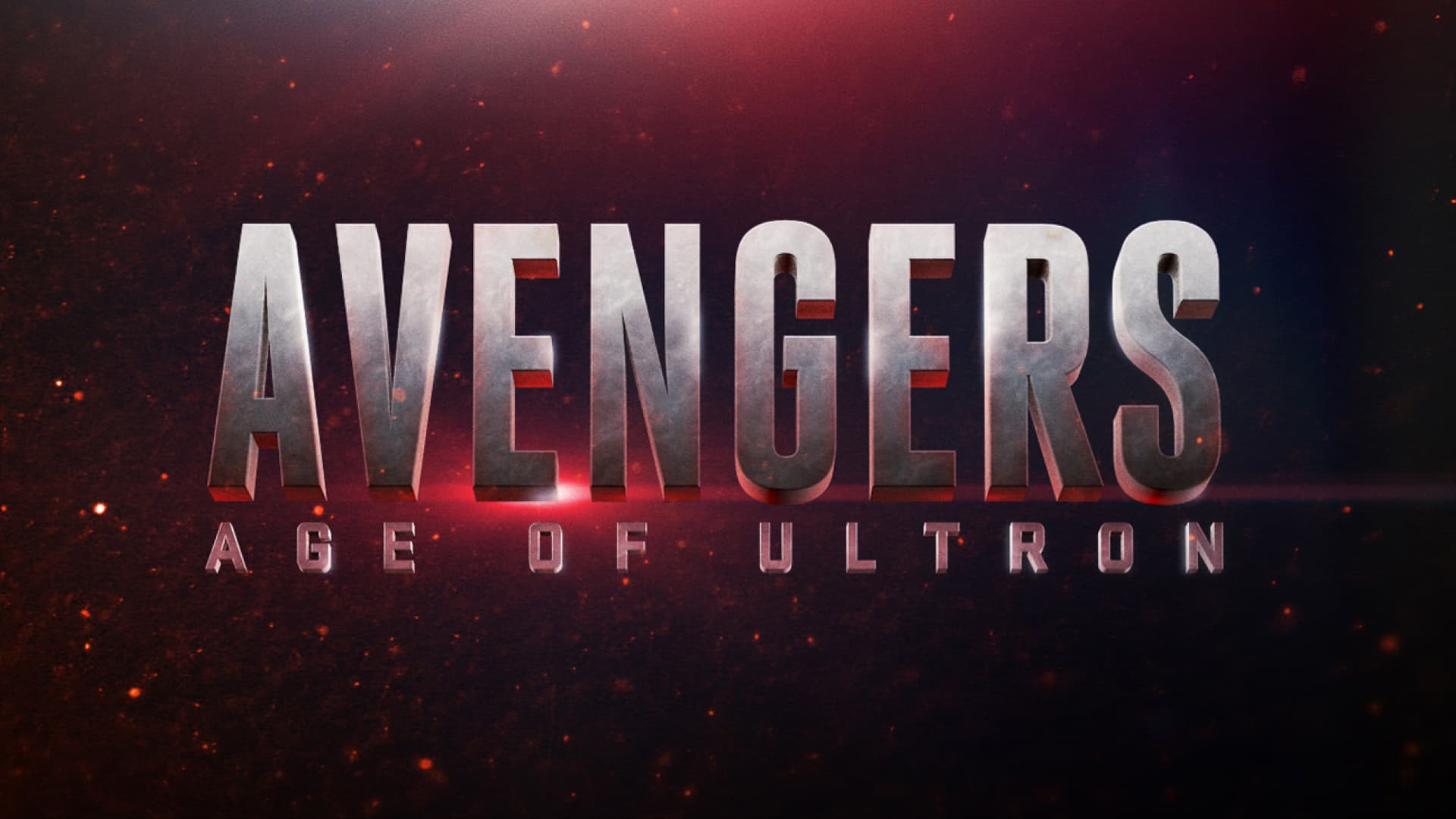
FINAL DELIVERY
After several rounds of exploration, Marvel Studios wanted the type to be a direct continuation of the first film. While the first film’s type rotates towards the camera, that motion is continued here by rotating away from the camera. They also chose to have “Age of Ultron” overtake the “Avengers” type. After combining these two main ideas, we used a marble texture for “Avengers” to mimic what had been done for the Main-On-End Titles and a vibranium texture for “Age of Ultron” to mimic the robot’s actual material.
07
CONCLUSION
Our team at Perception wishes to thank Joss Whedon, Kevin Feige, Louis D’Esposito, Victoria Alonso, Jeremy Latcham, Jennifer Bergman, and the entire creative team at Marvel Studios for letting us play a role in this film.