01
INTRODUCTION
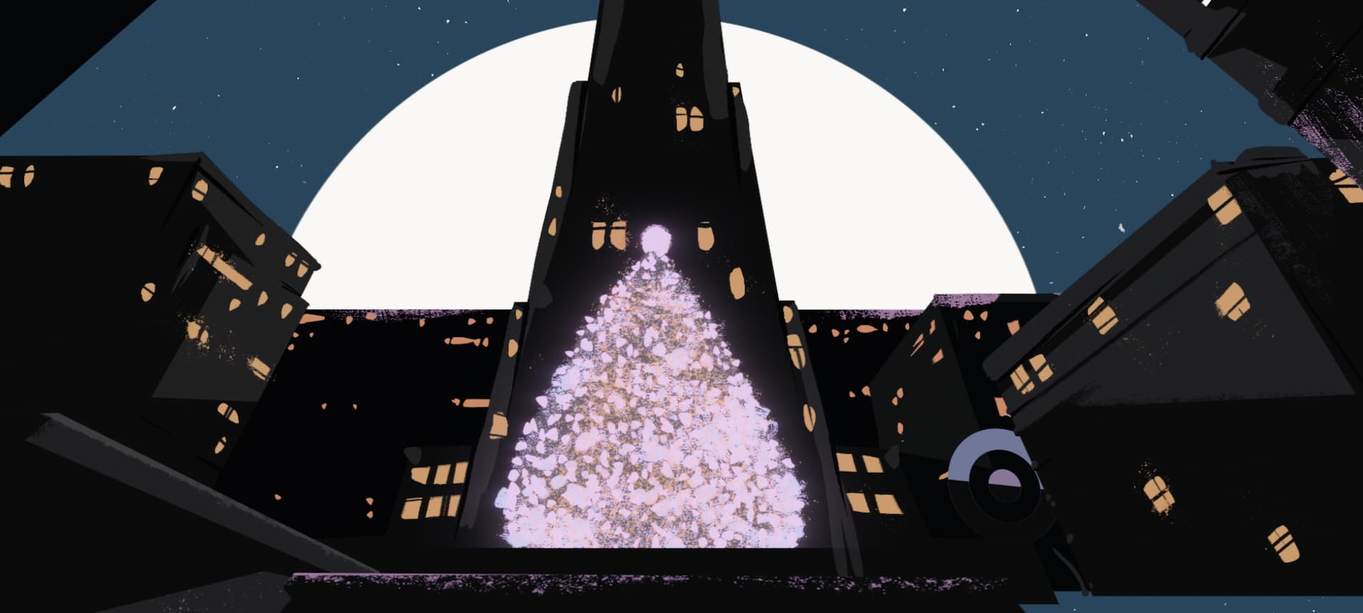
Marvel Studios asked our team at Perception to collaborate on their latest streaming series, Hawkeye. In this show, we catch up with Clint Barton after the events of Avengers: Endgame while also meeting Kate Bishop, a young archer inspired by Hawkeye. After a series of events that forces the pair to combine forces, we follow their action-packed journey leading up to Christmas Day, and hopefully, Clint’s return to his family for it. Our team designed the main on end title sequence, the opening title sequence for episode one, and more for Hawkeye.
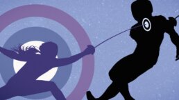
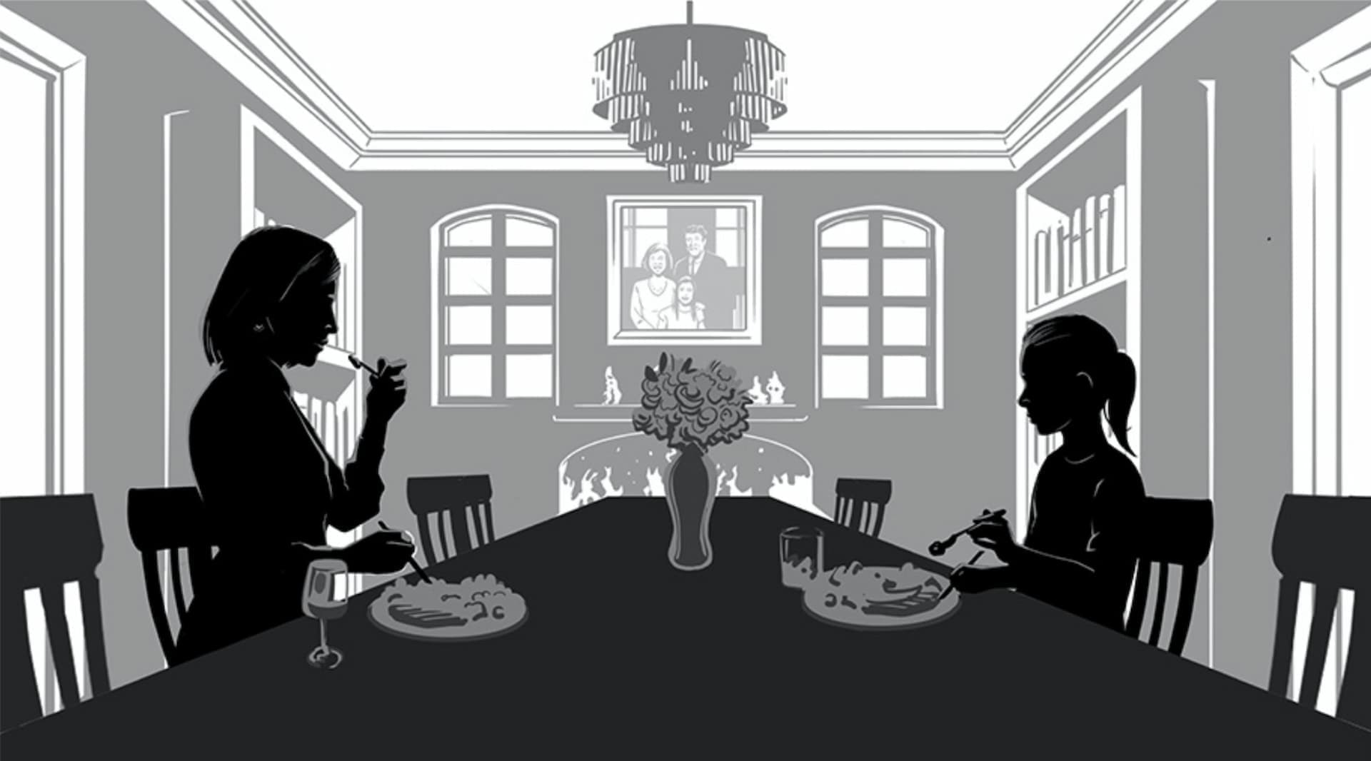
Hawkeye Episode Six Main On End Title Sequence
02
Opening Title Sequence
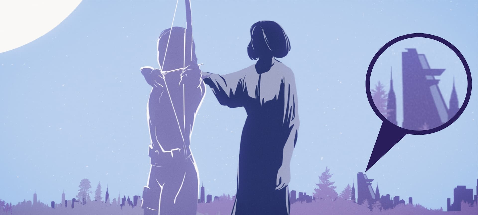
One of the most exciting things about Hawkeye is the introduction to Kate Bishop. At the beginning of the first episode, we meet Kate Bishop when she is a young child. Many years pass between her first appearance and her becoming a talented archer and fighter. Marvel Studios discussed with us that they wanted to tell the story of those very important and formative years in her arc, and therefore, it was decided that episode one would have an opening title sequence to depict this.
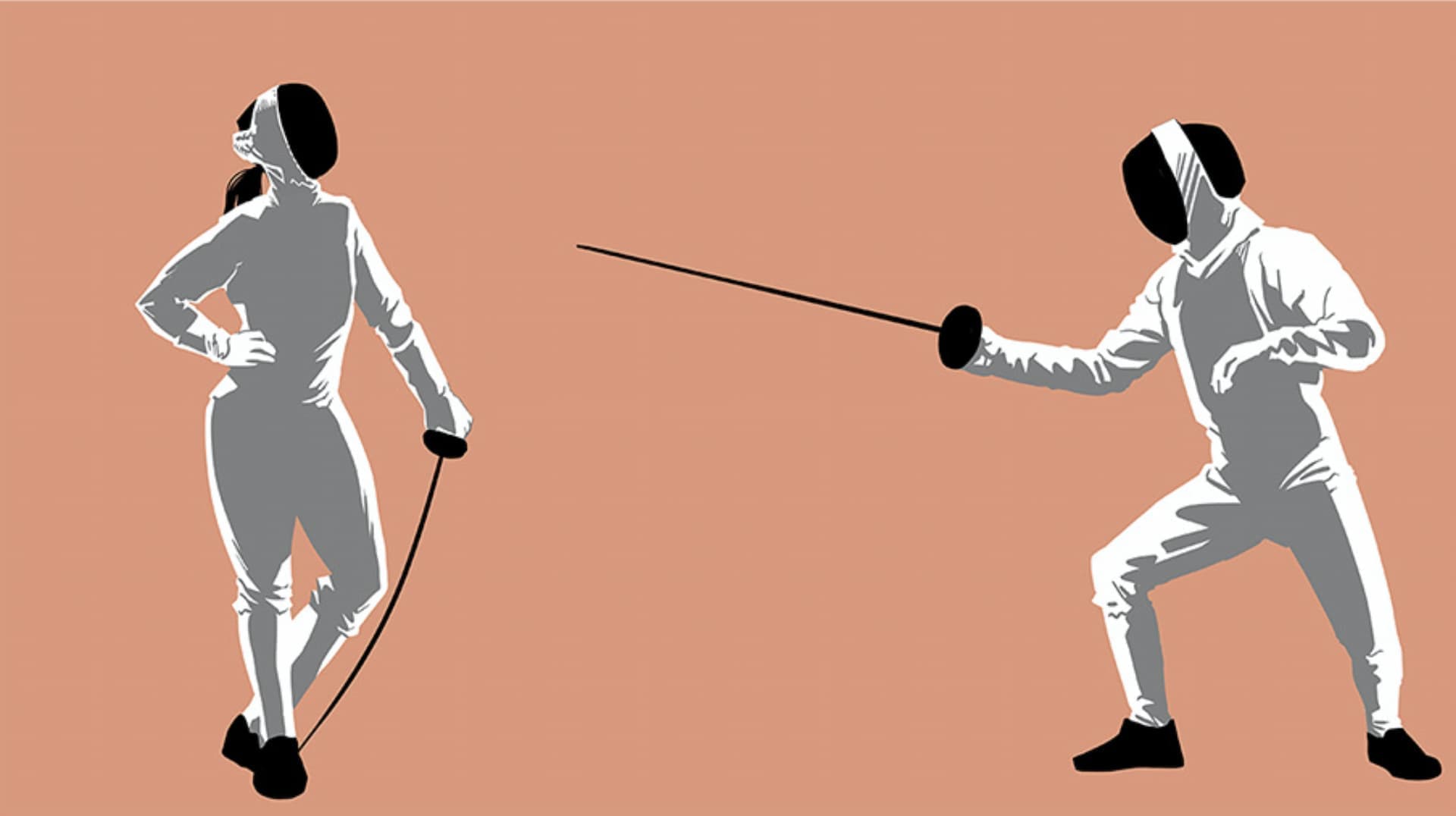
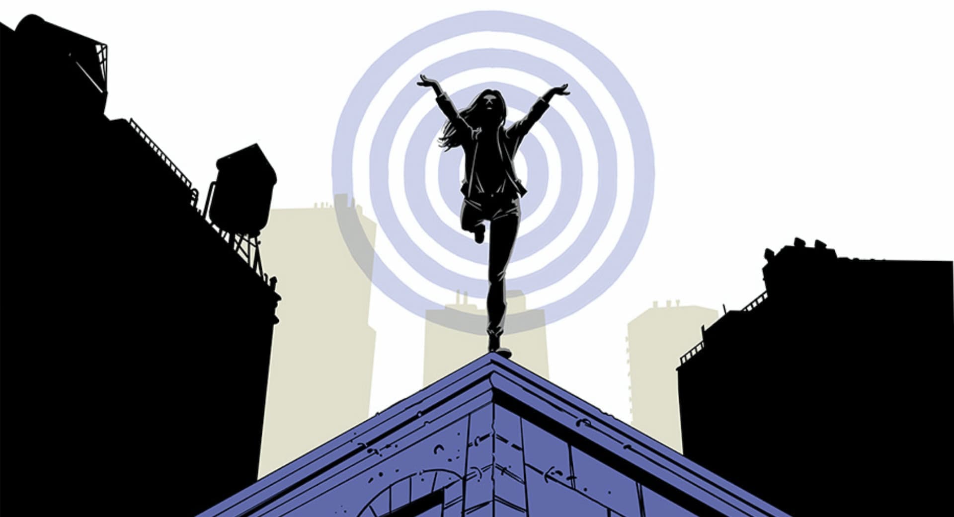
Hawkeye Episode One Opening Title Sequence
Developing the Story
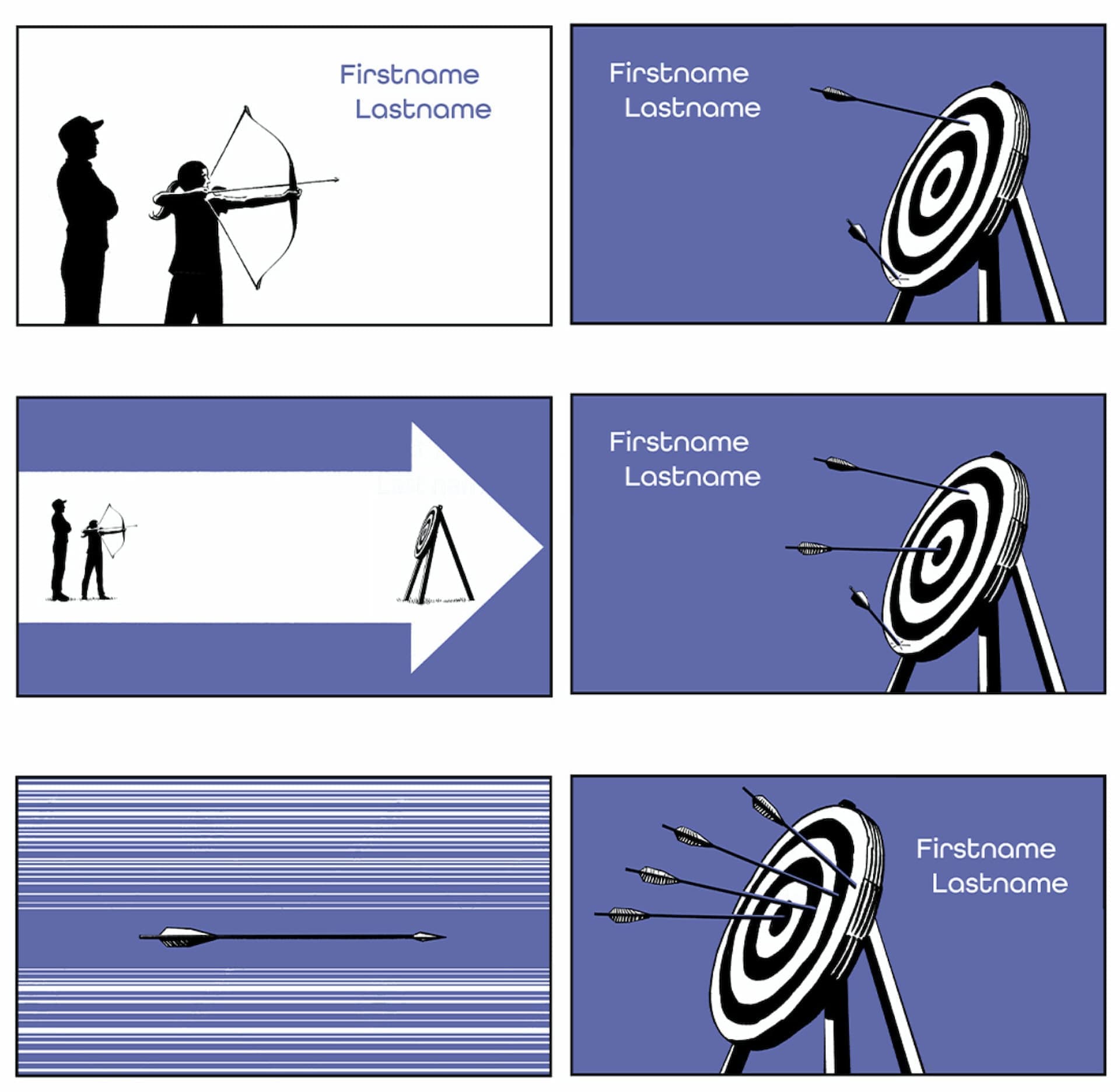
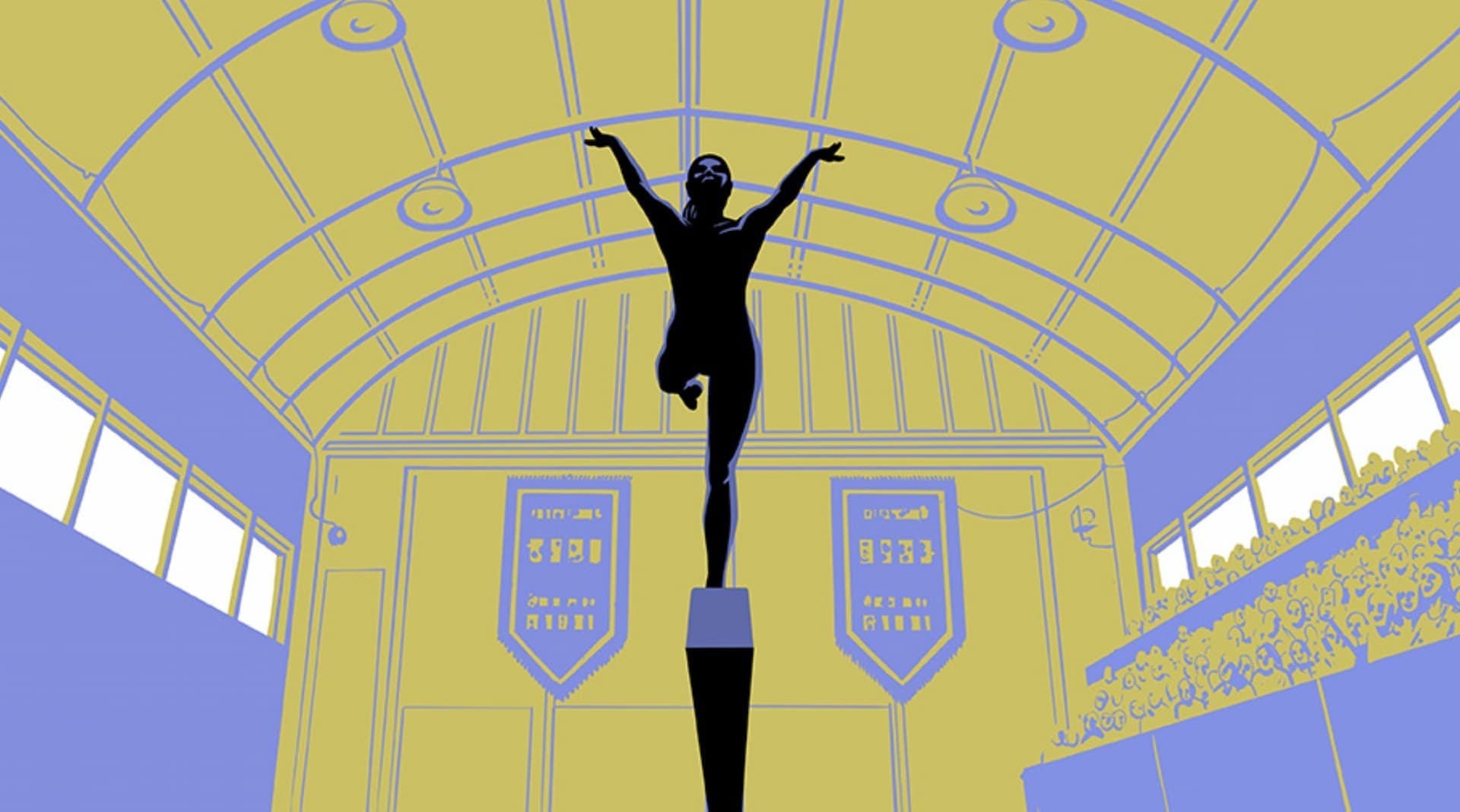
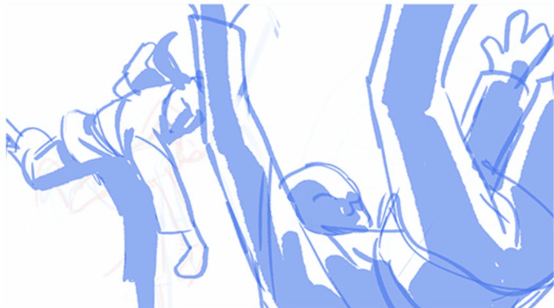
Since it was important to show Kate’s development in the opening title sequence, we created several developmental frames to lay out how the story could be told. Marvel Studios provided us with her main arc, and we had creative liberty to develop details along the way.
Opening Title Sequence Development Frames
Once a plot direction was chosen, we began designing the frames to follow the same visual style as the main on end title sequence.
Details in the Design
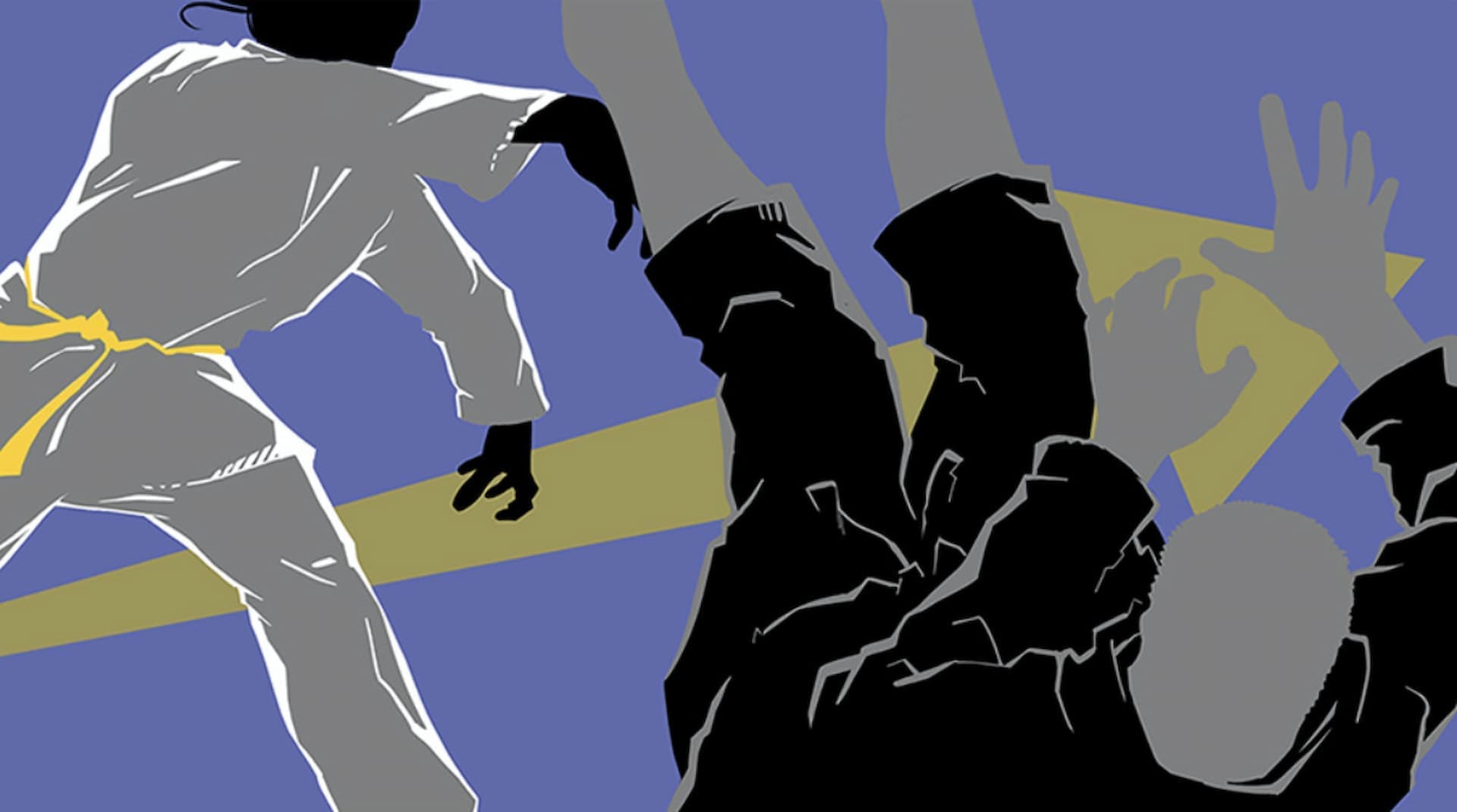
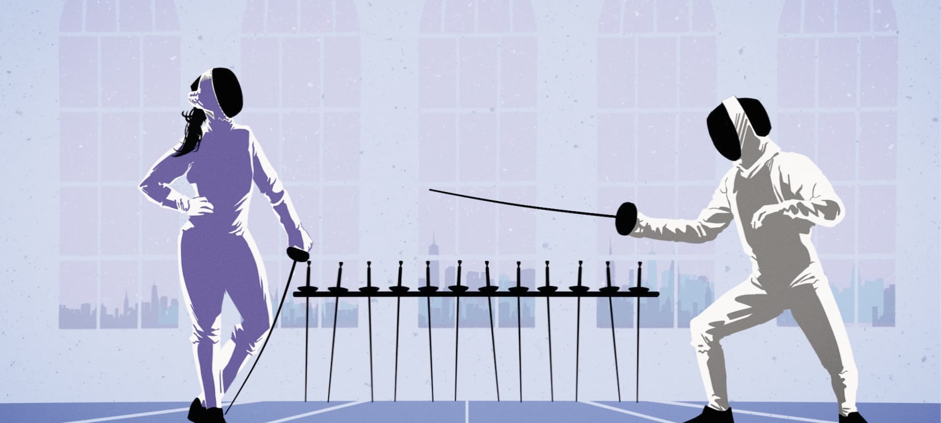
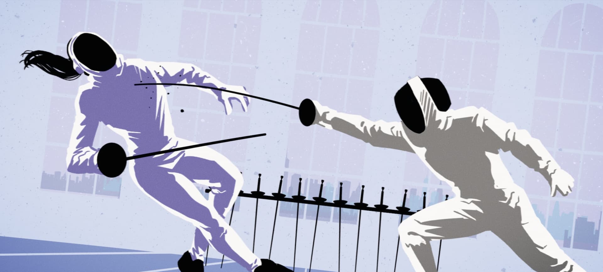
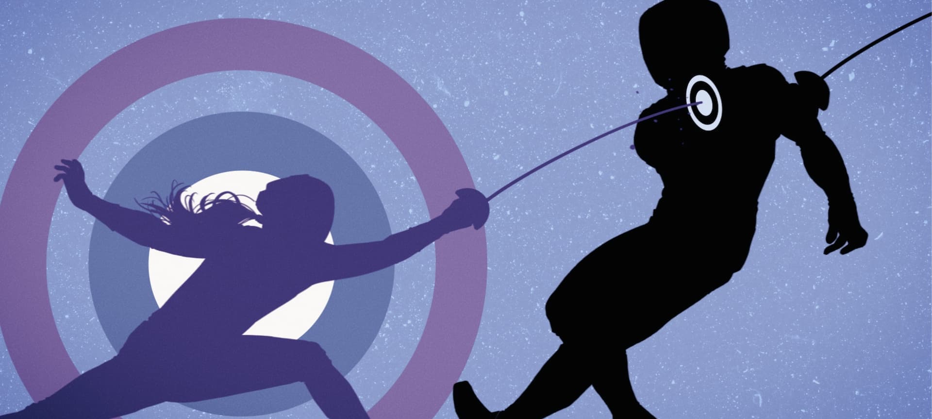
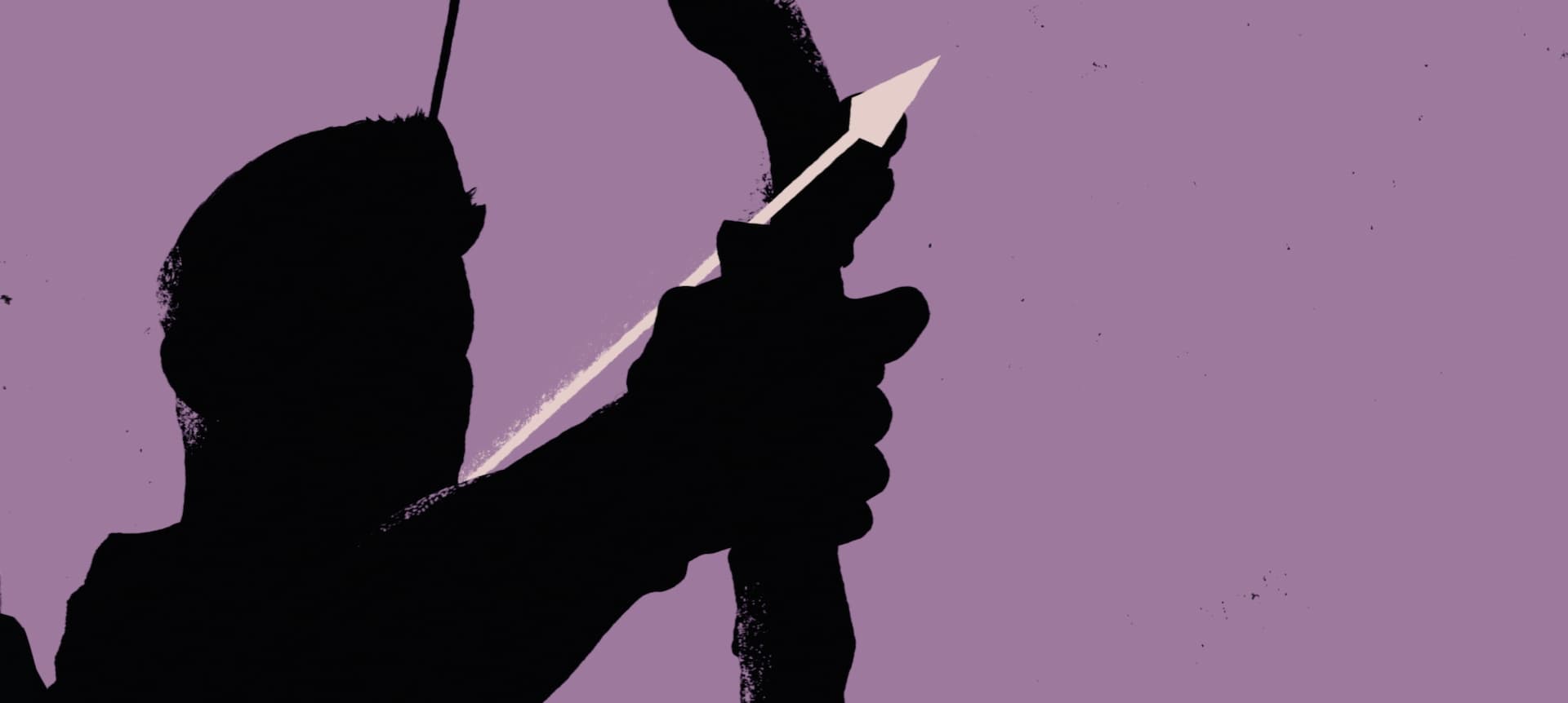
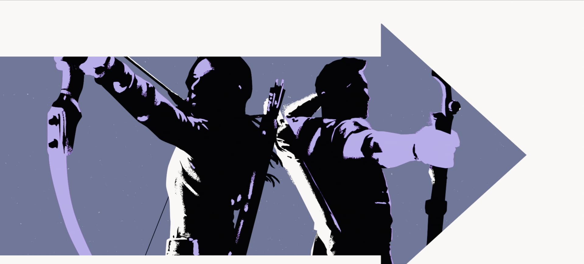
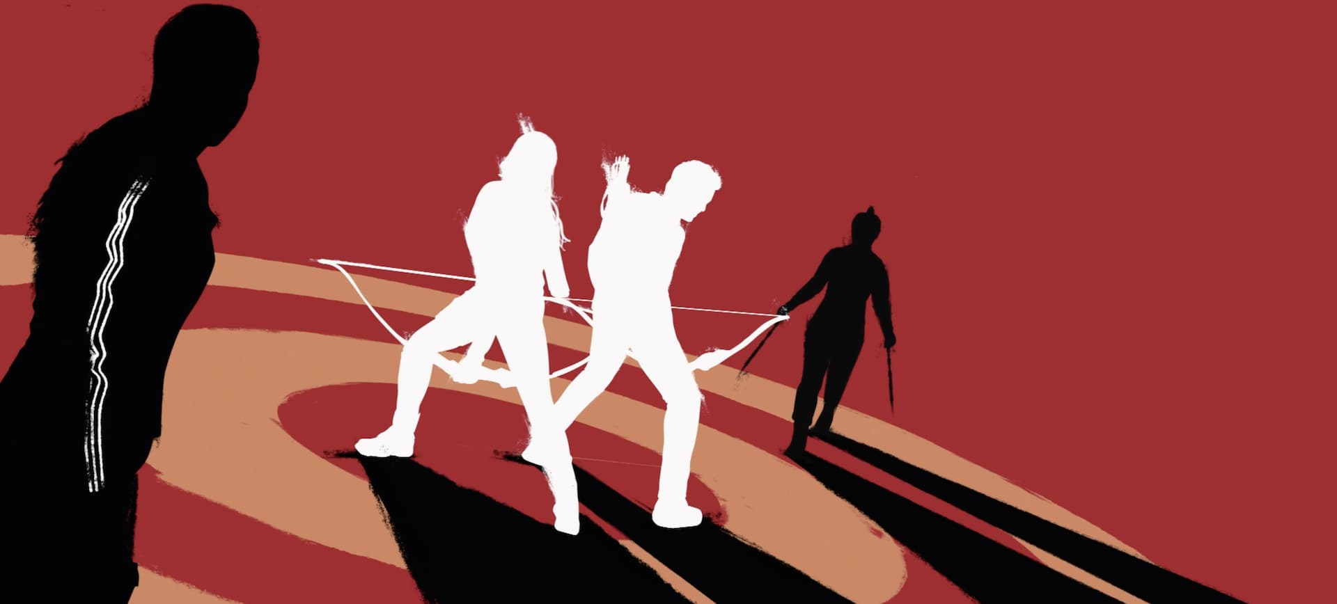
Like all of our title sequences, we wanted our title sequence to feel as true and genuine to the character as possible. To really connect with Kate, we went to the source material of the comics and found great inspiration in the Hawkeye comic illustrations by David Aja. Aja’s style is incredibly unique and adored, and therefore, we wanted to pay homage to this run of comics in our design. The silhouettes, color palette, and detailing all emulate Aja’s iconic illustrations. We even added small line work, dots, and shadowing to add depth and dimension to the frames as a reflection of Aja’s style.
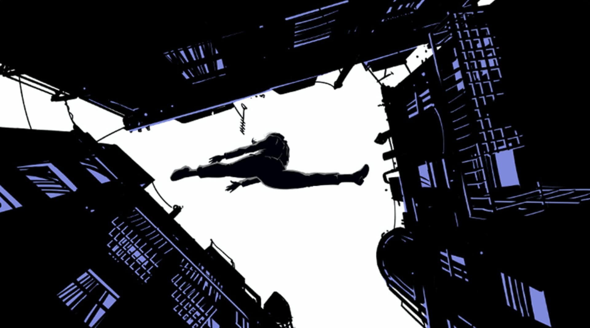
Opening Title Sequence Breakdown
In these comics, Kate is notorious for wearing her purple costume. Therefore, we designed Kate’s silhouette to be purple throughout this sequence to make her character stand out. Shades of blue and purple were also used throughout this sequence since those colors are so closely associated with her and her story.

STORYTELLING
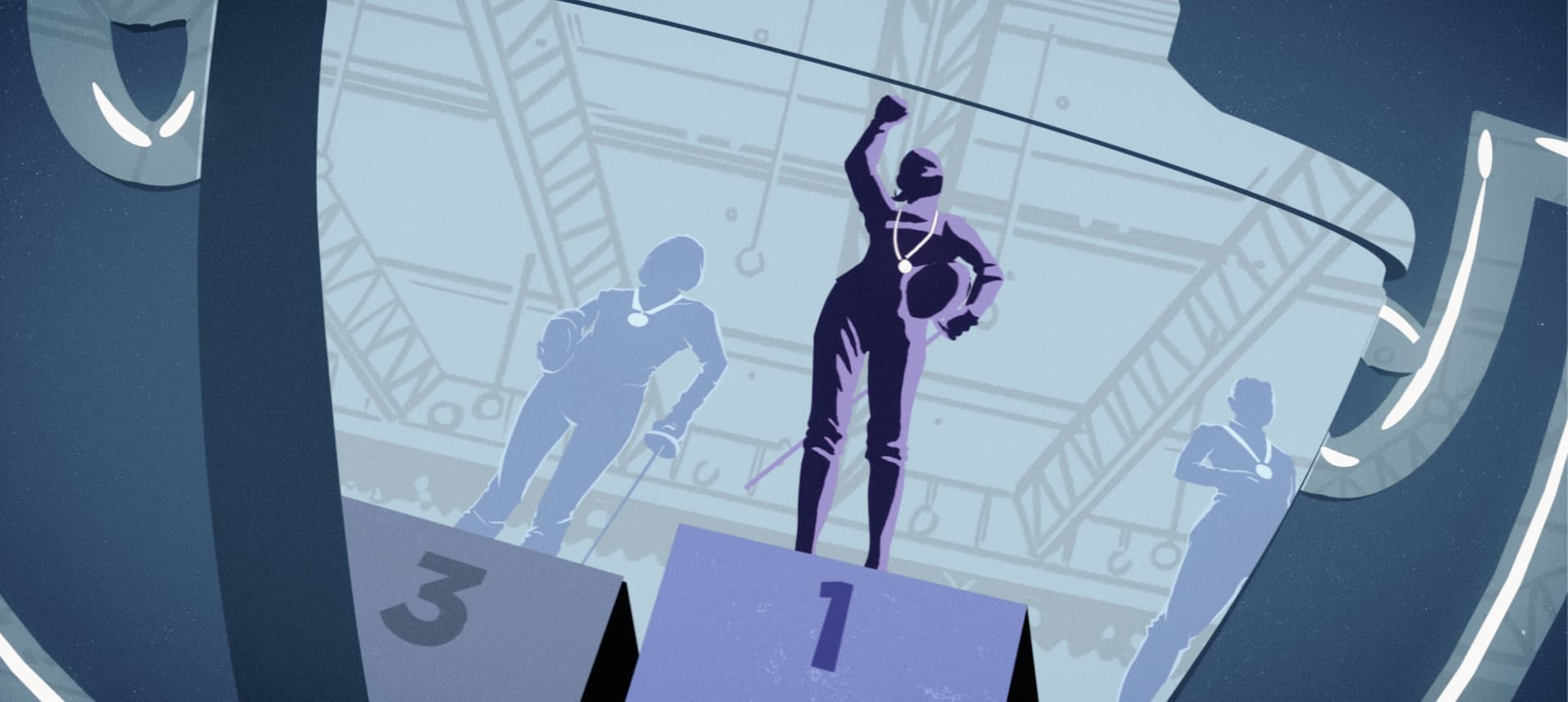
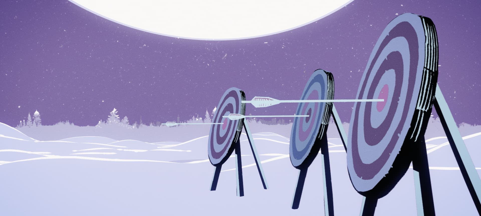
One of the most important features of this sequence is that it tells a story that we do not get to see. Therefore, the story we’re detailing had to be clear and detailed, yet concise. While we could not show every moment of Kate’s arc, we utilized different frames to depict the passing of time and the growth of the character.
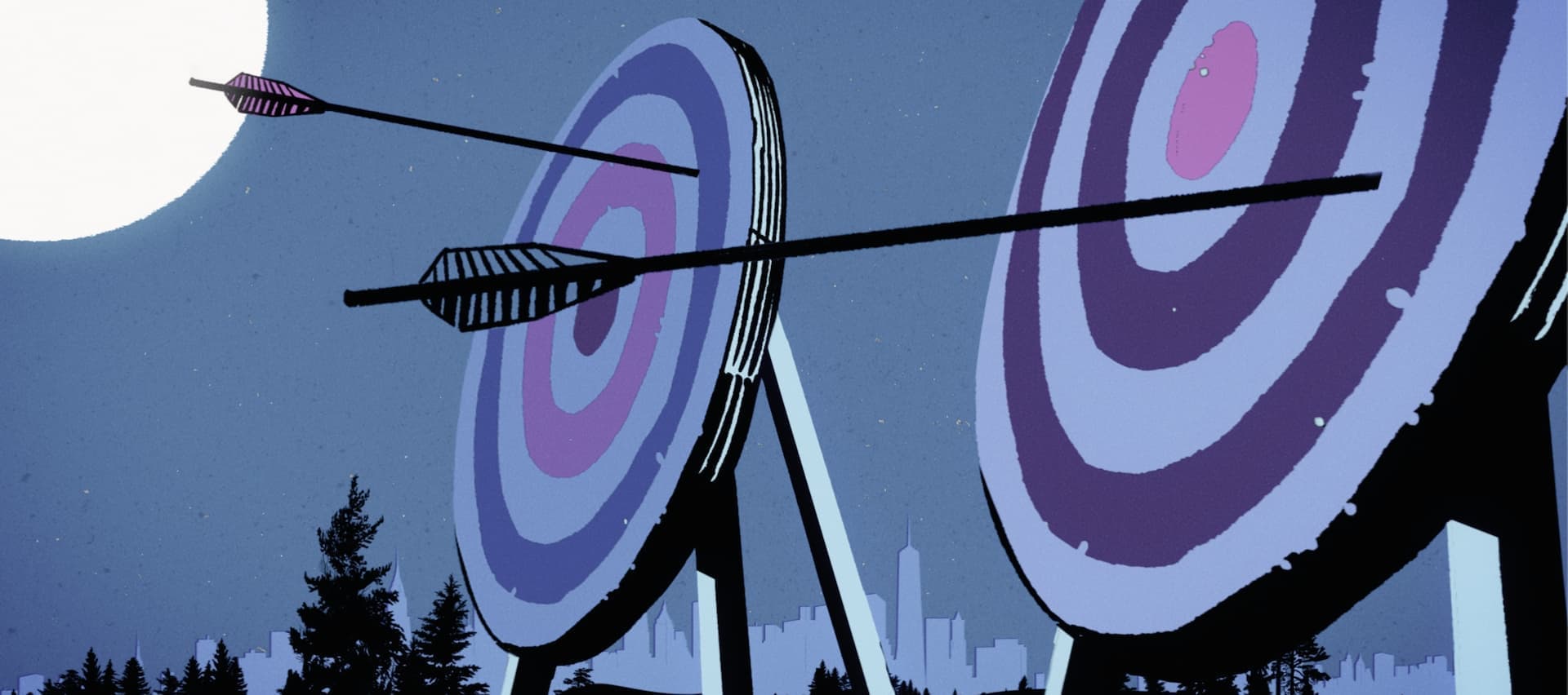
Towards the beginning of the sequence, we see Kate continuously mess up, fail, miss her targets, and get beaten up, but as time progresses, she begins hitting her target, beating her opponents, and collecting more accolades and trophies. While we do not see every moment of her training, the audience can connect that she must have trained vigorously to achieve such great progress and awards, since she struggled at the beginning of the sequence.
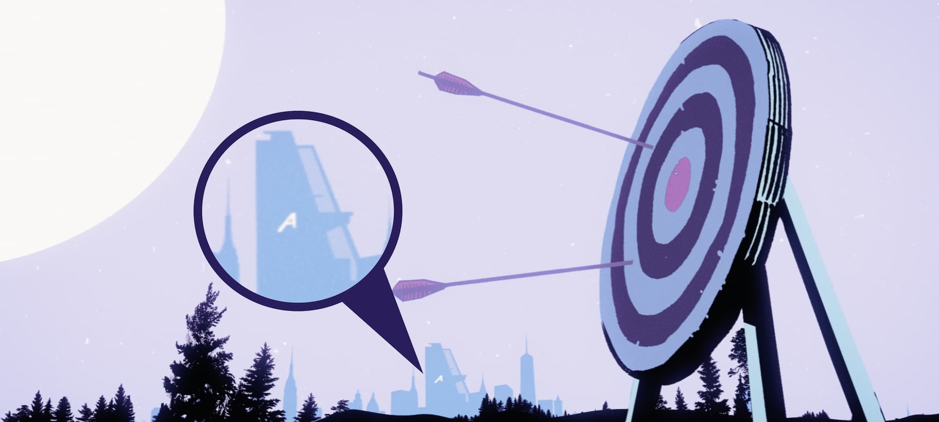
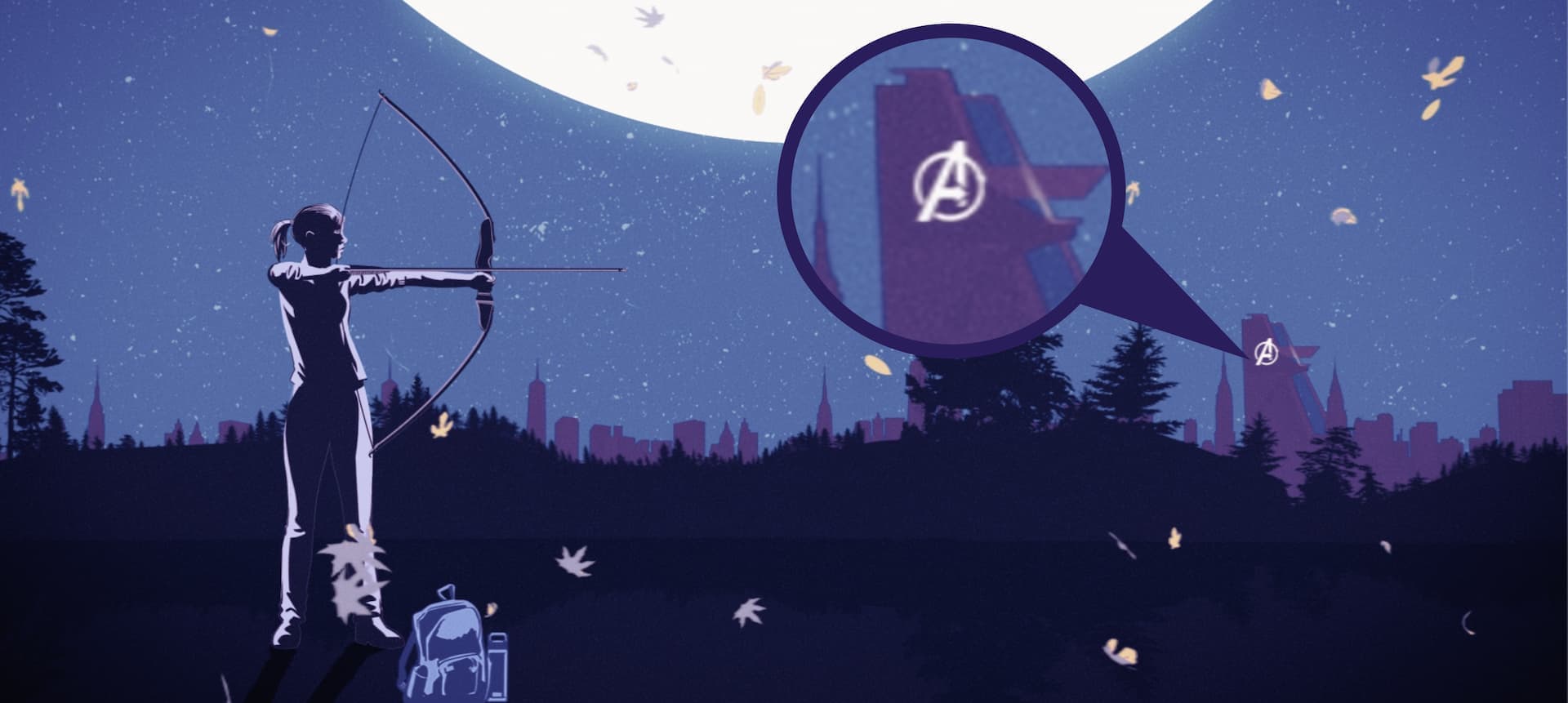
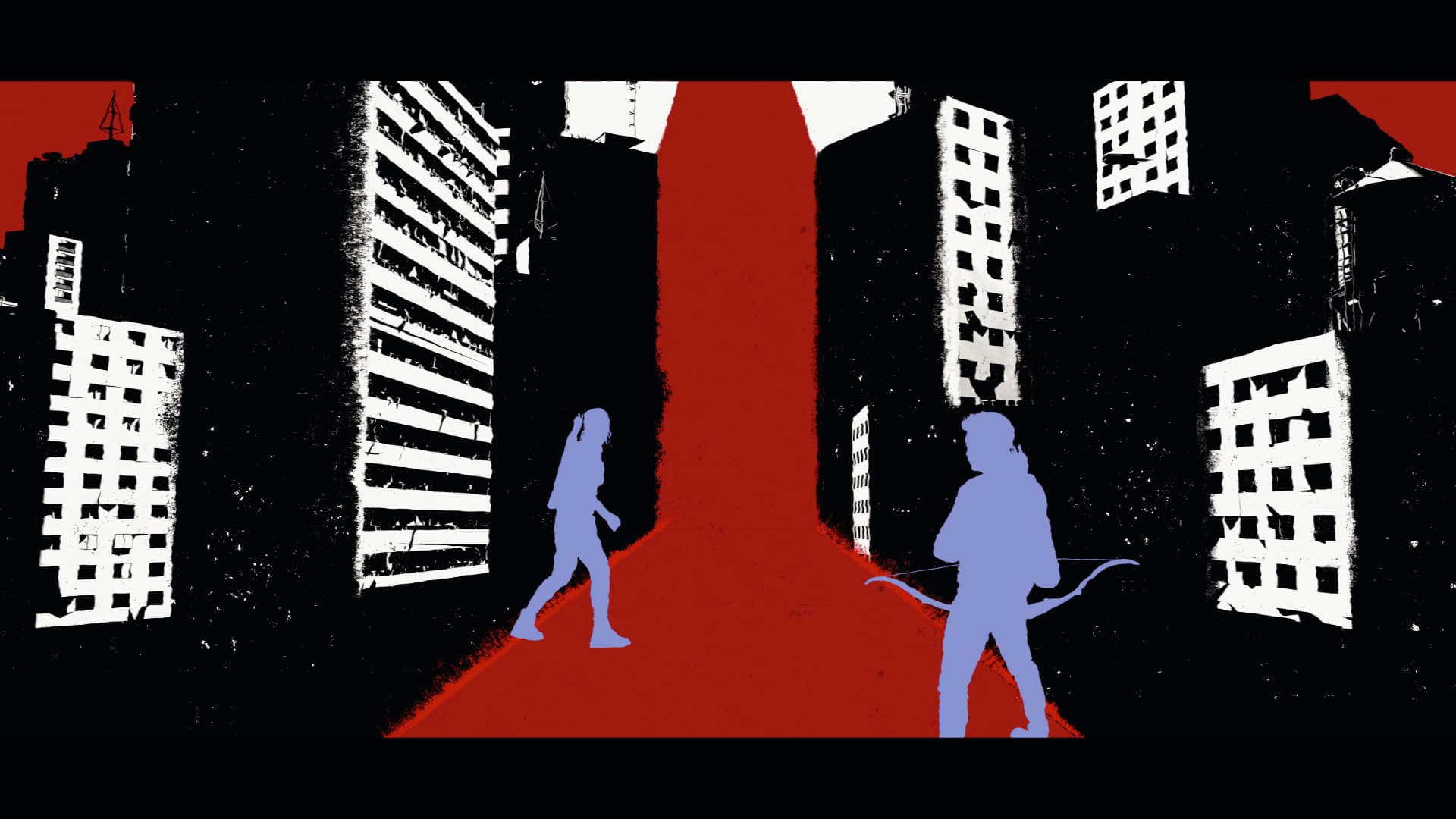
A fun time telling device used in this sequence includes shots of Avengers Tower in the background of Kate’s journey. As time progresses, the “A” and the logo on the tower change and update to correspond with who was owning or occupying the tower at that time as well. We start the sequence with seeing just the “A” from the destroyed Stark Tower after the events of the Avengers. Next, we see the Avengers logo on the tower when it’s being occupied by the Avengers. Lastly, we see the tower without any markings, showing that this scene takes place once Avengers Tower was sold. It’s an Easter egg that helps give context to what the time period is while connecting Kate’s timeline to the events we have already witnessed in the Marvel Cinematic Universe.
03
Main on End Title Sequence
With the style and story of the opening title sequence for episode one of Hawkeye decided, Marvel Studios asked us to continue this story in the main on end title sequence. While the opening title sequence tells the formative arc of Kate Bishop, the main on end title sequence highlights the spirit of both Clint Barton and Kate Bishop, as well as the show itself.
Hawkeye Episode Two Main On End Title Sequence
Utilizing Silhouettes
Since silhouettes were the main medium of communicating the story, we decided to pick out specific elements from the series that would be visually dynamic and recognizable to the audience, such as characters, moments, and scenery.

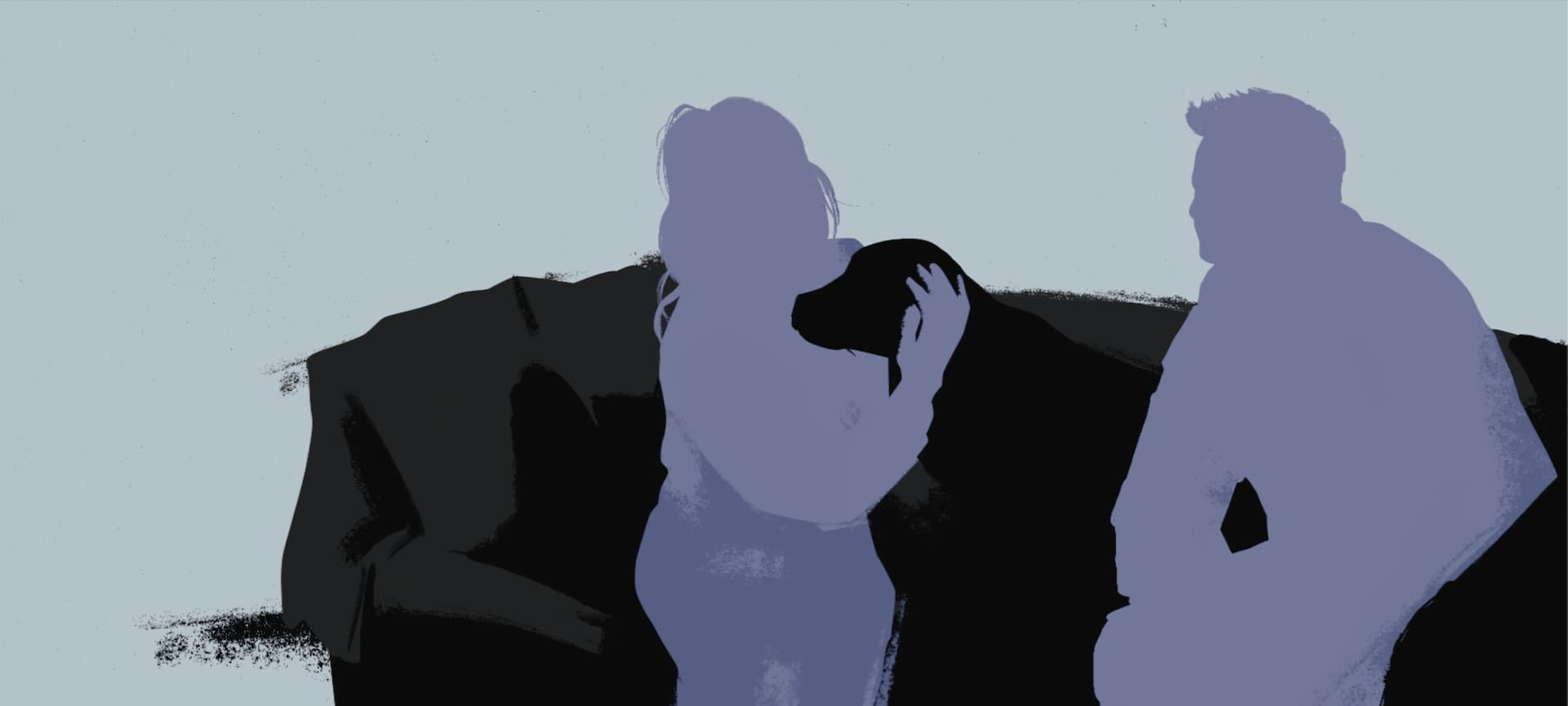
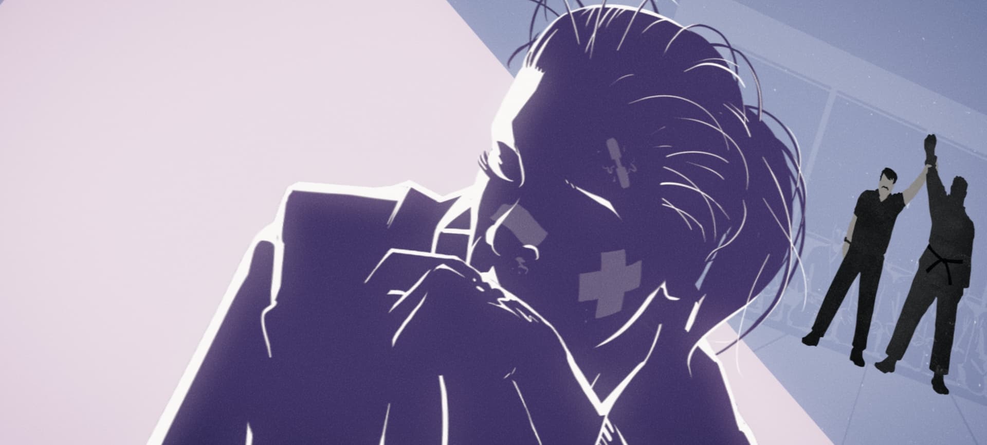
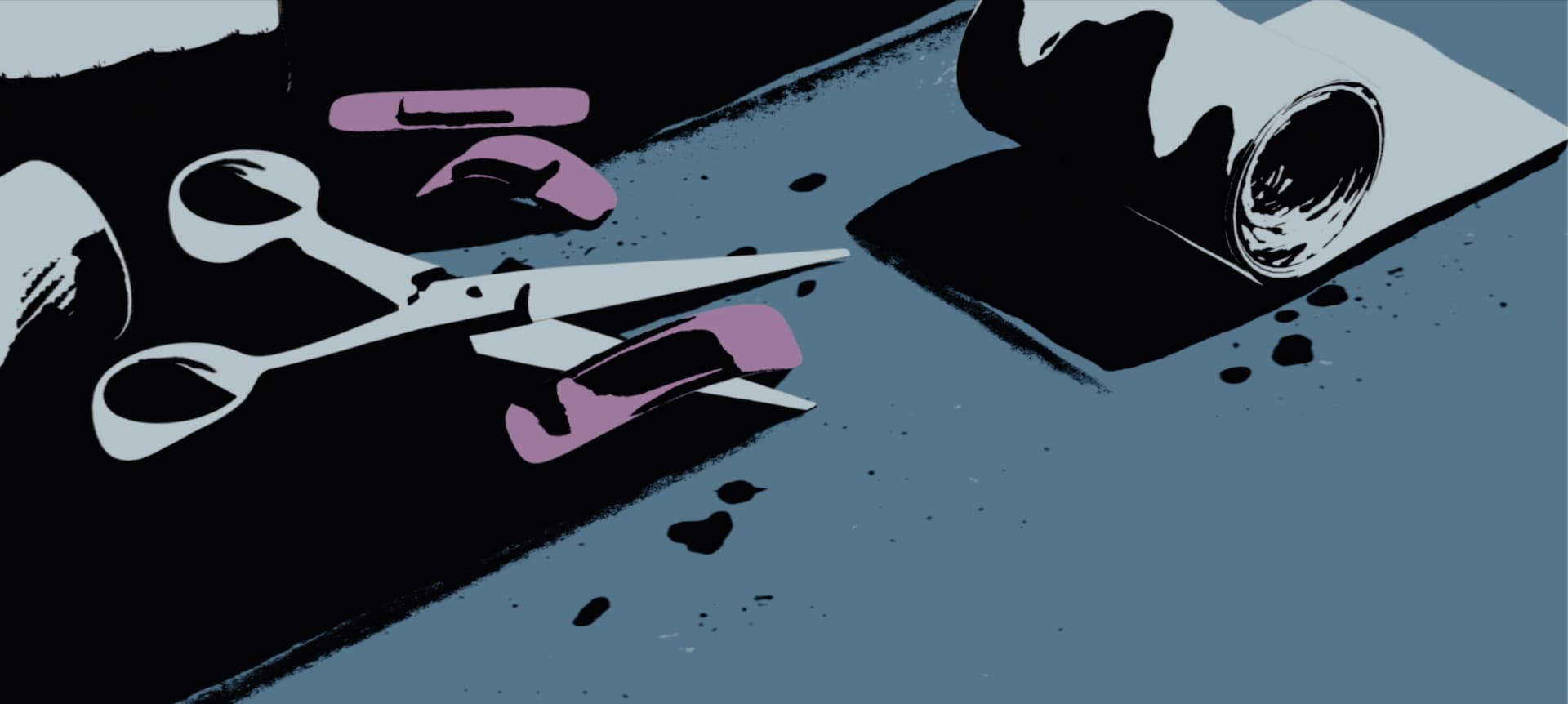
For example, in Hawkeye, Clint shows Kate how to properly bandage a wound. He explains that he knows this because he does not have super strength or powers that prevent him from being hurt, so he has had years of practice taking care of his injuries. This scene not only gives background to Clint’s character, but it also helps strengthen the connection between the two main characters. This memorable scene was represented by a frame of bandages and gauze as a callback to this moment.
Progressing the Sequence
As the series progresses, we wanted to include new elements in the sequence that would keep the audience’s eyes peeled every episode. Whether it’s the introduction of new characters or a plot device, minor tweaks in the sequence added suspense and foreshadowing for what is to come. For example, after Clint and Kate meet Yelena Belova for the first time on a roof while fighting her, a shot of their fight is added to the sequence.
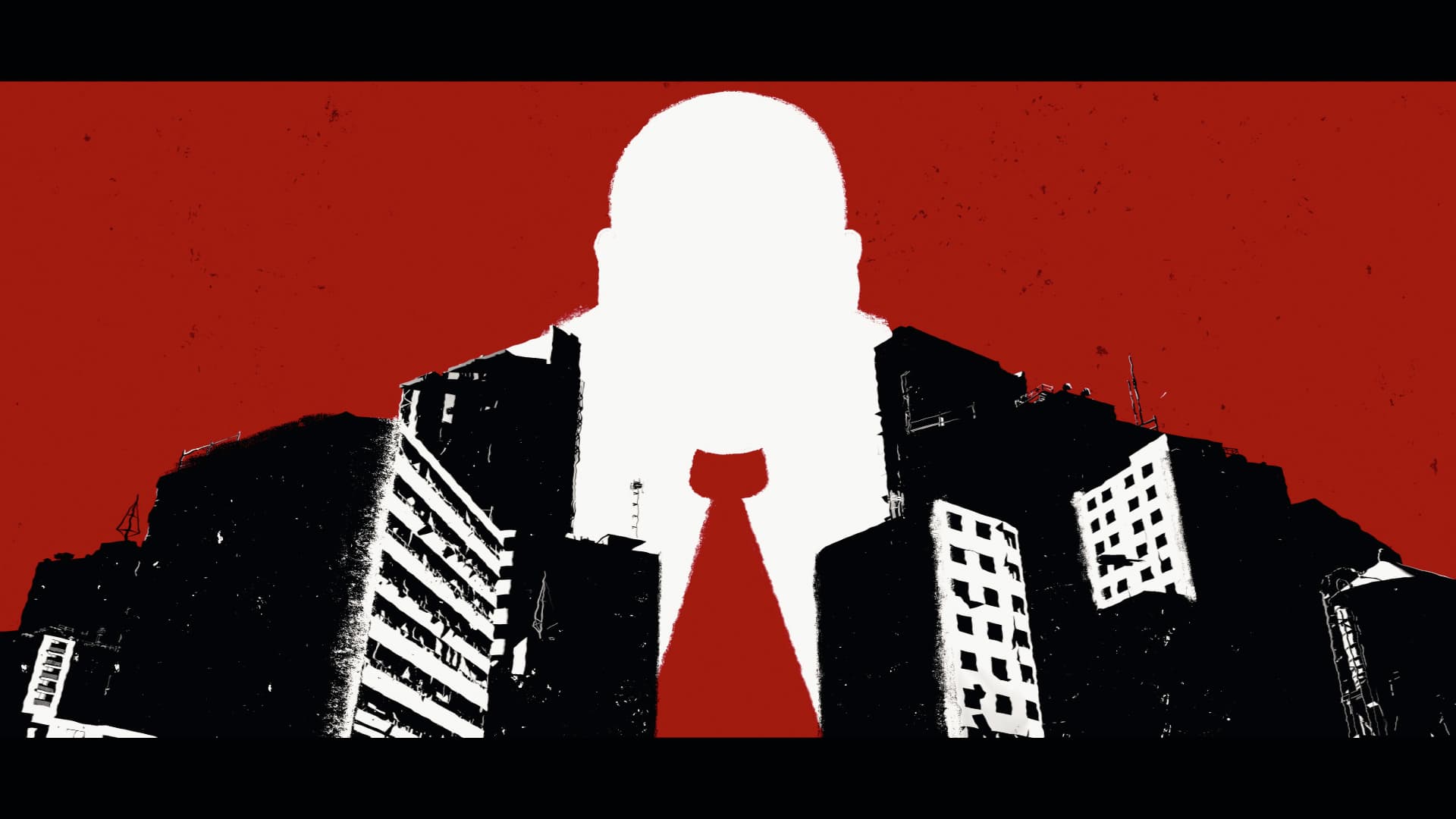
Furthermore, upon the introduction of Kingpin in episode 5, the final title in the sequence is outlined by Kingpin’s silhouette, depicting him looming over the events of the story quietly this whole time. These developmental frames of Kingpin evolved into the end title of the episode 5 main on end title sequence.
04
MAIN TITLE
We designed the main title with the same style as the opening title and main on end title, using vibrant colors and similar illustrations seen in the other sequences. We developed two variations of the main title - one with arrows shooting the target of the “a” in Hawkeye, and one without.
Main Title, First Variation
The variation with the arrows contains a small detail to add extra dimension to this added animation. When the arrows hit the target, a small yellow paint splatter is shot onto the black background, notating the impacts of the arrows.
Main Title, Second Variation
05
LOCATOR CARDS
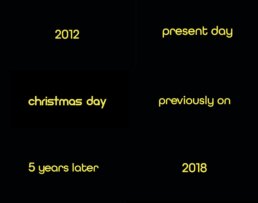
Following the same color and round style of text seen in the main title and in the credits listed throughout both title sequences, we developed locator cards with dates and times throughout the series. The show’s countdown to Christmas and its time stamps are crucial to the plot, so developing bold, large locator cards was aimed to aid in clarity and continue visual continuity between the main title and title sequence.
05
HAPPY HOLIDAYS!
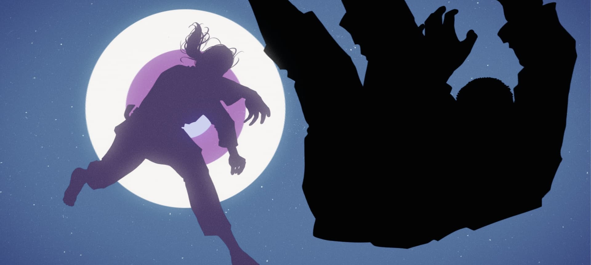
As a fun way to conclude the series, Marvel Studios asked us to develop a “Happy Holidays from Marvel Studios” card to air after the main on end title sequence of episode six. We designed this card to emulate a wrapped Christmas present, because after the card comes on screen, it is “ripped open” to reveal a full musical showing of “Save the City” from Rogers the Musical!
Happy Holidays Post Credit Scene
CONCLUSION
It was an honor to collaborate with Marvel Studios on Hawkeye and tell the story of Kate Bishop and Clint Barton. Our team was able to take deep dives into various comics and truly get to know Clint and Kate through these sequences and we are thrilled to share those stories with viewers!