POSSIBILITIES & POTENTIAL
Given our unique combination of cinematic and real world ux experience, we’ve been getting a great deal of interest lately in collaborating on Virtual Reality projects and initiatives. In light of this current trend, I thought I would put together some quick thoughts and considerations for designing effective user experiences for VR.
In the last year, there’s been a massive rush into this space. Stampede is more like it. Tech companies that were making video games and dabbling in the space just a couple of years ago are now making a major push into VR. The NBA streamed its first game in VR, CNN recently streamed a presidential debate in VR. Major content companies need to be and desperately want to be in VR. Of course we’ve been saying this for 25 years. Now finally we have consumer price points for these devices, and experiences that people can really use. Once the public starts to dive in, once its advertised more prominently and its embedded in devices, it will take a much firmer hold and reach a critical mass. The Consumer Technology Association’s projection of 1.2 million headsets for this year, may be vastly underestimated.
This is an incredibly exciting era for interactive, visual and motion graphics designers. As the architects of user experiences, we need to develop new design strategies now to adapt to these emerging virtual platforms, and try to stay ahead of this impending technological revolution.

The opportunity we have to conceptualize new interaction standards for content presentation, shopping, entertainment, education, social and collaborative endeavors is immense. We can dream up new ways to present users with experiences that fully eliminate the glass barriers of their current screens. Without these traditional boundaries, we can create interactions with content in brand new ways. Its an exciting new frontier, indeed.
DESIGN FOR COMFORT
COMFORT [kuhm-FERT] a state of ease of satisfaction of bodily wants, with freedom from pain and anxiety; Consolation; Solace; Something that promotes such a state.
When designing for VR, considering a users comfort is of the highest priority. To begin with, the design of the interface needs to be exceptionally legible and readable. In general, text instructions don’t perform well in virtual reality, and small text is very hard to read. Clarity and cleanliness of graphic elements should be the goal. Users are often overloaded with visual information from the virtual environment around them. Less is truly more in this context, and reducing the GUI down to its essence; seeking a purity of design should be the goal. Eye strain is a real potential issue in these headsets, so adhering to solid principles of good, quality design cannot be overstated. A close study of human factors and ergonomics will be essential to achieving the most comfortable VR experience.
“To design is much more than simply to assemble, to order, or even to edit: it is to add value and meaning, to illuminate, to simplify, to clarify, to modify, to dignify, to dramatize, to persuade, and perhaps even to amuse. To design is to transform prose into poetry.”
— Paul Rand
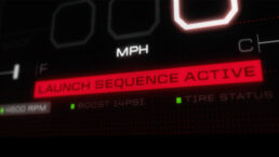
My team gets tremendous inspiration from film and science fiction for our work. Being lucky enough to work in both worlds, we get to cross pollinate these aspirational ideas from the film world into the real world. An obvious device to use for VR interfaces from films, is the Heads Up Display (HUD) so prominent in movies like Iron Man, RoboCop, and Terminator. However — -as is often the case when making the transition from Film UI work to real UI work — -the design and screen density need to be significantly scaled back. When we’re working in film, we deliberately design with a ‘heavier hand’ then normal to ensure the audience notices the interface. Film UIs are usually an integral piece of storytelling, and every piece of critical information on the screen must get the audience’s attention. Often, these film screens are being used for some climactic moment in the story: “ACCESS DENIED” “SECURITY BREACH” “MISSILES ARMED” “:09 TO DETONATION” etc. Certainly, working on real-world UX, involves a far greater sense of restraint. It’s a complete change of gears, and often a successful interface should truly be more invisible then visible. This is a continuum of two extremes, but one we constantly and ably dance between.
For VR interfaces, unlike film HUDs, the density of information and objects on the screen needs to be kept quite low. Much lower in fact than in standard screen design, since the entire UI doesn’t need to be in view at the same time. A high density of graphics also leads to a high luminance, which tends to be quite fatiguing on the eyes. Hence, bright scenes should be avoided. Eye fatigue can also be avoided by carefully and sensitively guiding a user’s focus. Directing and guiding focus and point of interest is a very valuable tool of the designer (and filmmaker). This ability should be fully utilized to create the most comfortable and enjoyable user experience.
“Try to reach for a simple visual phrase that tells you what the picture is all about and evokes the essence of the story”
— Saul Bass
DESIGN FOR IMMERSION
We have a unique opportunity when designing for VR to create fully immersive experiences. At Perception, we often discuss designing the cinematic experience when we’re working in both film and next gen ux. I’ve written about it extensively in a previous blog, but essentially a cinematic experience is one that moves the user/audience to another emotional state; it transcends the very boundaries of the screen being watched. With VR, immersion is inherent to its very nature. As such, when designing for VR, the entire environment needs to be reactive — -it all needs to be brought ‘to life.’
To enhance the immersive qualities, audio and sound should elevate the sensory qualities. As this engadget article recently discussed VR isn’t truly immersive without convincing audio, and a number of Audio companies are working to solve that issue at this very moment: “The premise of VR is to create an alternate reality, but without the right audio cues to match the visuals, the brain doesn’t buy into the illusion.”

Motion should be restrained and used mainly to enhance interaction, and to draw focus toward it. However if too many elements are moving around all at once, it quickly gets distracting and confusing, not to mention highly annoying. We like to preach that when crafting successful user experiences, interactions should ‘wear in’ instead of ‘wear out’ over time and repeated usage. The user should become more and more enamored with experiencing all an interface has to offer, as opposed to getting increasingly irritated by it’s excessive ‘bells and whistles.’ These are the magical moments of delight we constantly strive for.
DESIGN FOR THE EXPERIENCE
At his CES keynote this past January, Intel CEO, Brian Krzanich said “consumers are choosing experiences over products,” and future successes will be the direct result of exceptional experiences, not exceptional technology. As such, focusing on the experience is imperative to successful Virtual Reality design.
A common issue and complaint with VR is experiencing motion sickness. This is generally caused by the divergence between what one feels and what one expects to feel. Input received from your perception of balance that is different from your visual perception, will quickly result in nausea. Essentially, when your eyes think you’re moving but your body does not, you get sick. There are several ways to help alleviate this issue. Firstly, users should always be put in control of the movement inside the environment. This will feel more natural and they will be able to anticipate what they are about to see. Users should not be “passengers” letting the interface drive them. Car drivers rarely getting car sick because they fully can anticipate the sensations of movement before they happen. Always let the user drive. Secondly, an important rule is to keep any horizon line steady. A rotating horizon in VR is exactly like a rotating horizon when youre on a ship — and that usually has a most unpleasant result. Any other fixed points of reference in the users environment will certainly help as well. Use real world cues when appropriate.
“Be Natural…”
– “The Professor,” Dai Vernon
Rapid movements and abrupt transitions can be jarring and can also make people sick, so should be avoided. Transitioning back and forth between 2D and 3D UI can be harsh, so needs to be carefully considered.
Requiring the user to move their head or body too much is asking a lot and can be quite disorienting. Additionally, the user may be wearing a headset in a setting that they cannot turn around in — so limit this extraneous movement. Overall, the user should be grounded in their environment and maintain a sense of their own physical presence. Whenever possible test, test, test and test again with users.
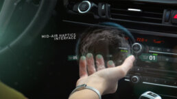
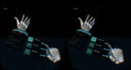
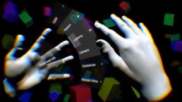
As we enter into this new frontier of ux design for virtual environments, standard 2D interface traditions no longer apply to 3D spaces that now involve a Z-axis. Since users are no longer able to see what their hands are doing in VR, designers true talents will be put to the ultimate challenge of conceptualizing natural ways to interact with virtual worlds. Pointing, touching, grabbing, selecting and receiving feedback will need to be wholly re-imagined. New intuitive controls using gesture, gaze, voice recognition and motion will need to be developed to deliver the most natural user engagements.