DOUG APPLETON – TOP 5 UI’S IN FILM
When creating a list of the best user interfaces in popular culture, it’s almost inevitable that one of those spots will be taken up by Minority Report. The UI is so expertly conceived and executed that almost fifteen years later it’s still referenced as a high watermark in UI design. The ideas in that movie can be seen today in any technology that uses gesture control, from Microsoft’s Kinect to the Leap Motion Controller to Google’s Project SOLI. With that being said, Minority Report is not on this list. This is a list of my top 5 favorite UIs. It’s not necessarily what I think is the best looking or best executed but they each have something unique about them that make them stand out and make them influential in one way or another. So, without further ado…
Star Trek: The Next Generation (1987)
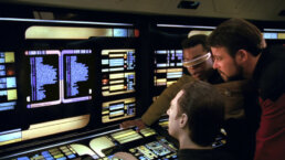
Star Trek: The Next Generation has one of my favorite interfaces of all time. Not only is it gorgeously designed, but it was incredibly ahead of it’s time in 1987, and it all came out of necessity. The production had very little budget and couldn’t afford to create giant consoles with real buttons that lit up. So, they looked to the past to create the future. Movies like Logan’s Run had used a cost effective technique of backlighting colored panels to create monitors and it was the perfect solution for the new displays. Even today the design stands out as a colorful, bold, yet clean design that looks and feels futuristic. While not the first use of a touchscreen display, it popularized the technology and it would be impossible to deny it’s influence over the proliferation of touch screens today.
Hackers (1995)
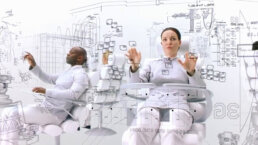
Hackers feels like a movie written by someone who has never used a computer and views them as some sort of magical mystery box. So it makes sense that the Hackers control room interface is over the top and practically unusable. However, what I like so much about the interface is the idea of taking a computer system and turning it into a city structure. There are even some ideas here that you can see now in interface design. The information is grouped into categories similar to how an iPhone groups apps or how Windows 10 puts information in blocks. This is the modern 2D representation of the 90’s at its finest. The idea here is to give you an overview of the entire system instead of a traditional endless list that you still see today in plenty of operating systems. I’m not suggesting that the iPhone is based off of the Hackers interface, but it is interesting to see how some of these ideas have been translated into a more practical use.
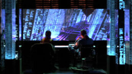
Matrix Reloaded (2003)
The Matrix series is known for a lot of things, its unique green rainfall interface being one of them. But that’s not one of my favorite interfaces. One of my favorite interfaces is from the Zion control room in which users can be seen in a stark white room using a black interface. Even today, this interface stands out among the plethora of green, blue, and cyan interfaces of the world. It looks overwhelmingly complicated with the feel of a futuristic blueprint, but its limited color palette keeps it clean. While no one has gone this simple in color yet, there is currently a trend of reducing all the chrome and unnecessary flourishes in UI and using a simpler, flatter aesthetic.
Iron Man (2008)
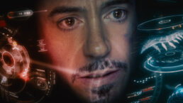
While Star Trek inspired the last few generations, Iron Man is inspiring future generations. The heads up display in the Iron Man armor is one of the coolest UIs to come out in a long time. It not only responds to Tony’s voice commands, but it tracks his eye movements and has an advanced situational awareness. The desire for technology like this is huge, and we’re getting remarkably close to it. While technology like Google Glass, Microsoft Hololens, and the DAQRI Smart Helmet aren’t as smooth Iron Man, they are huge stepping stones to a world where we all have Iron Man like tech in our every day lives.
Speaking of Iron Man, check out some great work we did for Iron Man 2!
Oblivion (2013)
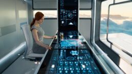
My love for Oblivion’s table UI is purely aesthetic. A large touchscreen table isn’t anything new. Star Trek: The Next Generation was doing it in 1987, and having it extend up the wall probably isn’t very practical. But the look of this UI is gorgeous. The color palette in particular makes it stand out against other UIs. It uses traditional cool colors for a majority of the UI but punctuates it with de-saturated warmer colors as accents. I also love how modular it is. The whole design is based off a dot grid, which allows them to quickly populate the entire screen while still maintaining it’s organization. It’s a great UI that stands out against the overly crowded cyans that we see far too often.
While these interfaces are vastly different from one another, to me they all stand out as being unique additions to the world of UI design. They are innovative, memorable, and at the end of the day, just plain cool.