01
Introduction
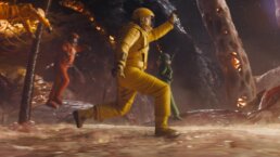
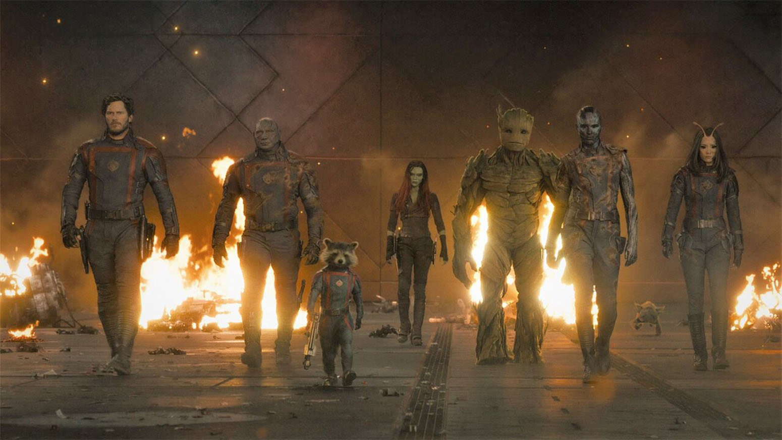
Our team at Perception collaborated with Marvel Studios to design several key features of Guardians of the Galaxy Vol. 3. This emotional film is a powerful conclusion to the Guardians of the Galaxy trilogy, and we were tasked with fleshing out strange and new worlds through storytelling, world-building and alien technology.
OrgoCorp Organic UI
02
THE IMPORTANCE OF WORLD-BUILDING
All of our contributions to Guardians of the Galaxy Vol. 3 were based in narrative elements. Each aspect aided in providing a deeper story to the new settings that the audience is introduced to without needing to pause for further explanation. Our work was often woven into the set or the scene around the action to help build the worlds of OrgoCorp and the High Evolutionary’s ship, providing depth and dimension to settings that plays a critical role in the film.
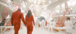
World-Building of OrgoCorp
03
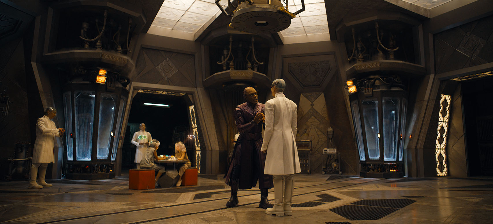
ORGOCORP TECHNOLOGY
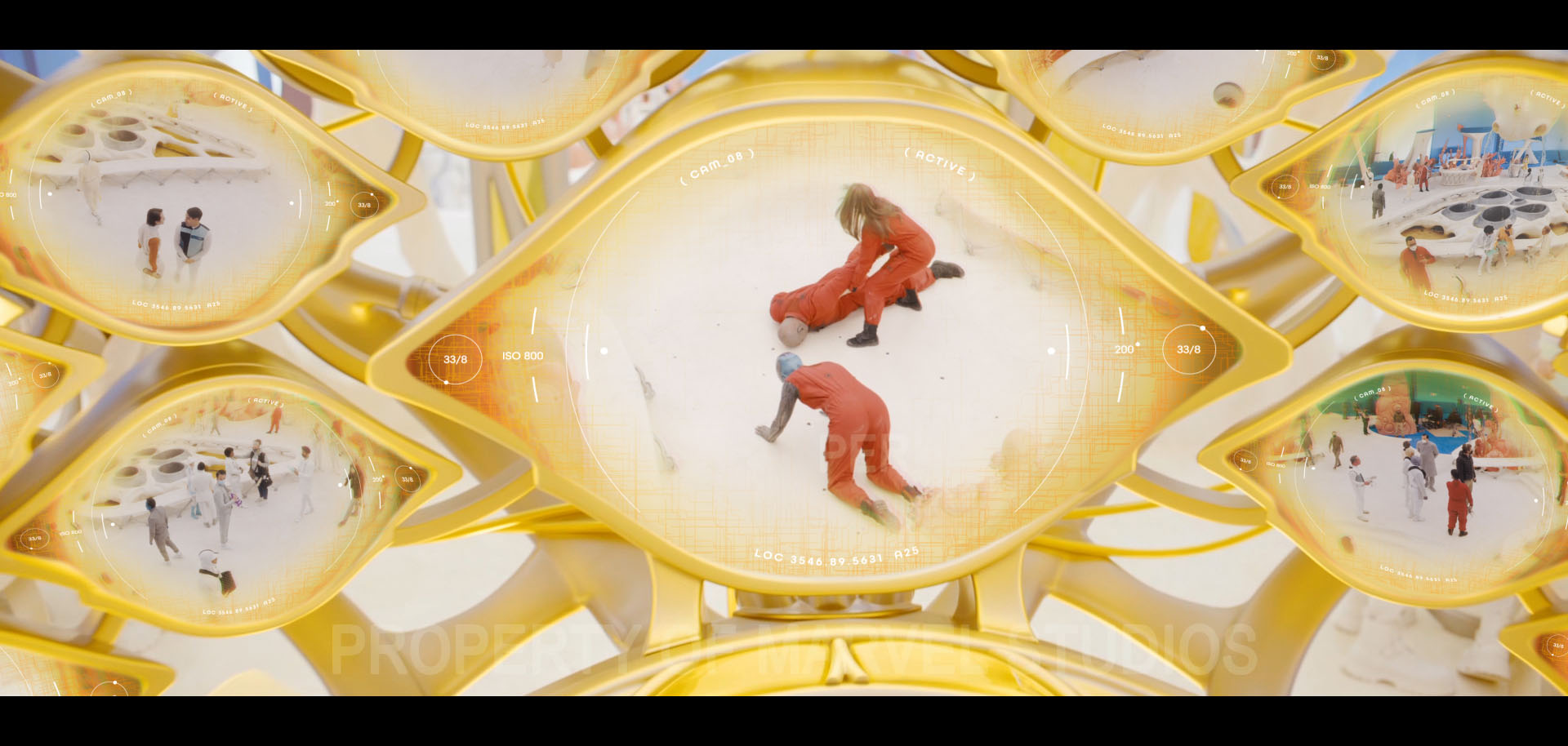
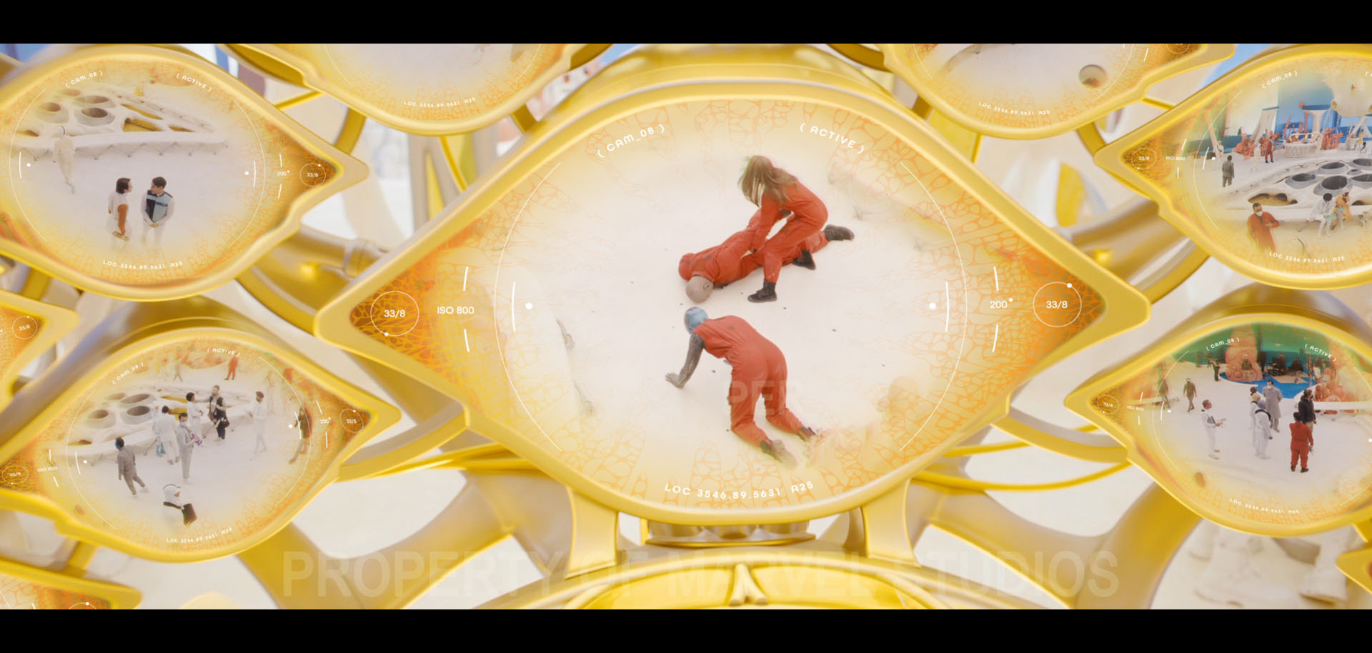
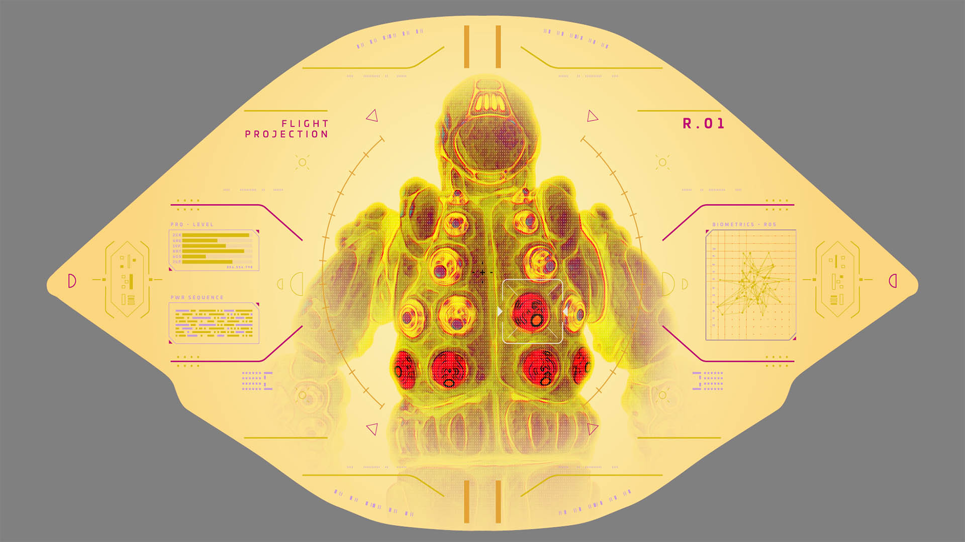
The technology of OrgoCorp is a critical storytelling feature within Guardians of the Galaxy Vol. 3. To ensure that the facility is kept secure, guards monitor security screens that provide constant footage over OrgoCorp. These screens are later used to take control of the “meat suits” that the OrgoCorp soldiers wear. Our team designed these screens, the security details and the takeover animations that occur while the Guardians are invading OrgoCorp.

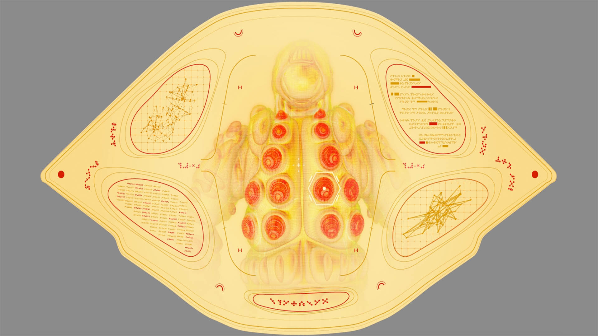
AN ORGANIC SETTING
Because the whole space station that OrgoCorp is located in is organic, we wanted the design of our UI to feel organic as well. To match this distinct aesthetic, the security screens are shaped like eyes. Since the screens are shaped like eyes and the planet is organic, we conceptualized the UI to feel as if it was made of organic material, specifically an eyeball. Within the eye-shaped screens, we included subtle wavy lines, vein-like detailing and expanding features to emulate the features of an eye.
Security UI Concepts

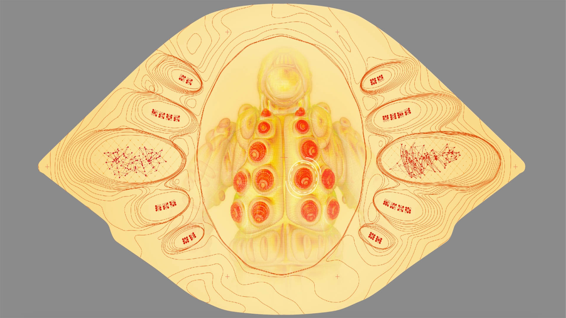
As we designed the UI details, we also tested how different motions and moving UI pieces could evoke the feeling of an eye moving. Since this tech is from an alien civilization, we developed interesting shapes and patterns that we could utilize within these movements. Using swiping, spinning and swirling motions, we crafted various ways that the security screens could demonstrate different functions and operations.
Final OrgoCorp Security UI
MEAT SUIT TAKEOVER UI
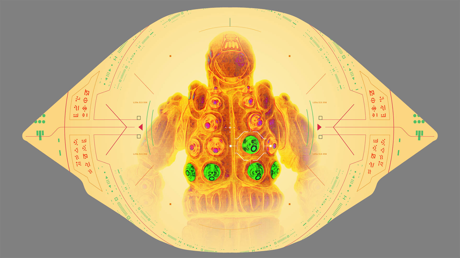
After experimenting with organic styles to overlay on the security footage, our team moved onto designing the takeover UI for OrgoCorp’s “meat suits”. We began by taking a model of the suit and placing it into the eye-shaped environment. With the suit being the focus of the screen, we tested placing it within a circular frame, reminiscent of a pupil.
Meat Suit UI Initial Designs

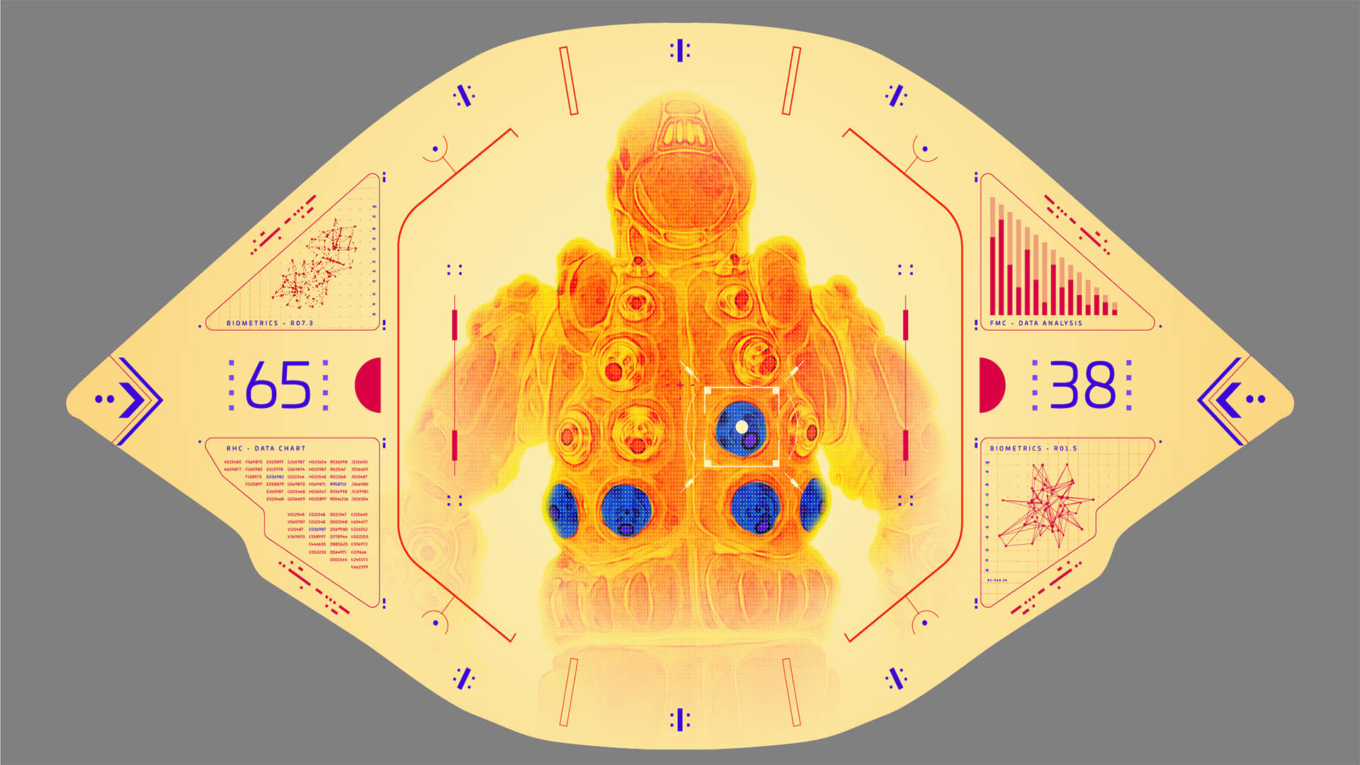
In this scene, Peter Quill hacks into the meat suits to take control of their functions. We conceptualized various ways that this complex operation could be displayed on the screens. We sampled sketches of different graphics, energy measurements and data points entangled in the organic material of the eye-shaped screen.
Meat Suit UI Look Explorations
Our final design for the OrgoCorp UI was completed in Adobe Illustrator, After Effects and Cinema 4D, and features the organic eye details and a hazy, orange color palette. This aesthetic matches both the core colors of OrgoCorp and the flesh environment of the scene, becoming a perfectly integrated piece of technology. The UI features quick scans that are reminiscent of eye flickers and movement.
Meat Suit Takeover UI Final Design
04
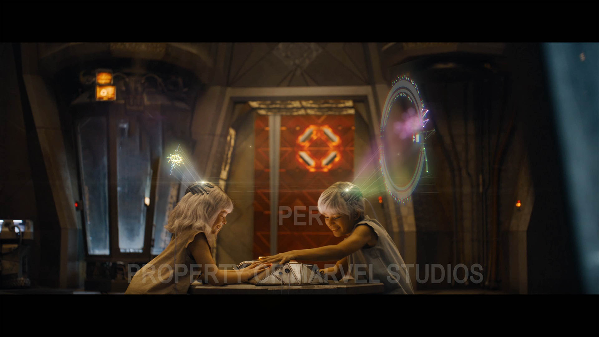
CHILDREN'S HOLOGRAM GAME
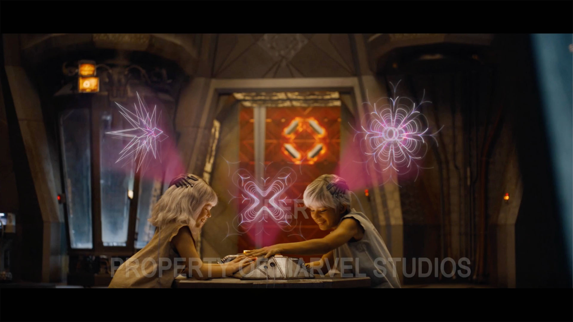
As a way of demonstrating the new skills and experiments that the High Evolutionary has successfully generated in the children of the new society he is creating, Marvel Studios developed the idea to show a children’s game in action. This game would showcase the memorization and intelligence of these children. Two children are playing a game with their minds while wearing headpieces and smacking a central board between them. Marvel Studios gave our team creative freedom to conceptualize how this game could be played, what the visuals were and how it could successfully convey the story of these children.
Children's Hologram Game
CRAFTING THE GAME
The first measure we took to visualizing the children’s game was backtracking to develop the story of the game itself. We structured this game and organized a set of rules for how it could be played. We visualized this game in a way that if it were to exist in our society, we could understand how to play it. While the rules and regulations weren’t necessary to the scene, it was a critical method to fleshing out the game and providing a guided structure when developing our designs.
The premise of this game is that the children are conditioning their minds for telepathy through a matching game. The children are trying to guess the images that are appearing above them, and when they think they’re correct, they smack their hands on the central board. Since the children were wearing headpieces for this game and the High Evolutionary is building a perfect, advanced society, we elected to utilize holograms to display the images above their heads.
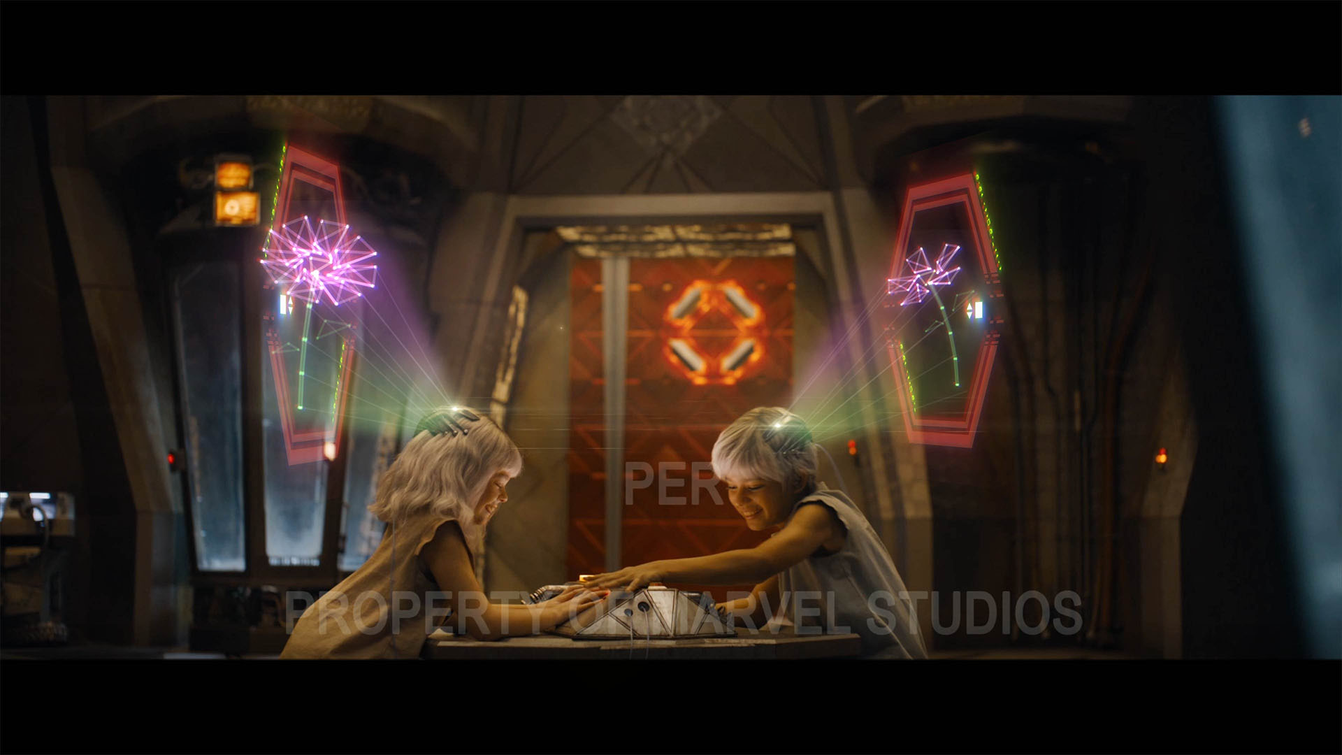
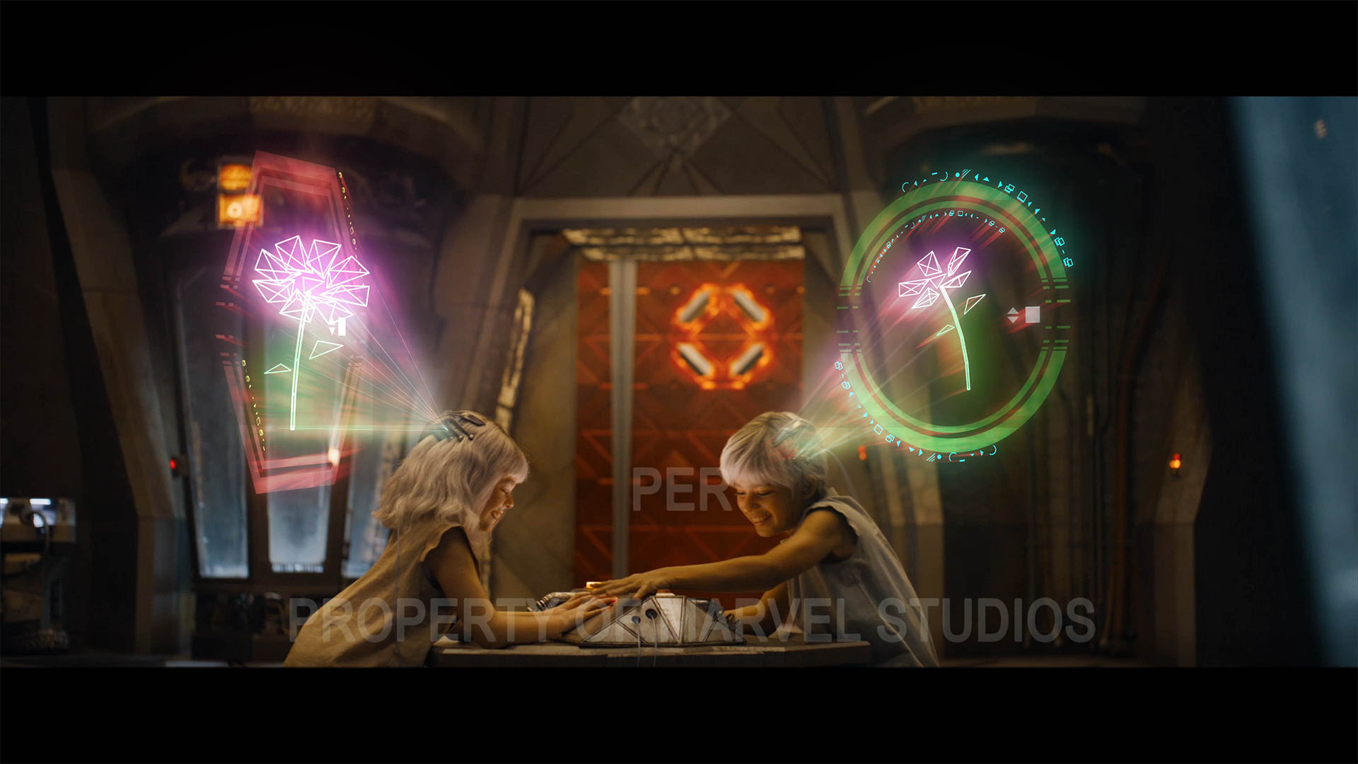
VISUALIZATIONS
An important step in developing the holograms for the children’s game was figuring out what the objects within the holograms should be. The children did not know anything about Earth or any natural worlds, as they have spent their whole lives aboard the High Evolutionary’s ship, so we were initially limited in what these children would have experienced and understood.
Our first idea was having the children envision different shapes - structured, fluid and geometric. These did not tie the children to any sort of sights that they may have seen, but the nature of the shapes was potentially too abstract.
Children's Game Hologram Look Development
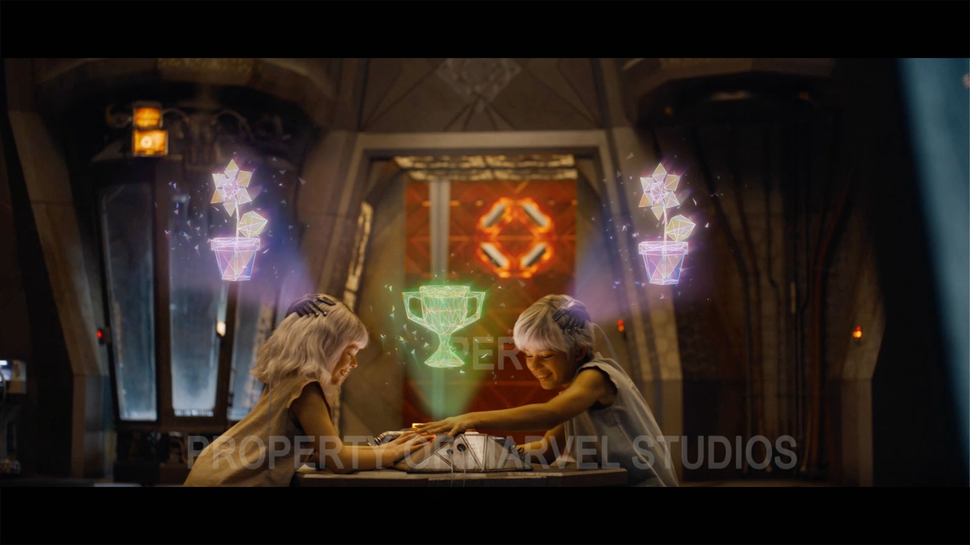
We then leaned into only things that could have been seen on the ship, such as a cog or hammer. These objects were more industrial and provided minimal variations of items we could pick. After selecting a few of these items, we consulted Marvel Studios and began introducing flowers into the mix, with the idea that the High Evolutionary potentially taught the children about flowers just as he had taught Rocket Raccoon about the sky and music.
Further Exploration of Children's Game Holograms
As we nailed down the objects within the game, we started experimenting with how these items could be depicted and how complex the holograms would be. Our tests included adding barriers or fogged screens to the holograms to obscure the images, or adding green and red rings to indicate when the children were close to guessing the object, correct or incorrect.
Success And Failure Holograms
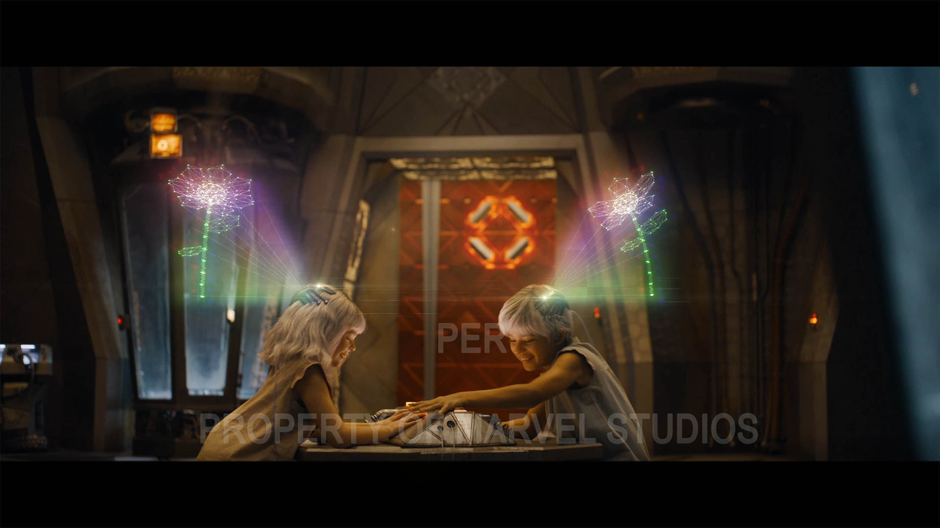
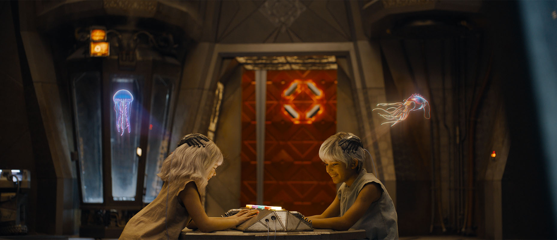
FINAL DESIGN
Our final design is a projection based hologram connected to the children’s headpieces, created using Cinema 4D and After Effects. The objects are a mix between industrial items native to the ship, and animals and plants native to a natural world. The holograms flicker and change color depending on the children’s accuracy and if they are correct.
Final Hologram Designs
05
ORGOCORP PROPAGANDA
To tease the influence and power of the High Evolutionary, our team was asked to create elements that would emphasize and define a chilling propaganda sequence that plays to the citizens of OrgoCorp. We were tasked with designing the branding of this organic-based society and discovering. how it could fit into the world of OrgoCorp.
Similar to the security UI, our designs for the propaganda sequence were based in flesh and meat aesthetics. As the sequence progresses between clips, we developed a muscle-based transition, where the footage is contained with tissue and bone. We utilized a pink, orange and red color palette to align the branding of this piece with the organic textures of OrgoCorp. Not only did this fit the general aesthetic, but it created a familiar, comfortable look that would draw in the OrgoCorp community and help them relate to the messages on screen.
OrgoCorp Propaganda Scene
06
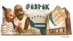
COUNTER EARTH BILLBOARD
Another unique element that we contributed to Guardians of the Galaxy Vol. 3 was the Counter Earth snacks billboard. Marvel Studios knew they wanted a billboard to be included in Counter Earth, and we conceptualized what this billboard would be. The team wanted the billboard to be otherworldly, but something recognizable to the audience. After discussing what this billboard could be, we decided on an advert for a Counter Earth cookie.
Counter Earth Billboard Inspiration
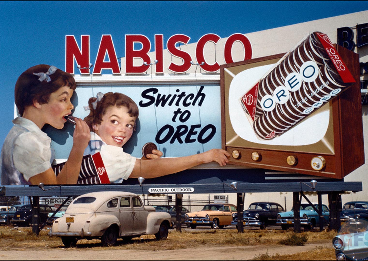
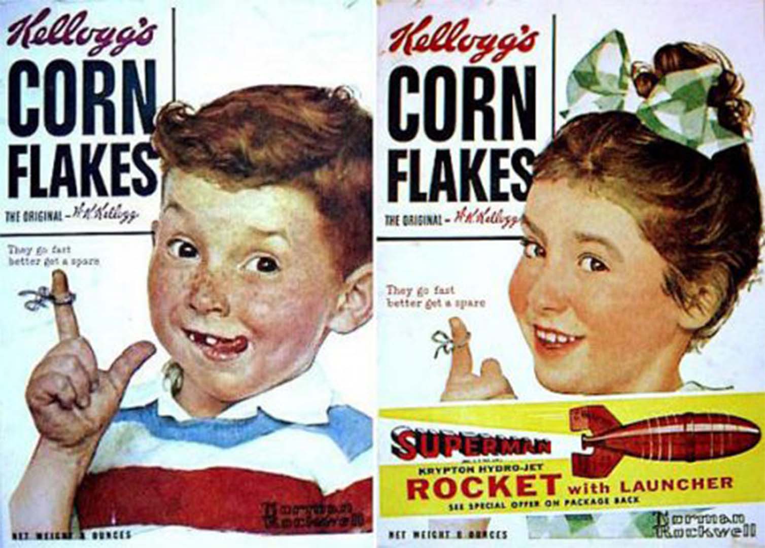
This interesting world-building assignment helped add a backstory and elements of realism and grounding to this world. Counter Earth isn’t just a planet of humanized animals, but rather, an entire fully functioning world with jobs, advertisements and culture.
The final design is based in old Nabisco advertisements with a 1950’s drive-in billboard aesthetic. While the billboard is in an alien language, we did ensure that it translated to something funny about these cookies. The name of the cookie is “Juicy Crumbs”, the company is “Tender” and “mmm, yummy” is the tag line!
Final Counter Earth Billboard
07
CUSTOM MARVEL STUDIOS LOGO ANIMATION
For every Marvel Studios film and series, our team updates and customizes the opening Marvel Studios logo animation to include new clips, characters or details. To celebrate the third installment of this franchise, we overhauled the entire sequence from concept art to footage from the vault of Guardians of the Galaxy imagery.
The tone of the sequence was a creative challenge for our team. The Guardians of the Galaxy are a humorous team and the opening logo is usually paired with a bombastic fanfare. However, the opening of Guardians of the Galaxy Vol. 3 is somber with a quiet track. We had to find a balance between the fun nature of the Guardians of the Galaxy while also keeping in tune with the tone of the music and the opening scene. To do this, we gathered imagery that demonstrated the powerful, impactful moments of the Guardians of the Galaxy, supported by fan-favorite memorable moments dispersed throughout.
Scenes and Imagery that Inspired Perception's Customized Marvel Studios Logo
08
CONCLUSION
Our team greatly enjoyed honing our world-building abilities through our contributions to Guardians of the Galaxy Vol. 3. Working with the stories of the Guardians of the Galaxy has always been exciting for our team, and we are honored to have helped conclude the adventures of this cosmic team within this film.
See how our team helped grow the roots of Baby Groot in our I Am Groot Title Design case study!